15.07.2015
FINDING AMSTERDAM
The Atelier studio recently returned from a field-trip to Amsterdam, with the Rijksmuseum being the focus of our excursion. Opened in 1885, the museum was created to flaunt the art and history of the city. It was a gothic / renaissance concoction designed by the architect Pierre Cuypers. London's Victoria & Albert Museum (V&A) opened 28 years before the Rijksmuseum but by the time they were centenarians both museums faced similar challenges; miles of corridors over many floors and plenty of steps, low levels of natural light, a burgeoning collection that spurred add-on galleries, and rising visitor numbers. Museum administrators began to put great faith in wayfinding systems to unify collections and stronger identities to ensure visitors left having had an enriching experience at their museum.
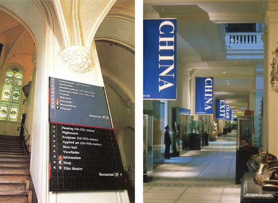
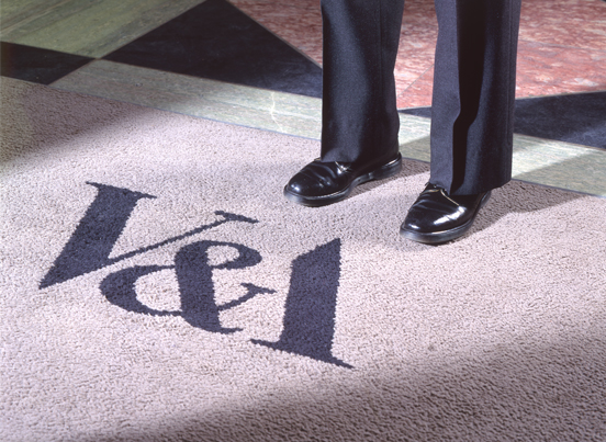
In the late 1980's new identities and ground-breaking wayfinding schemes were launched by both museums. The irrepressibly playful Dutch designer Gert Dumbar introduced a chaotic mix of art and design to the Rijksmuseum (above, left). Working on the V&A logo in the London office of Pentagram was Alan Fletcher, but he showed more restraint — just removing the downstroke of a capital 'A' to create a mark that is still cherished and in use today. Fletcher was adroitly assisted at the time by a fresh-faced Quentin Newark who recalls Fletcher spontaneously asking him to remove the downstroke just an hour or two before he was due to present to the V&A. Fletcher and Newark went on to develop a 'colour compass' for the V&A's wayfinding (above, right) and a coloured map to help orientate visitors: red indicated north, green for south, blue for west and yellow for east.
To meet the challenges of a modern museum the V&A then embarked on 25 years of continual work with a succession of gallery redesigns and extensions. It is currently refurbishing its European galleries and building a new Exhibition Road entrance. In contrast, the Dutch government decided to close down the Rijksmuseum for ten years, during which it undertook a complete renovation to bring the museum up to modern curatorial standards and provide the visitor facilities expected of a capital city destination. The Rijksmuseum reopened in 2013 and I was especially interested to see what could be achieved when curators press a reset button.
There is much to admire about the Dutch beyond tulips, cheese, windmills, and van Gogh. I have always been struck by their nonchalant approach to life, where friendliness extends to accepting the differences between people even if privately they hold diametrically opposed opinions. At night for example, when gawping tourists and rowdy stag parties furtively pick their way through the narrow back streets of Amsterdam, you will find the red flush of brothel lights enveloping the walls of a church standing opposite. The lapsed and the devout coexist quite literally side by side, quite accustomed to one another.
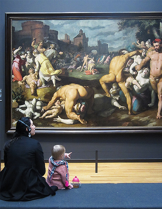 Another Dutch contrast, this time in the Rijksmuseum's paintings gallery. Oblivious to one another was this mother and child seated in front of the uncontrolled 'Massacre of the Innocents' (Cornelis van Haarlem, 1590). They seemed unfazed by the throat cutting, eye gouging and gratuitously naked bodies in questionable contortions.
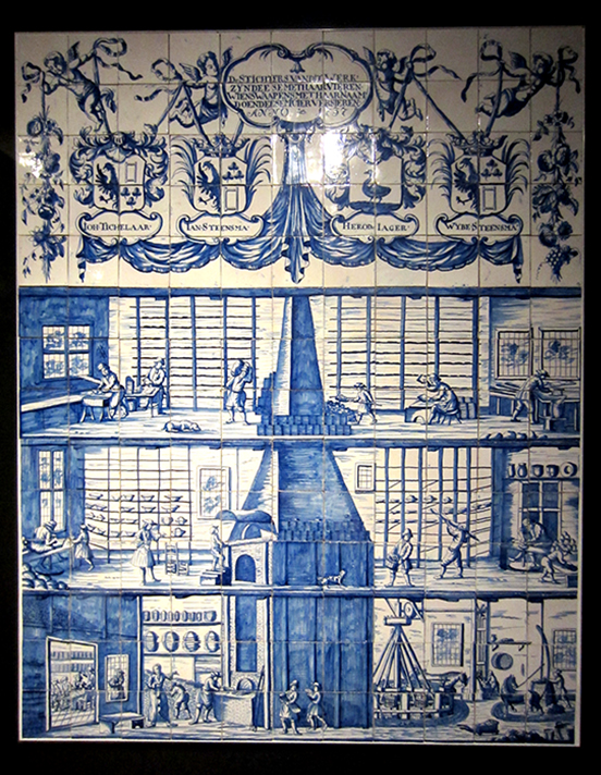
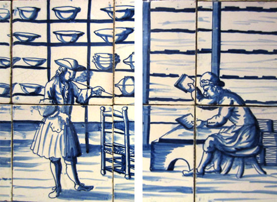
My study of Dutch life continued in the special collections where I found this Bolsward pottery tile panel made to commemorate the founding of the factory in 1737. The panel not only guided me through all the manufacturing processes (as I suspect was its original purpose), it also honours hard work and enterprise. Note the contrast between the jaunty pipe smoking owner and the head down, back aching worker. I was taken by the nerve of the artisan caricaturing his master 270 years ago; the inference can still be appreciated today. This 18th Century infographic needed no gallery caption — it explained itself.
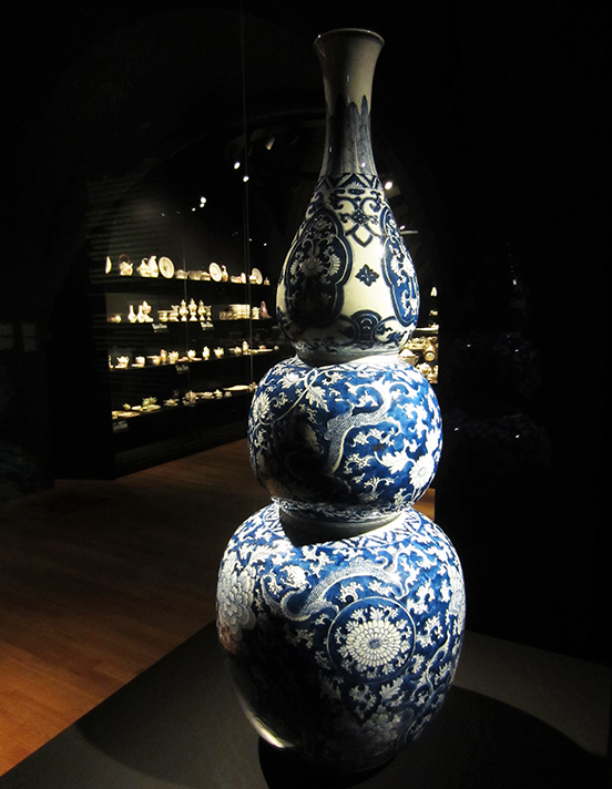
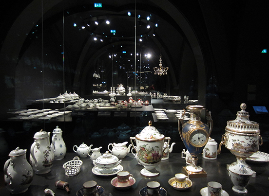
Each gallery presented unexpected exhibits. Objects are arranged in clever proximity to one another so that scale and repetition create a startling display. High contrast lighting isolate every object and in particular cases it is used to pinpoint what the curator really wants you to notice; the form, texture, or colour of an object. I realised that I was being lead through the galleries with a skilful use of light.
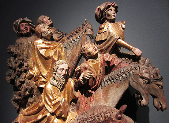
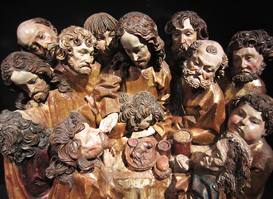
There is a continuity of presentation throughout the Rijksmuseum that ensures that each object, no matter how mundane, plays its part in the Dutch narrative. From a visitor's perspective, you therefore have to look at everything. I'd never looked closely at religious wood carvings before, but found myself enjoying the ingenuity of the compositions. I marvelled at the many expressive figures released from a solid block of wood, and found myself tested trying to identify the stories they told.
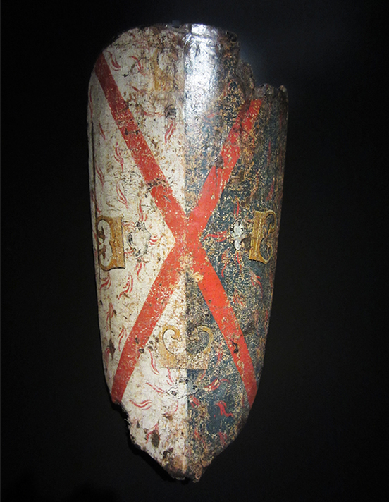
I often look at museum objects and admire the patience and craftsmanship of the creator. I can also be absorbed by the cracks, dents, scars, chips that form an aged patina and I wonder what had happened to it to make it look the way it does today. When an object is beautifully lit you not only see it, you see more to it.
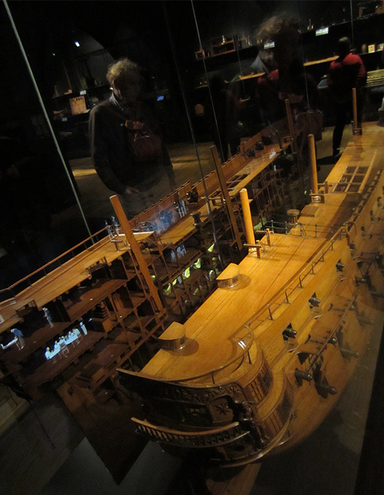
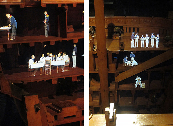
During the 17th Century the Dutch were a major seafaring nation so there is a gallery dedicated to their special collection of model sailing ships. Alain de Botton co-wrote Art is Therapy (published by the Rijksmuseum), in which he points out the limitation of these exquisitely made models; 'I know you want to see what is going on inside...' he writes. So the museum has installed a very large split model of the 84-gun ship Neptunus with hologram projections showing the crew working between decks. De Botton becomes thrilled with this; 'The model takes us into the tarry dank of the orlop deck...and along the noisy gun deck, reeking of gunpowder and cabbage soup, and up high in the salty wind of the main topmast staysail.' De Botton sees this ship model and all museum objects as works of art, to be valued more than admired; 'Artworks have the power to take us to places we can't easily go... extending the range of experience that we can understand and use. They humanise the world.'
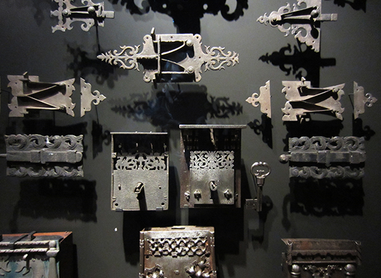
In the ironmongery gallery de Botton even considers the familiar. 'A funny thing happens when you put a fairly ordinary object in a beautiful glass box and illuminate it from above against a black background: the sweetness, interest and worthiness of objects become newly apparent.' He doesn't want us to think about these objects as beautiful historical hardware, his art therapy suggests that we should reconsider underrated objects as meaningful 'details of our own lives'. Can an array of locks and keys induce a sense of liberation? Museums now offer more than the preservation of our past.
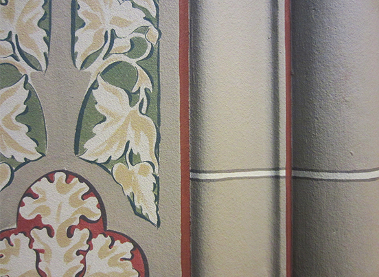
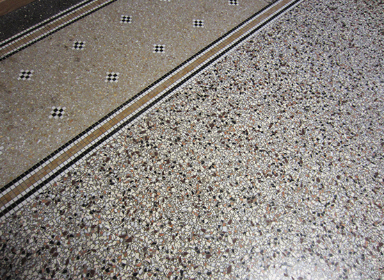
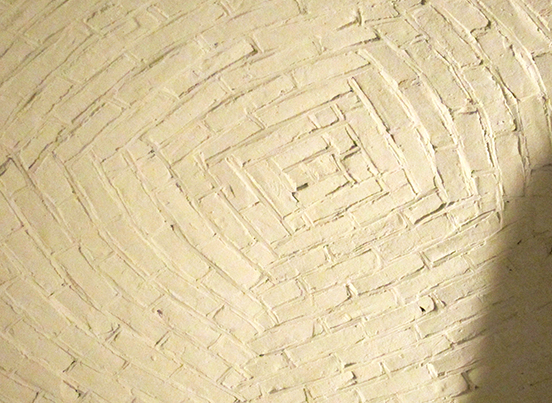
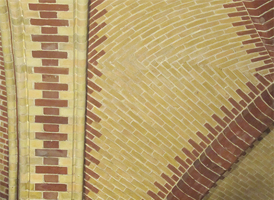
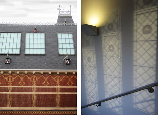
I found myself wandering through the museum enjoying the details of every wall embellishment, brick pattern, ceiling texture and even the shadows created by the natural light in stairwells.
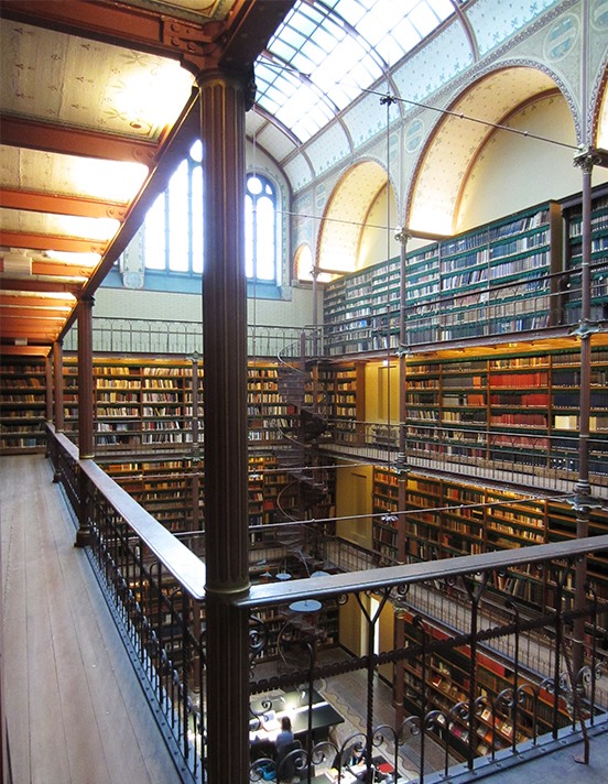
The Rijksmuseum renovation team was lead by the Spanish architects Cruz y Ortiz and they have been impressively meticulous over every aspect of the building. It is in itself, an exhibit to enjoy. I discovered the Rijksmuseum library through an unassuming side door that took me out onto a viewing gallery, from which camera-wielding visitors papped a fastidiously well preserved room. It was a beautiful 'bookscape', overwhelmingly rich in texture, colour and bathed in a suffused light. Elsewhere, and of particular wonder, are the refurbished floor mosaics, stained glass windows, and the hand painted wall decorations faithfully replicating Pierre Cuypers' original 1885 designs. These impressive murals seem extraordinary when we have become so accustomed to modernist whitewashed walls, frameless windows and polished concrete floors — all expressionless and without detail. After years of whitewashing their walls, the Rijksmuseum have purposefully reinstated 'underrated' architectural features and visitors can decide for themselves if fallalery should be a meaningful detail in their lives, as de Botton encouraged us to consider.
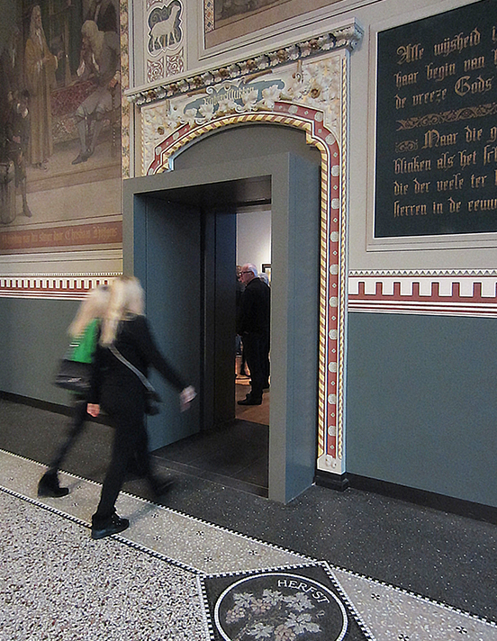
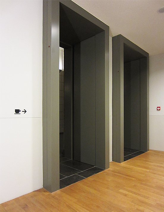
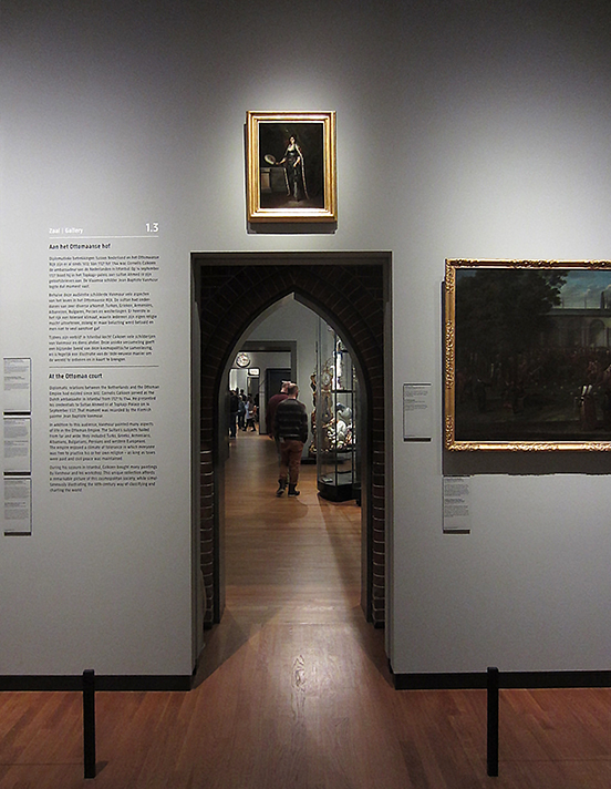
Nevertheless, the Rijksmuseum is not a slavish return to period decoration. Inserted into the main inter-gallery openings are protruding box-tunnels. Lifts are defined by heavy box frames and more delicate box-like architraves can be found linking gallery rooms. These modernist interventions are brazen, directly challenging Cuyper's period archways. From a wayfinding perspective, I think Cruz y Ortiz's framing of doorways is very clever. Each box frame forms a subliminal hierarchy, suggesting the relative importance of each door and helping the visitor to 'read' the building. The threshold clash of modern and period architecture is yet another stimulating aspect of the Rijksmuseum renovation. The Dutch flare for coexistence is built into the fabric of the Rijksmuseum.
My first visit to the Rijksmuseum was in 1986 and I left sadly not enthused by the dimly lit Rembrandts or the aged splendour of the building, but by the museum wayfinding system and exhibition posters designed by Studio Dumbar. The new Rijksmuseum has a fresh identity designed by Irma Boom and I was particularly interested to see what had replaced Dumbar's maverick signs. Not a lot was my discovery.
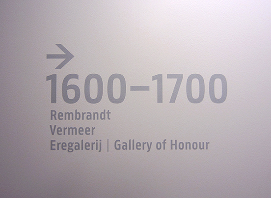
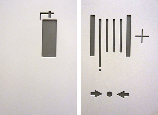
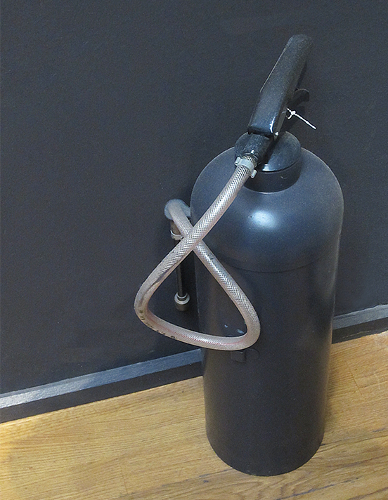
Of all the national museums that I have visited, the Rijksmuseum has the most understated wayfinding system of them all. Look hard and you may find some grey type applied here and there to a whitewashed wall and a few pictograms recessed into the doors concealing fire fighting equipment. Even the fire extinguishers are camouflaged.
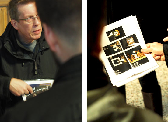
During our field-trip every member of the Atelier team presented a five minute talk on something of personal interest in the Rijksmuseum. I chose to show our younger designers (who were not around in the 1980's) some examples of Studio Dumbar's original museum signs that had so impressed me on my first visit to the Rijksmuseum. Dumbar carefully selected appropriate details from Old Master paintings and overlaid them with stylish pictograms. When the system was introduced in 1986 this graphic juxtaposition was a daring idea and for copyright reasons would be a non-starter if proposed today. Still, Dumbar's signs were most appropriate, representing art and design working together. And they are yet another example of the Dutch embracing completely contrasting values.
I suspect the need for signs at the Rijksmuseum has been much reduced by the thoughtful co-ordination of the renovation team. Careful positioning of objects (like the Bolswald pottery tiles and the Neptunus) inform visitors, dramatic light guides visitors through galleries, and the box door frames help visitors to read their surroundings. These intuitive wayfinding solutions have enabled the Rijksmuseum to 'design out' the need for many conventional signs. Commissioning one firm of architects to make changes across an entire site, encouraging them to reconnect disparate buildings, thinking how visitors flow through a unified museum, and above all, being confident to rely on intuitive forms of wayfinding — this is a quite uncommon approach.
It is not just the curators that rose to the challenge when the reset button was pressed. Exhibition designers, lighting designers and architects have worked together to make it reassuringly comfortable to wander through the galleries without a creeping fear of becoming lost. Other national museums will now have to look towards the Rijksmuseum benchmark.
Ian Chilvers
![]()