30.05.2018
FIVE HUNDRED YEARS ON PAPER
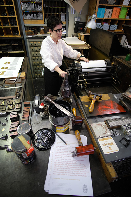
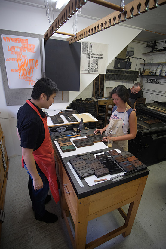
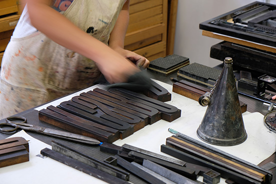
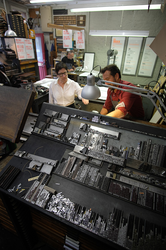
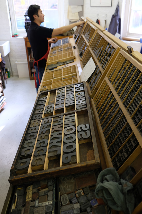
Their ambition is nothing less than a new art school. Based on something most art students rarely encounter - discipline. Because what at first seems to be an Aladdin's Cave of alphabets, ink pots, wooden type, drying racks, and printing presses takes discipline to operate. Their manifesto offers both a promise and a challenge to today: "as an antidote to the immediate & often dispensable nature of modern technology, the slow articulation of the technical side of letterpress allows the designer to immerse themselves in the focus on craft & revel in the simple joys of making". They plan to pass on their knowledge, and develop student's skills with a programme of workshops.
Alan Kitching is a well-known innovator in graphic design, he has spent fifty years first learning the craft of letterpress and wood letter printing, and then using it in ever more inventive ways. His monograph "Alan Kitching: A Life in Letterpress" was published two years ago. Kelvyn is an experienced teacher, and has an highly varied portfolio of work - commissioned and self-motivated - that shows he is of a like-mind with Kitching; although letterpress is beset by restrictions in how it must be set up and handled, those restrictions can melt away to yield typography of the most imaginative and unexpected kind.
After all, much of the greatest innovation in typography to date - from the playful geometry of Hendrik Werkman to the precision of Jan Tschichold - was all made using exactly the same metal and wooden type, viscous inks, and heavy iron presses in this workshop. Indeed, Johannes Gutenberg's workshop would have looked very similar, we are channelling history here, a living connection that runs backwards through five hundred years of typography.
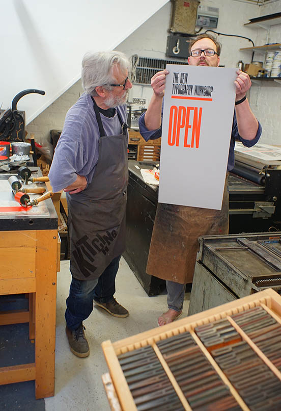
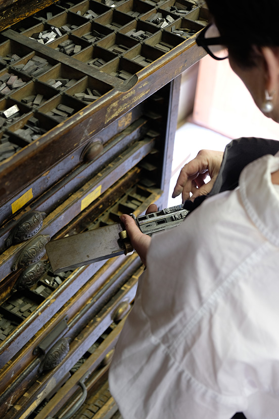
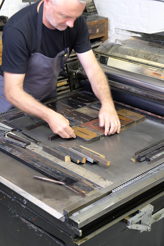
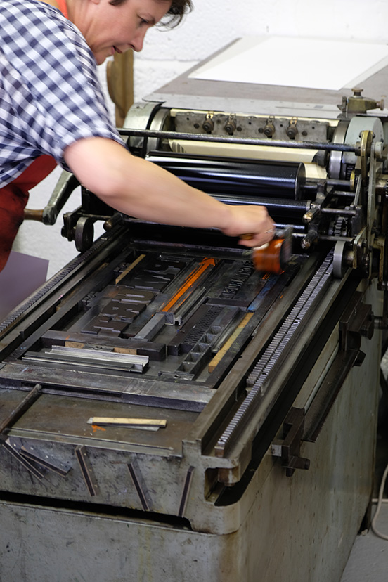
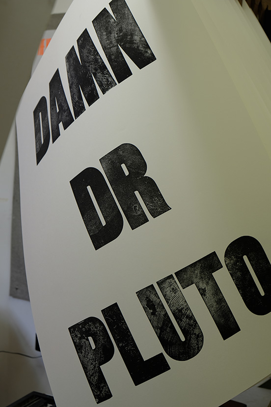
I have done one of these workshops, with Alan Kitching, and discovered more in a day than a decade of reading books and fiddling on computers. The first revelation was that the type is physical, you have to lift, carefully position, lock, ink, pull, to get even one letter onto a piece of paper. The process itself leads to consideration, weighing, deciding, which is simply not there with a computer. The second revelation was about aesthetics; the old typefaces, the way letters looks made of metal, the aged wood, the smells, the coarse paper, the entire process is an aesthetic overload.
The website lists the range of courses to suit every level of capability from civilian to experienced, and the fonts and equipment available, sufficient to enable infinite variation. And they have amassed a long list of visiting consultants, that reads like a who's who of current British design; Anthony Burrill and Hamish Muir of fabled design group Octavo to name but two. Any student or young or even older designer lucky enough to come and study here is going to leave stuffed with all kinds of knowledge; a firm grasp of typographic theory, lots of practical ideas, and creative inspiration to last their lifetime.
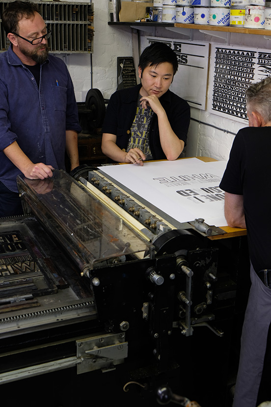
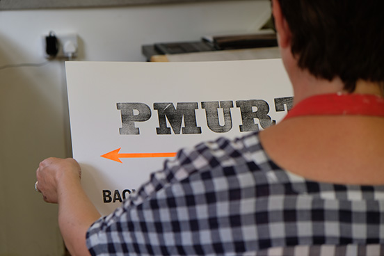
The photographs on this post are from the first workshop, in July 2018.
newtypographyworkshop.com
smithsrules.com
See other posts: