17.10.2017
BUSH HOUSE Phase 1
King's College London
THINKING, DESIGNING AND TESTING
Atelier are currently working on a challenging wayfinding scheme that will unite four landmark buildings and greatly extend King's College London's Strand Campus. When completed, the refurbished buildings will provide more than 55,000sq m of high-specification learning space, and house three university faculties in 500+ rooms, spread over 42 floors.
THE SCALE OF THE TASK...
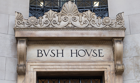
The site includes the iconic Bush House, once home to the BBC World Service. It has cavernous entrances, echoing hallways and labyrinthine basements. George Orwell spent an unhappy time here as a Talks Producer in the early 1940s and it is believed that parts of the building were referenced in his dystopian novel Nineteen Eighty-Four. When we first visited the empty building it had been redeveloped and refurbished by a Japanese developer who was aiming to attract a corporate tenant. Nevertheless, it was still possible to picture Winston Smith lost in the building. The urge to find Room 101 took hold but this was quickly dispelled when we discovered that it had been demolished. Still, the 'low-ceilinged, deep underground' Canteen also referred to in his novel could still be made out, despite the new whitewashed walls, the mirror-finish travertine pillars and marble floors, and the low-energy, high-lux lighting that bounced around the empty, silent space.
Our fanciful musings of the unhapp lost Orwell came to an abrupt end when our guide from King's announced that the university was expecting more than 5,500 students and staff to move through the site during peak changeover times. That's a big ask for any wayfinding system.
Three floors of a Phase 1 refurbishment were completed for King's in October 2017 and we installed our first sign prototypes. This blog post records Atelier's thinking and how it lead to the development of an unusual sign solution. It is a design that was determined by a blend of strategic thinking, heritage considerations, a pragmatism, guidance from the original architect, and quite a bit of Charles and Ray Eames.
STRATEGIC THINKING
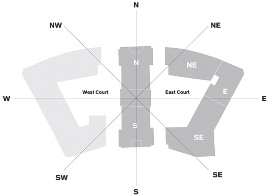
After site investigations and an intensive desk-bound study of the plans, we developed a logical wayfinding strategy that would link the four wings. It was underpinned by the then-forgotten, but now obvious revelation that each of the buildings was originally part of one site and known as the North, North East, South East and South Wings. We discovered evidence for this carved in the stone lintels, high above each entrance.
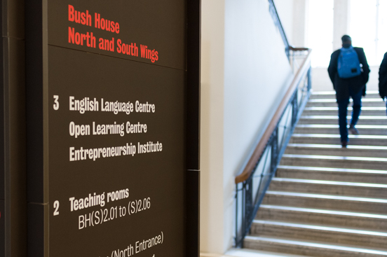
We reinstated this terminology and developed an internal wayfinding scheme that used the prefixes N, NE, SE and S, followed by level numbers and then room numbers. This system would enable students and staff to grasp their timetabling instructions quickly and would help staff when making room bookings. Ultimately, we hope that students and staff will begin to develop their own 'mental map' based on the compass and find their own way around the site — making only first-term students and staff sign-dependent.
HERITAGE CONSIDERATIONS
Bush House was originally conceived as an international trade centre, with exhibition galleries, shops, conference rooms, reference libraries, a small theatre, badminton court, cinema, swimming-pool, club and restaurant. The size, scale and Art Deco opulence is still very evident. In 1929 Bush House was declared 'the most expensive building in the world', with a construction cost of £2 million. Little wonder then that it is Grade II listed and now sits within the Westminster Strand Conservation Area.
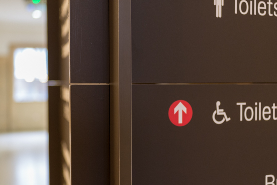
For Atelier, the consequent constraints meant that the usual positioning of signs within optimum sight-lines would be hampered by untouchable travertine-clad walls, Art Deco ironwork and inlaid marble floors.
PRAGMATISM
Unable to attach signs to walls, our directional signs had to be freestanding — but positioned where they would not impede the circulation of people at peak changeover times.
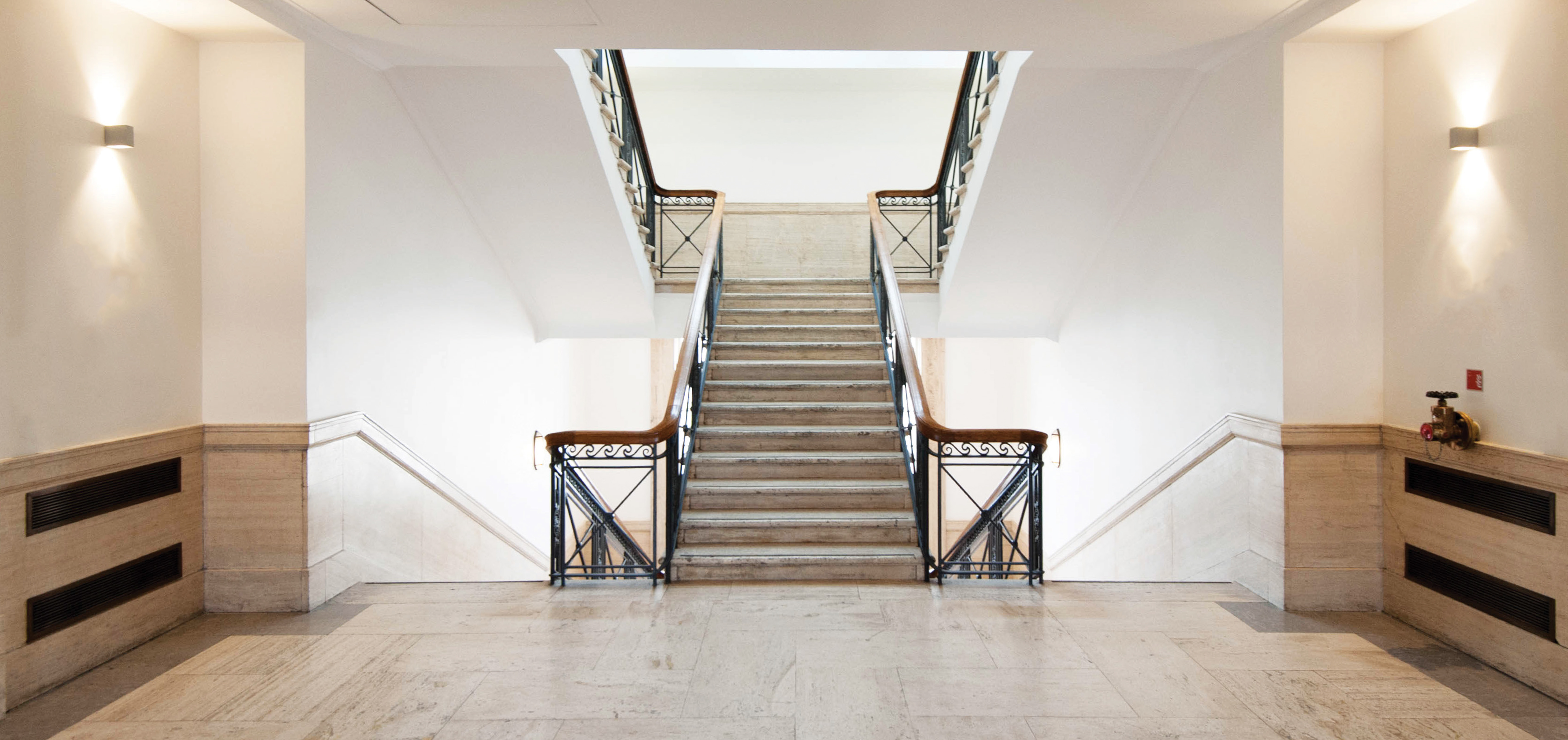
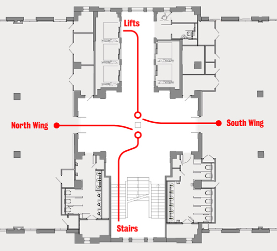
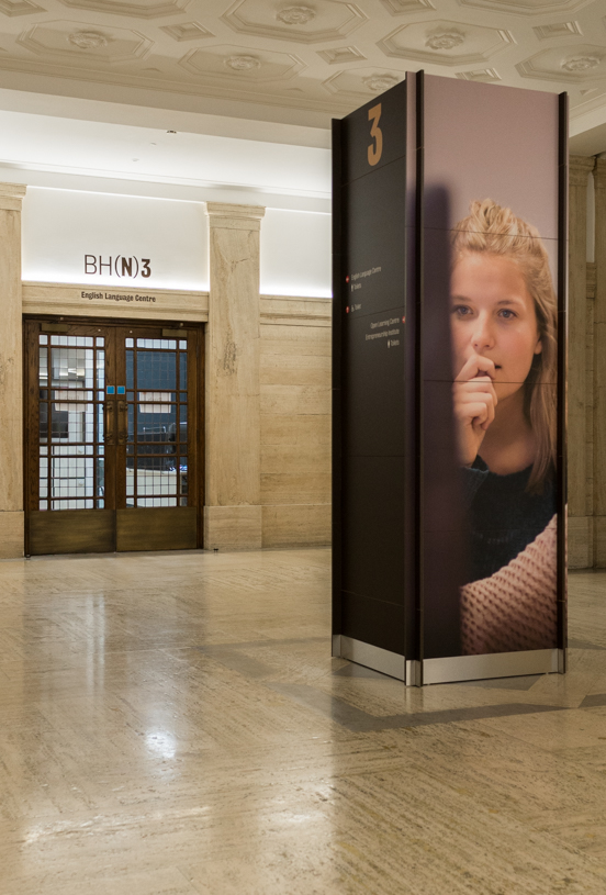
We analysed the flow in the vertical cores (stairs and lifts) in each wing. All stairs and lifts adjoined a lobby and these were particularly spacious in the North and South Wings — an ideal position for a single point for all directional signs. For students and staff to be drawn to this point, we knew these structures had to be very large, and very visible.
HINTS FROM THE ARCHITECT
Having established a content strategy, understood the heritage constraints, and identified a possible position for a single, large freestanding sign in each lobby, we then began to consider the sign design.
Our starting point is always the aesthetic of the building, to try to understand what the American architects were thinking when they designed the building and we try to envisage what signs they might have created if they had been handed our brief.
This is why site investigations are so important. In my opinion, staying in a studio to study plans and then creating computer-based ideas will not result in an appropriate wayfinding solution. Spending time in a space reaffirms a sign's optimal position and informs its ideal proportions and materials — and can even inspire an innovative outcome.
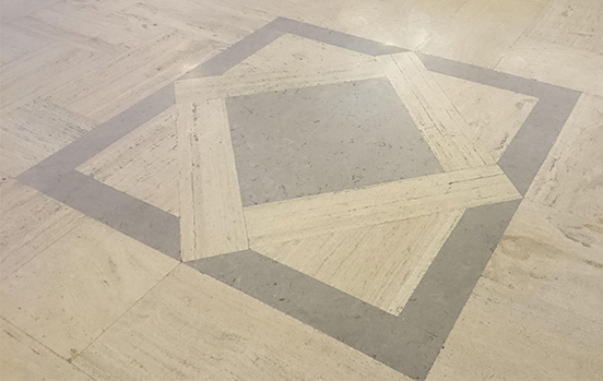
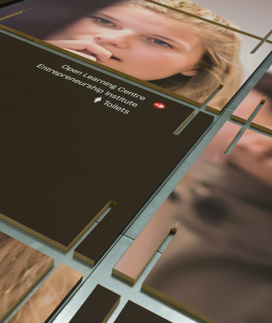
And it was while in the North and South Wing lobby that I realised I was standing on a series of square and diamond marble inlays; the architect had provided us with the position and the proportions for our sign.
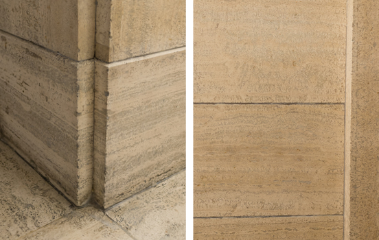
Looking around, the architect had provided many clues; the height of our sign would be governed by the height of the travertine wall cladding. The colours of the sign would match the bronze ironwork of the stair balustrade. Looking closer still, I noticed the travertine pillars in the lobbies. In particular, the inverted corner details (above, left) and the travertine slats (above, right). These provided an idea for the structural build of our new freestanding signs.
CHARLES AND RAY EAMES
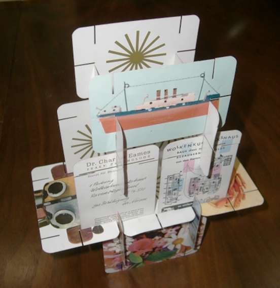
This inverted corner detail reminded me of Charles and Ray Eames' House of Cards. Originally produced in 1952 as a creative toy for American children, the large cards featured colourful images and had slits cut into them. The cards could be slotted together to create imaginative structures, the corners of which always appeared inverted. This line of thought lead to the idea that we could construct slot-together, self-supporting sign that didn't need to be bolted to the stone floor.
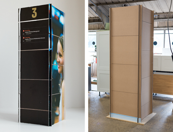
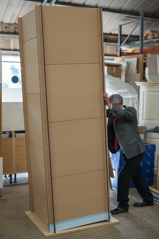 We tested this out; first in cardboard (above, left), then in wood (above, right). Assuming the structure may come in for some rough treatment during peak changeover times, we even tried pushing it over. We were delighted to find that the structure remained very stable.
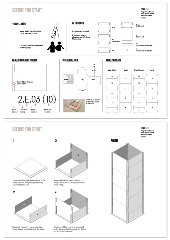
Our factory tests lead to the Phase 1 prototypes being delivered on site as a 'flat pack' order. Inspired by a well known Swedish retailer, we even prepared our own flat pack assembly instructions.
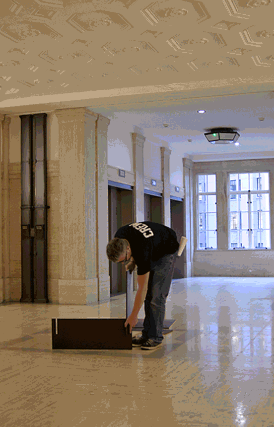
The prototypes can be assembled in about 20 minutes. This little film doesn't last that long.
PROTOTYPES
The prototypes are being tested for eight months on three floors and so far they are holding up well. Phase 2 roll-out across the whole site is expected in September 2018.

Christine Ayre, Head of Brand Design, King's College London
Other Bush House posts: Bush House Phase 2, Bush House
Ian Chilvers
![]()