28.05.2014
ANOTHER FULL STOP
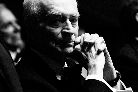 Massimo Vignelli, image borrowed from lafondazioneny.org/remembering-massimo-vignelli.
Another great designer has left us. Massimo Vignelli died, aged 83, on 27 May 2014.
Massimo, as his first name suggests, was big. And in these musings here I try to get at why.
I wrote this brief passage below to convince the board and executives at D&AD that Massimo, and his wife and design partner Lella - were worthy of flying over to be the headline lecture at the D&AD Congress of 2000-and-something. 2005 I think.
(I know what you are thinking ... "Congress? As in sexual congress? As in Trade Union Congress?" Yes. As with most things at D&AD it seemed like a good idea to someone, to inflate the awards ceremony and the student awards into a quasi-conference, and give it a funny name. It stuck for a short while until someone fresh came along and thought of another idea.)
- * *
THE WORLD ACCORDING TO MASSIMO VIGNELLI
Its hard to describe Massimo, largely because Britain has no-one even remotely like him. He is essentially a graphic designer, but then alongside his wife Lella, he has spent a 50-year career designing almost everything there is to design.
One-time assistant Michael Bierut put it like this: "You could fly into New York on American Airlines, find your way on the New York City subway, shop at Bloomingdale's, dine at Palio, and even worship at St. Peter's Church and never be out of touch with a Vignelli-designed logo, signage system, shopping bag, table setting or pipe organ." And then, Michael could have added, you could go home, pull up a Vignelli-designed handkerchief chair to a Vignelli-designed table and eat dinner on Vignelli-designed plates with Vignelli cutlery whilst candles guttered in Vignelli-designed candle sticks.
His list of awards and accomplishments, honorary professorships and medals would take an entire evening to recite. Alan Fletcher's nickname for him was Mister New York - so ubiquitous are his designs in that city. Logos everywhere, sign systems, including Citicorp a prototype of most city-wide pedestrian sign schemes, building identities such as the Guggenheim museums, the literature of all national parks in the city and the state. (These peans by New York designers make the point far more convincingly than I can, they lived and breathed the effects of his work.)
In the first ever full-length talk he has ever given in Britain, Massimo and Lella will tell us stories about some of the world's most universally admired design work, and the meaning of the phrase "design is one". And does he agree with what one critic said: "In many ways, the Vignellis are considered to have given graphic design its stature in contemporary society."
- * *
What I wrote must have worked, because they came, the Vignellis, and over an all-too-short evening amazed us with their confidence, fluency between disciplines, consistency over decades, iron-clad resistance to fashion, all carried out with a highly restricted palette of shapes, colours and typefaces.
This film by them captures some of their abundance of glamour and character.
I tried to capture what struck me in a piece for EYE magazine. (Sorry if it irritates you that I repeat certain ideas. Think of my metaphors like Vignelli's endless re-use of the square.)
There is no one in my generation remotely close to Vignelli, who bears comparison with the greats. And if it's too early to make that call in mid-career, then I will say that there is no one who even remotely looks like becoming a designer of Vignelli's stature. A colossus. A giant to compare with giants like Herbert Bayer or Eric Gill.
What is it that gives him that scale?
He seemed to be perfectly at ease with clients of every sort. Publishers, he designed hundreds of books. Charities, he designed countless identity and literature schemes. Big national bodies and multinational businesses, from the National Parks to Bennetton. His projects ran up and down the design gamut, from two colour flyers to nation-wide systems. And spanned every tone; promotional, high seriousness, chatty, grand. Very, very few designers get to meet this sheer range of challenges.
He designed everything, literally, anything you can name; from sofas to suits, offices to wine bottles, jewellery to typefaces, magazines to train liveries. There wasn't anything he didn't get his hands round. This takes him into the realm of William Morris and the designers at the Bauhaus, and elastic architects like Frank Lloyd Wright and Rennie Mackintosh - the designers of whole worlds. Making a world as you think it should be. Being a designer capable of designing a building and a door handle, and the clothes of everyone in it. Which of us does this? Marc Newson, maybe. Philippe Starck, maybe. But the next point shows how far Vignelli is above them.
His morality was a substantial part of how he thought about design ... but what exactly does that mean? He lived well. I remember visiting his studio in about 1998, at the top of a New York skyscraper. It was like a film set, all grey tiles, roof lights, doors flush with the walls, all assistants hidden behind high booths. Vignelli greeted us in a collarless black suit, and white hair, like God. I have no idea what his relationship was to those less fortunate than he: but from the amount of charity work he did, how he treated young upcoming designers (he was hugely lavish with his time and advice to me and John Powner, two young design worms whom he could have simply ignored), he met more than his fair share of obligations of all kinds to educational and pro-bono bodies, I suspect he was personally generous. His morality showed itself most in what he believed design should be doing - making the world better, clearer, less wasteful, efficient, clean, stripped down and (in his eyes) more lovely. And the purpose of this was that better design gave people a better experience. Understand a map faster, read a book more fully, enjoy a meal more with more thoughtful crockery. His thinking was: for design to last, it has to transcend its time, it needs to use eternal forms, simple and pure geometry, a red that is not salmon or maroon or almost an orange, clearly a red, a red red, a red that will be red for ever more.
This is only my unresearched opinion, but Philippe Starck (who designs products, furniture, interiors, architecture, but has to my knowledge has never strayed into the graphic design world) seems happy to use eccentric, personal, striking forms for his work, with little concern whether or not it might 'last' in the way that Vignelli worried about. Starck loots French history, reaches out for antlers and horns, seeks inspiration in the insect world, adds Post-Modern bits and bobs, designs hotels reputedly by scribbling hundreds of sketches with a fat pencil and faxing them to lesser designers to create a final design from. (Instead of "final", I was going to use the word coherent, but that is the last word to describe any Starck interior. Walking into a Starck bar or café is like walking into a thrown-open scrap book.) There is a black building in Tokyo designed by Starck, the headquarters of a beer company, with tapering sides, and to top it off, like a maraschino cherry, there is a puffy golden flame emanating from the roof. (Why? The local residents have had their revenge, it is known locally as the Poo Building.)
Vignelli had a missionary zeal, a purifying morality that stretches out across the whole of society, and that urge for things to be better - purer, simpler, reduced, clearer - underpins and invests his work in a clear way. I have no real sense of what Philippe Starck wants the world to be. (His, maybe?) Starck's is a wilder, more playful imagination, a free-wheeling, eclectic, historical mish-mashing puckishness. A world populated with golden poo. Starck may have the morals of an Amish, but I don't read them in his work.
He is called "leftist", but I don't think Vignelli was a Socialist, a thing that it is getting harder to believe ever really existed. I don't think he believed in a grand plan coming inevitably into being - the rise of a newly liberated working class the world over, a class free of all the evils of the past, free of colonial impulses, free of the desire to oppress or collect capital... to paraphrase Karl Marx: history will come to an end, and mankind will be reborn in a better form. (An awful lot of apparently intelligent people did believe this. Like the Bauhaus founders.) I think Vignelli was a non-doctrinaire instinctive follower of Utilitarianism. This blog post is already long, and I am straying into territory that threatens to make it far longer, so put as succinctly as I can: Utilitarianism might be described as a belief that what works is good.
Wanting design to be good, because good design elevates whatever it is used to assist; reading, travelling, eating, praying. Most modern designers want fame, and money, much more than they want to elevate other people's lives. They strive for originality, to do something that will make them stand out. Massimo was busy his whole career doing less. Happy with a handful of colours, four typefaces, some very fat rules, a square and a circle. These humble ingredients got reused hundreds of times to stunning effect. Showing us that originality is one thing, but utility is another, better thing.
Dear Massimo, Deyan Sudjic in his obituary said you gave America "a modern look". I doubt we'll see your like for a long time. I imagine you in Heaven, frowning at the elaborate harps.
Quentin Newark
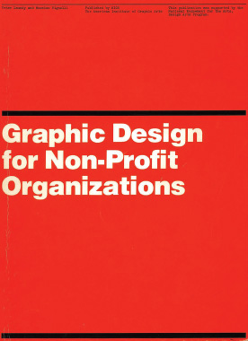
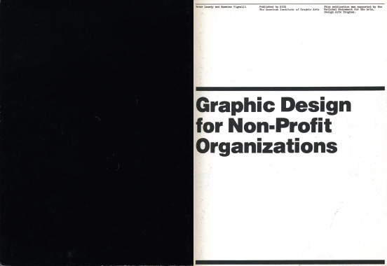
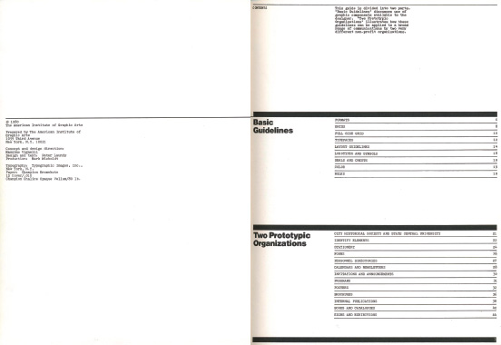
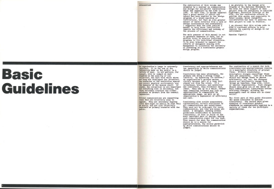
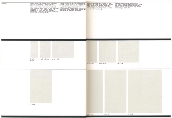
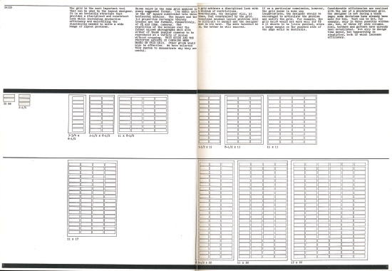
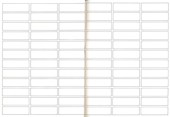
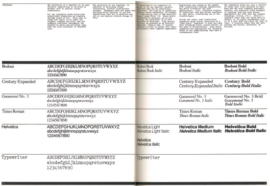
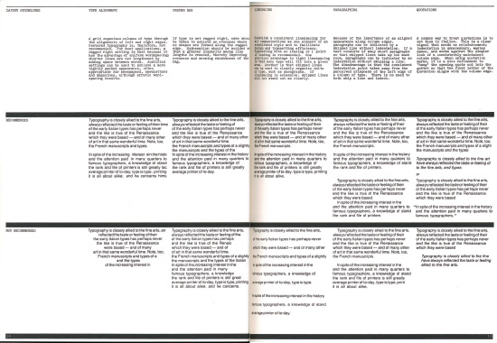
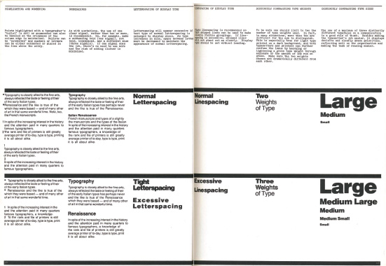
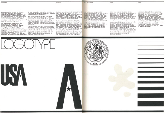
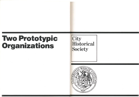
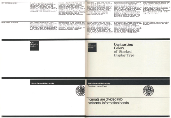
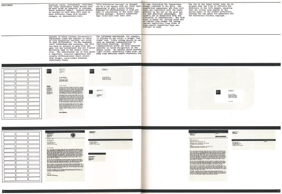
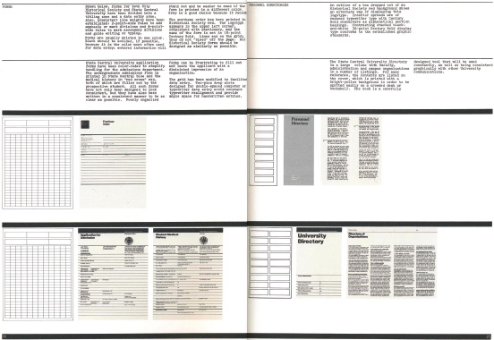
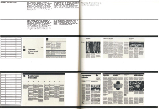
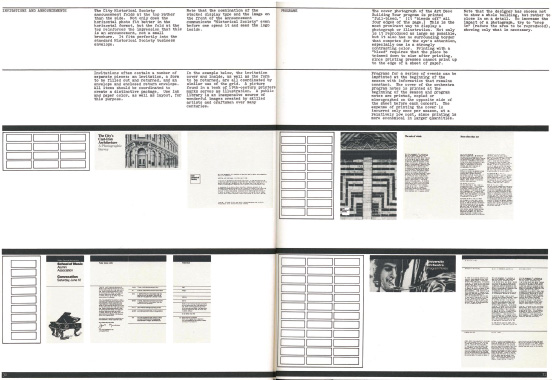
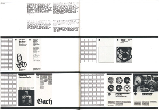
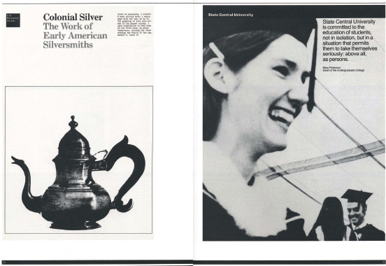
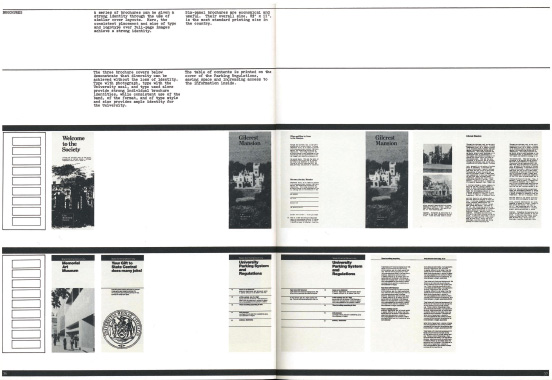
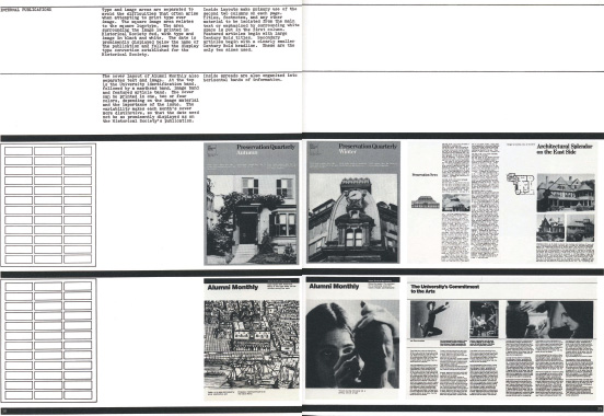
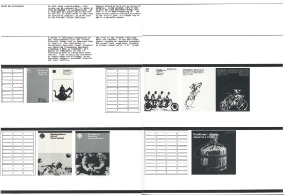
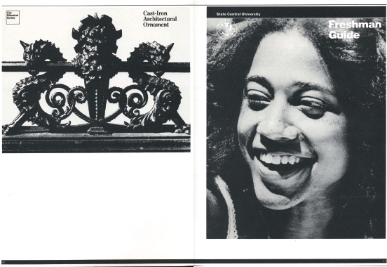
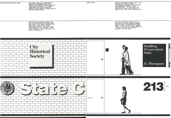
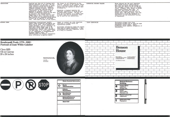
You can easily google Vignelli's work. But this set of guidelines is rare. A magnificent example of genericisation. Or, using Vignelli's word from the brochure: prototypicification. In it he imagines two charities and every piece of communication they would ever need. One proud of its past, the other looking forwards. It shows Vignelli's design thinking in its fullest form; how the grids work, those ubiquitous fat rules, the restricted typefaces, the geometry. Even the very idea of creating generic templates, a generic identity is typical of Vignelli's urge to extend his simplifying reach beyond the organisations that he could actually design himself. As much of the world as possible should look good.
