10.12.2018
BUSH HOUSE Phase 2
King's College London
MORE THINKING, DESIGN EVOLUTION, TESTING, MODIFICATION AND INSTALLATION
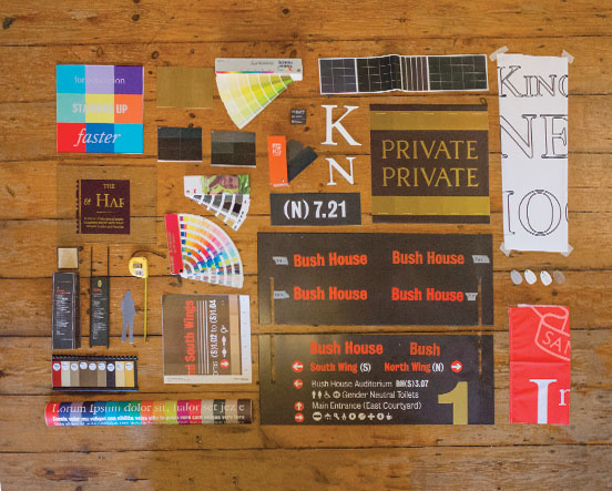
Bush House, once home to the BBC World Service, has been leased to King's College London and is now part of its central London Strand Campus. The acquisition has added more than 55,000sq m of new teaching space, spread over 42 floors, in four separate landmark buildings. Atelier was commissioned to develop a wayfinding system that would unite these disparate buildings and set a wayfinding benchmark for future King's campus developments.
THINKING
Being appointed early enabled Atelier to join the project team at a point when we could test and implement proven sign solutions. You can read about the development of the Bush House wayfinding strategy and the 'form follows function' Phase 1 prototyping process in our October 2017 blog post. What follows here is a medley of applied Phase 2 sign solutions that is underpinned by our Phase 1 work.
The sign types are all site-specific in that they are influenced by listed building restrictions, the prevailing materials and colours to be found at their locations, and the necessity to position signs so that they could be seen in crowded spaces. Indeed, the most important aspect of our brief was that King's was relying on our wayfinding system to get all students and staff to their lecture rooms on time. King's predicted that at peak changeover time, some 5,500 people would be circulating between the four buildings.
REVIVAL
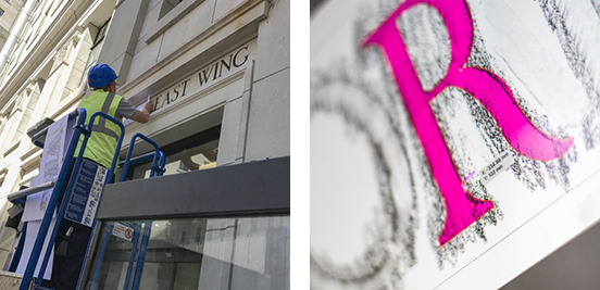

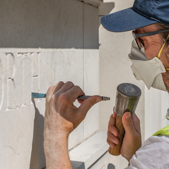
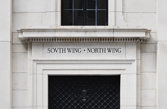
A sensitive addition to a period building; traditional hand-cut lettering.
Our wayfinding strategy reinstated the North, North East, South East and South Wing naming convention. When the Bush House development was built between 1925 and 1935, these names were carved into the stone lintels above the entrance to each building. After a persuasive planning application, followed by some traditional paper and graphite rubbings, Atelier revived the original lettering and had it cut into the heritage listed stonework above the new entrances.
DESIGN AND MODIFICATION
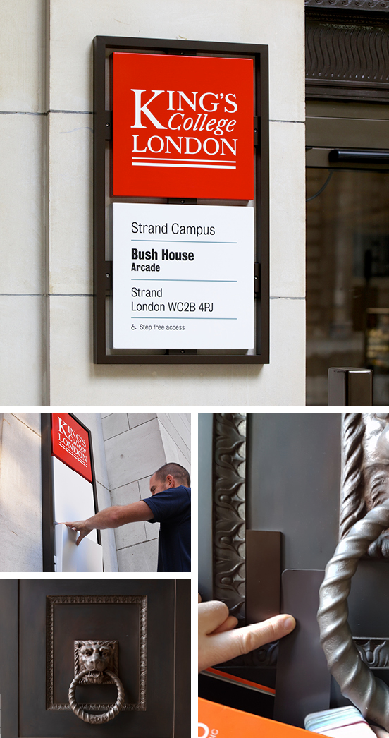
These external signs placed around the perimeter of the campus are designed to withstand vandals and can be easily updated. Future-proofed wayfinding.
Eye-level entrance signs followed the conventional King's campus style, but the outer fames were given a bronze finish to match Bush House's bronze doors and window frames. By adotping this sensitive design modification we secured planning permission, allowing all signs to be affixed to the protected Portland stone exterior.
INSTALLATION
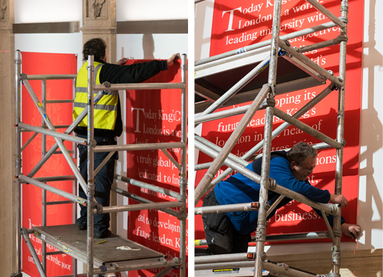
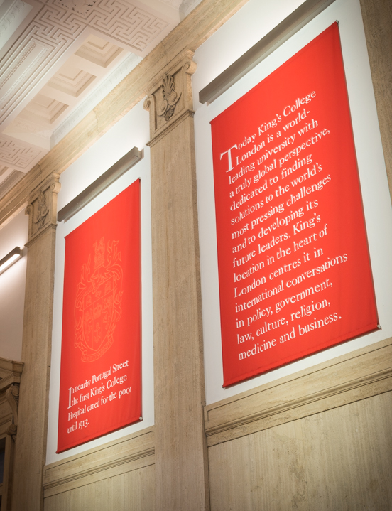
Great trouble was taken to hang these banners straight — it is just possible to see the laser level guide in the top, right photograph. Precision hanging.
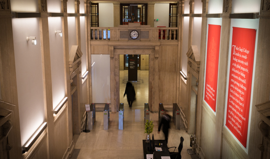
Large, red, drop-down fabric banners were installed in all building reception areas, providing maximum impact without disturbing the listed wall surfaces. Set behind the reception, they draw visitors towards the desk. As well as carrying the King's crest, the banners briefly describe King's longstanding association with the neighbourhood. It is an illuminating read for any waiting visitor.
MORE THINKING, DESIGN, MODIFICATION, TESTING
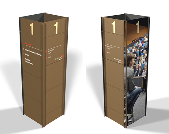


Made from an acrylic-based material usually used for kitchen worktops, these totems are robust and easy to clean. All of the graphics are updatable.
The North and South Wings share the same lobby space, so students and staff approach these main circulation cores from opposing directions. Unable to apply signs to the walls due to listed building restrictions, we developed a four-sided, free-standing totem that could command the centre space. The totem is delivered as a flat-pack, slot-together structure carrying directional information on two sides. The other two sides feature students and staff from King's Diversity & Inclusion Campaign. You can read more about the development of this totem in our October 2017 blog post.
DESIGN EVOLUTION

Special grommets were cast to hide the sign upright fixing points to the ceiling and floor. These grommets matched the ironwork of the stair balustrade. This attention to detail helps the signs to appear to be an origninal fixture.
The North East and South East Wings have their own, much smaller, lobby spaces. Again, unable to apply signs to the walls, we developed a two-sided, fixed totem that faced the lift doors. Slide-in panels held between floor-to-ceiling tie bars carry directional information on one side. The reverse also features a student or staff member from King's Diversity & Inclusion Campaign Opening Doors....
MORE THINKING, DESIGN, TESTING AND INSTALLATION

A playful mix of screened and three-dimensional lettering met the call for each department to establish its 'own space' in the building.
The entrance doors to every department are glazed and — in keeping with the wayfinding principle that you need fewer signs if you can see ahead what you are looking for — we created 'welcome walls' visible from the lobby areas. These walls were painted in strong colours, and large-scale lettering was then applied directly to the wall. Each typographic arrangement is unique to the department, and provides a convenient backdrop for PR photographs and video interviews.

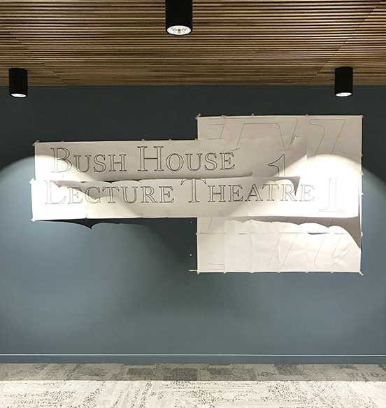
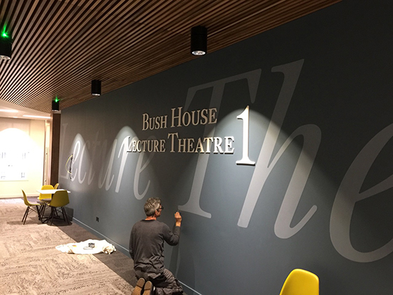
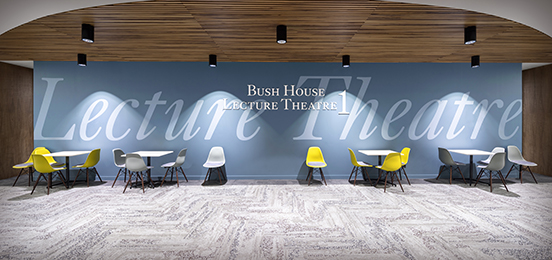

Adaptations of the Bush House welcome walls; same fonts and colours, different arrangements.
WAYFINDING BY PREFIXES AND NUMBERS
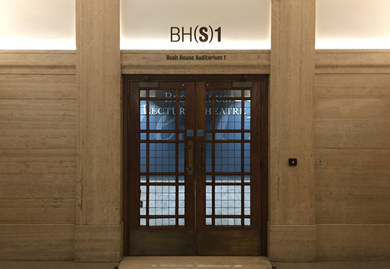
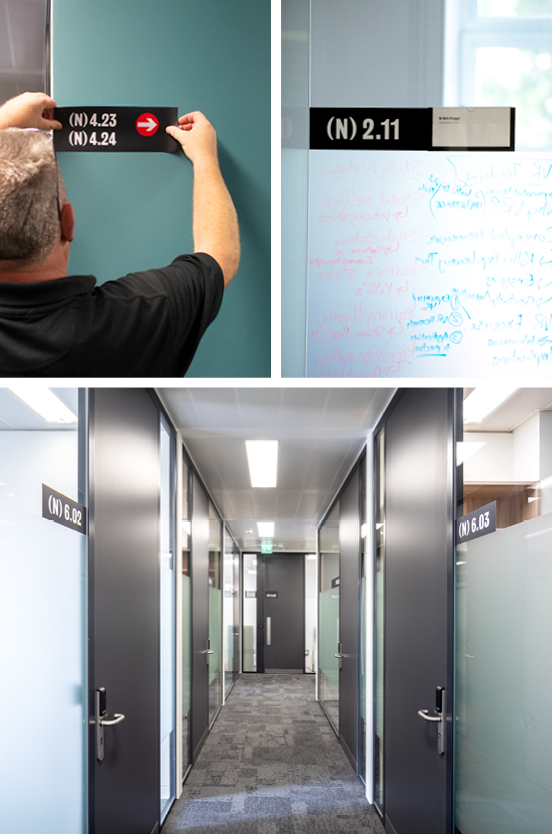
Using prefixes and numbers to guide students and staff. Result: far fewer signs required.
Integrating a Bush House room numbering convention with the university timetabling system was important if all four buildings were to function smoothly. Nowadays, students and staff check their university schedules on mobiles, so a concise, easily understood room description is essential. Atelier introduced 'N', 'NE', 'SE' and 'S' wing prefixes, followed by a level number and a room number. This short coding encouraged self-orientation. Sequential room numbering also guides — without the need for direction signs with pointing arrows. Using this system, we managed to limit the number of direction signs to just six across the whole Bush House campus.
SEEN FROM AFAR
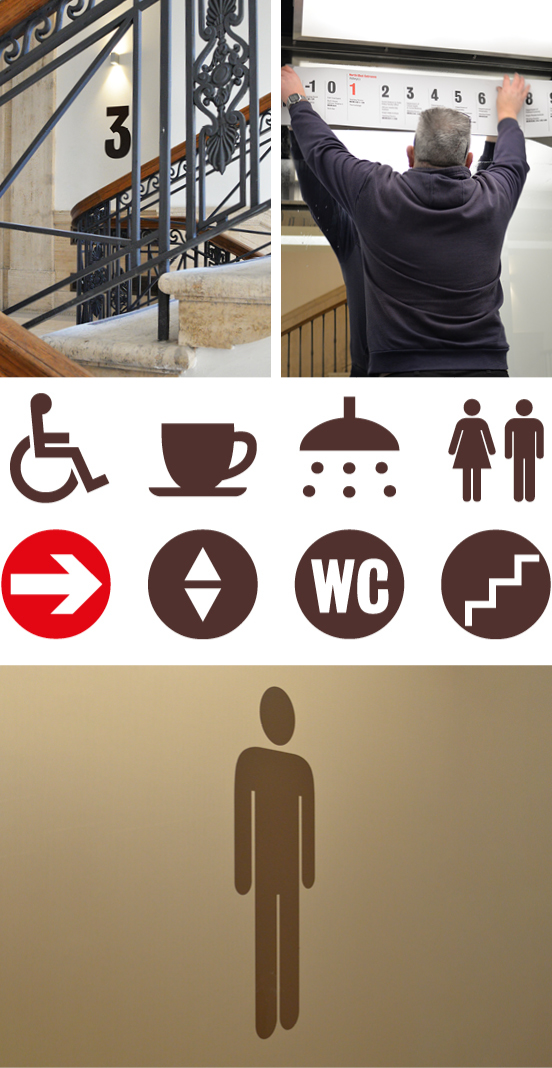
Signs that are designed be seen from afar.
Atelier spent a lot of time on site during the build phase. We checked sight-lines and ensured that signs were scaled and positioned so that they could be seen from a distance — for example, on stairwells — or overhead, such as in a crowded lift. Pictogrammes were specially drawn and were sensitively applied at large sizes, directly to walls and doors.
 Professor Evelyn Welch, Provost, King's College London
Other Bush House posts: Bush House Phase 1 , Bush House
Ian Chilvers
![]()