20.05.2021
PRICKING BALLOONS
I first wrote this just after the UK general election of December 2019. Rather a lot of water has passed under our bridge since then, things that seemed red-hot-urgent are now passing into cool history, but I think it makes many eternally relevant points about how groups gathered around a set of political ideas express their identity.
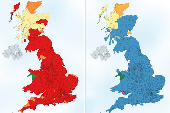 Two countries. Britains that show a very stark divide between two groups of British voters, in this infographic by Electoral Maps UK using voting intentions in 2018. On the left, the map shows voters 18-24, which would have returned 600 of 632 seats to Labour, and on the right the map shows just the votes of the over 65s, which would have yielded 575 seats to the Conservatives - these are both majorities the like of which no party has ever had, an almost complete annihilation of any other party. Who is voting with their head and who their heart?
British politics since the early 1990s has been, in my view, been mushy.
Tony Blair saved Labour from a cycle of seemingly endless defeats, and in a strange echo of today, the infiltration by the Marxist Militant Tendency. He did so by borrowing fiscal probity from the Conservatives, moving so far from what some Socialists see as Socialism, his period in office is known by socialist purists as Blatcherism.
It seems the deep origin of Blair's Blatcherism was acknowledging the electoral success of Conservatism (four elections and eighteen years on the trot) as obviously having something very popular with the British people. And learning from the electoral success of progressive Democrat Bill Clinton, who won the first of two consecutive terms with the phrase "the economy stupid"; promising fiscal prudence along with "change".
Then, after Blair, came David Cameron and George Osborne, who called Blair 'The Master' for his election-winning abilities. They saved the Conservatives from repeated defeats by borrowing social progressivism from Labour - the matching combination of financial-dryness with social-liberalness. The opposing parties resembled a Venn diagram, with most of their policy areas almost entirely overlapped. Or one of those stick insects that spends most of its life immobile, indistinguishable from a twig. Is it a twig, is it an insect, nobody knows.
Then in 2016 came the referendum on whether or not to remain in the European Union. The debates
that preceded and have followed this referendum have been the most contentious, vibrant, polarising,
emotional debate in thirty years. Politics has become urgent and meaningful again. It suddenly seems to
matter what you believe.
As a designer, I have been been especially alert to the communications - the logos and catchphrases, the
colour palettes, the typefaces and the social media memes.
SOMETHING WE ALL LOVE
Any political party aiming to be large, with a membership in the hundreds of thousands, is by definition a "coalition". It has to keep under its banner a wide range of political opinion, and portray itself as appealing to as wide a range as possible of the voting public.
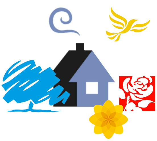 British Paradise: the ideal pastoral home.
All the major British parties, save one, have opted for symbols plucked from the British countryside.
They all speak to the great British Dream; an ivy-covered cottage with a generous garden, the
idealised home, a peaceful haven, the culmination to a successful life.
Let's imagine the scene, made with British political logos... The simple cottage with its curl of chimney smoke. Over there is a broad tree, we can sit in its shade and picnic or read a book. Is it an oak, a copper beech? We don't know, its a bit sketchy. Above in the cerulean sky is a lone bird. What is it, a kite, a dove? We don't know. In the garden are roses, vibrant glorious scarlet. And in the rockery a tiny little yellow poppy.
Just down the lane is the sleepy village John Major spoke of, "long shadows on ... cricket grounds, warm beer, dog lovers". And George Orwell, "winding roads, green fields and red pillar-boxes".
Obviously each of these political symbols have further ideas they wish to convey; the cottage is
Conservative Home, the logo of the website that calls its "the home of conservativism", the idea that
Conservatism has its foundations in John Locke's theory of individual independence resting on private
property. The tree has deep roots and protective branches, with inexorable slow organic growth and a
robust core; the ragged poppy of Plaid Cymru (oddly not the daffodil, the national flower) has
miraculous tenacity; the fact that all Socialists sport red or roses creates a visual link spanning
continents, it is a global Project, and the rose when it blooms is surely one of the most magnificent
things known to us; the Liberal bird is free to fly where it will, and seems to be the epitome of Nature, at liberty to fly anywhere and everywhere.
Whereas the British parties go to the British countryside for their emblems the American parties go to
the zoo.
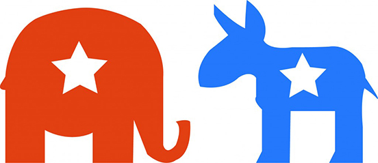 The Republican Elephant and Democratic Donkey were both derived from nineteenth century political cartoons, using the animals as metaphors of political behaviour. "Foolish animals"; the elephant dominating and scaring others, the donkey was a jackass powerfully (but somewhat blindly) kicking out.
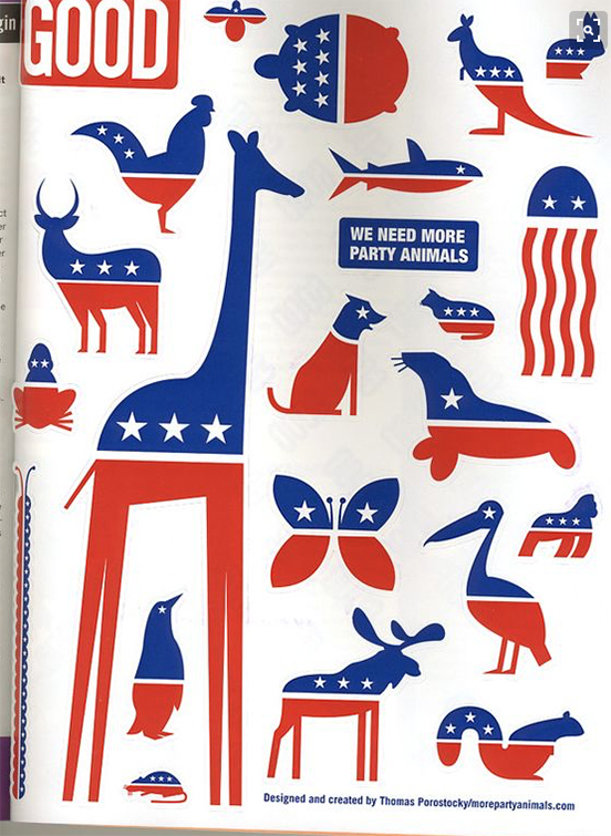 Designer Thomas Porostocky's plea for a wider political spectrum in America.
Elsewhere, designer Michael Wolff has written about his work designing British Labour's version of the
international symbol for Socialism: the rose. Wolff wanted something aesthetically gorgeous, a painting.
For designers and fans of detail, this podcast is well worth listening to, Matt Forde's interview of Peter Mandelson. In the first fifteen minutes, Mandelson describes the significance of Labour's switch from Soviet red flag to British red rose, a visual change that mirrored structural and policy changes, resulting in New Labour. He describes how he and three other Labour luminaries joined Michael Woolf to chose their favourite rose paintings at Philip Sutton's studio... and how Neil Kinnock disliked the over-long stem, which Mandelson ensured was snipped (or did he?)
The rose was first used in 1878 as a red alternative when the red flag was banned in Germany - the flag spoke of mobs in the street, barricades, the Paris Commune and the slaughter that followed, the collapse of society. The rose, more placid than the flag, yet still revolutionary red, became the symbol of the Socialist International. The American Socialists and the French Socialists use a rose in a fist, reinstating the idea of muscle and possibly some street violence.
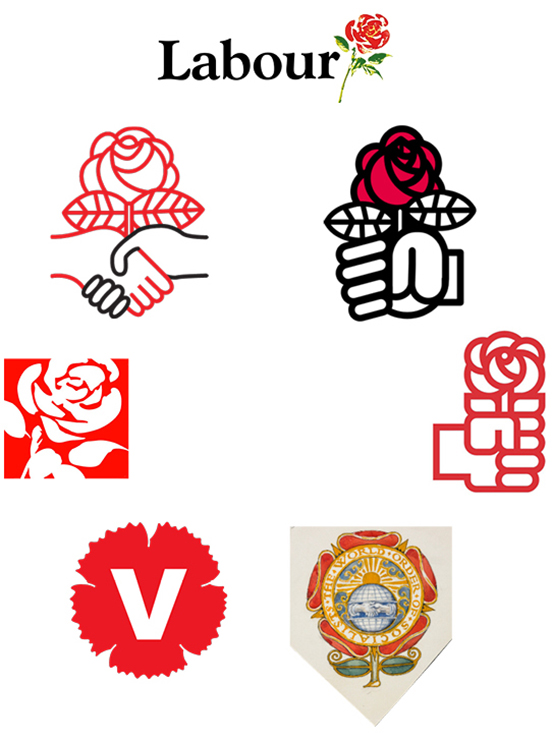 Socialism growing in fertile earth. Originally used because the red flag was made illegal in Germany, the red rose was worn in Socialist buttonholes from the 1880s onwards. In a circle from the top: British Labour by Michael Wolff, the Parti Socialiste of France, the Partido Socialista Obrero Español, the World Socialists by Walter Crane drawn in 1915, the Vänsterpertiet of Sweden, British Labour as it uses Wolff's rose today, the Democratic Socialists of America.
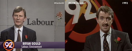 Two of the most prominent strategists of Labour in the election-winning Blair era, both sporting roses.
Wolff says that the rose he designed, in full colour, has been crudely cropped and shoved into a box, losing its brushwork and freeform shape. My guess is that the rose-in-a-box has come from social media,
the tiny "avatar" that marks posts and tweets, like a miniature hallmark on the back of a silver spoon.
When we designed the manifesto for Labour's first ever consecutive election victory, we weren't given
Wolff's rose to use, nor the rose-in-a-box, but a simple red box, with the legend "new Labour new Britain" inside it. What made it Labour was the colour. Each party has a distinct colour, and any new party has to choose one not attributed to an existing party. The association of colour to party is so potent, it is almost enough on its own, without names or logos.
A word here on the strange anomaly of red which represents Socialism all over the world except America, where red is the Republican Party, the party of conservatism. Every political American goes to the Stars and Stripes for their election branding: using the white, red and blue, the stars and bars. (Even the rebellious Notorious AOC follows the tradition, see her patriotic use of the star later in this piece.) Probably the simple needs of the media in depicting which states on the map have voted for which candidate - best communicated with colour - have caused the two primary colours to be associated with the two primary parties. Since the navy blue and the bright red come from the flag, the essence of the United States, there is no sense that this is revolutionary red of the Communards or China or the Soviet Union.
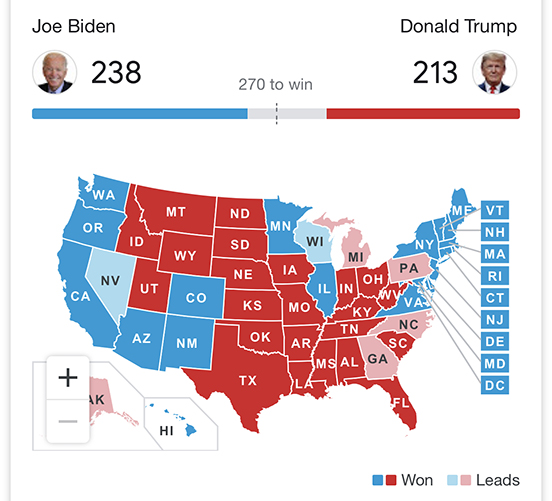 America split between patriotic blue and patriotic red - not Conservative blue and Socialist red, in America it is the red that is more conservative, and blue that is seen as more progressive, or in another unEuropean usage: liberal.
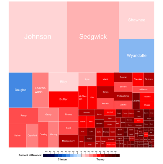
The state of Kansas and its votes for Republican and Democrat Presidential candidates in 2016. The names are names of the counties, which are arranged by size of population, rather than geographic location. Colour makes this kind of graphic viable, hence the binary red and blue for the two primary parties.
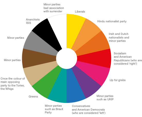 The political spectrum: all the fundamental colours are taken, any new party has an increasingly impoverished choice.
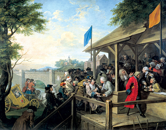 Before party logos, there was only colour. One of William Hogarth's series of paintings charting the corruption of mid-eighteenth century politics in Britain called 'Humours of an Election'. This one shows 'The Polling', with the flags of Tories (blue) and Whigs (buff), and party activists bringing various unsuitable citizens to vote; a mental patient, a corpse and a man with a hook (which means he cannot lay his hand upon a Bible to swear his identity). The Whigs later mutated into the Liberals, and their buff mutated into yellow - although with the advent of Scottish National Party yellow, the Liberal Democrats are gravitating towards orange.
NEW DIRECTIONS
Nature does what it does, despite humankind's desire to control it. Some political parties want to portray a more deliberate controlled politics: more pointed. Arrows say: we know where we want to take you.
The newly formed Brexit Party has literally a single policy, after which they will disband. Their name and emblem spell out their intentions. Designer Ben Terrett has commented that not only does the Brexit Party logo point metaphorically, but also literally and emphatically at the square on the ballot paper that you must mark.
Although Hillary Clinton was given a right-pointing arrow by designer Michael Bierut, many Americans saw her policies as left-leaning. In fact it is hard wading through the forty pages of her policy ideas, still on her website, to work out what she was offering: one commentator said the policies were well thought through but "arguably at the expense of having a big-picture orientation". Right at the top, presumably the most important?, are an end to Alzheimer's and support to those with autism. Further down is "comprehensive immigration reform" (but will it lead to more or fewer immigrants?) Hillary's arrow-letter was expanded into an entire alphabet, there is a C ready and waiting for daughter Chelsea.
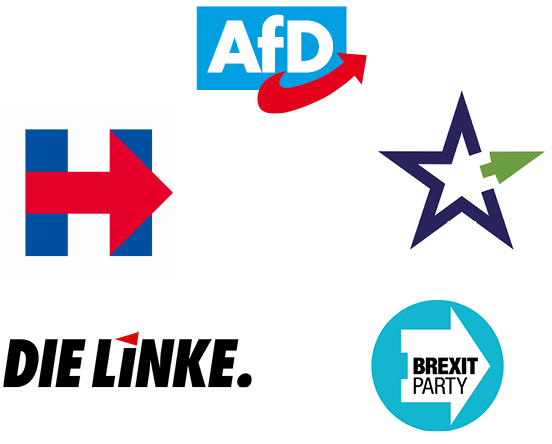
Pointing the way, which always seems to be the same way: Alternative für Deutschland has an arrow
that zooms to the right, EU star for a which-way-next project run by the Institute for International & European Affairs, the Brexit Party's emphatic put-your-tick-here marker, Nigel Farage's newest political entity uses the same emphatic pointer, Germany's Die Linke actually pointing left (although its your left, their right), Hillary Clinton's monogram pointing away from the Deplorables.
Another new British party that you would imagine might have gone the arrow route, chose a very strange emblem. The Independent Group (TIG, its members were called Tiggers) was formed from a collection of Labour and Conservative MPs, unhappy with the direction of politics. The TIG name was apparently a place-holder, and then they confusingly relaunched as Change UK, which was judged as too close to a campaigning website change.org, so they then switched to The Independent Group for Change.
What emblem would communicate their "new politics"? Two equals signs? Society neatly stratified? A redacted document? Embroidery on a naval Captain's cuff?
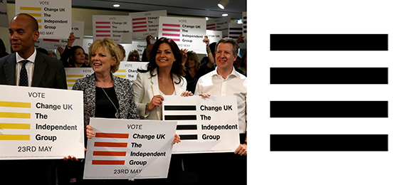 Logo for short-lived The Independent Group for Change, are these bars of a political cage they must break out of? Is it inspired by the 'hamburger menu' icon on their website?
A BIG NO
Britain's fourth biggest party by vote share is the Scottish National Party. Its logo is derived from Scotland's flag, the cross of Saint Andrew, who insisted on being crucified on a crux decussata, considering himself unworthy of dying like the Messiah. The SNP cross is twisted from a single line, like a ribbon or a pretzel, in an effort to make a thistle - another Scottish emblem from deep in its past.
The activist group Extinction Rebellion uses a somewhat similar logo, designed by a street artist known as ESP. He told a journalist he was chalking the symbol onto a wall, and "[onlookers] became curious about the meaning and one said "X marks the spot", then his friend said "No, time's running out". I turned around and was like "Yes!!". The symbol can be seen an hourglass inside a globe, a stop sign, an emphatic X for extinction. To further emphasise the cross, the group reduces its name to the initial XR.
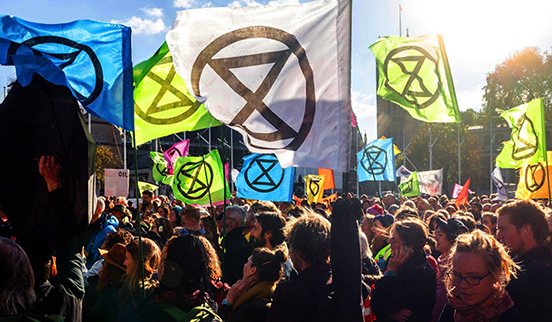
In our culture, the cross is most commonly used for negation. Road signs with a single oblique line, half the cross, mean 'you cannot do this'. A cross on your homework means it is wrong. To brandish such an emblem is to brandish a big NO.
The political party with a strong nation as its main political aim uses a motif derived from the national bedrock. Ideally an image of something before the nation got spoiled by foreign influences; the symbol of an early religion, something from the earliest aboriginal peoples, the idea is to go backwards in history to a period when the nation was pure. The emblem is meant to represent something essential in the nation, something of its founding strength, and stands for the idea that there should be continuity with that previous halcyon time.
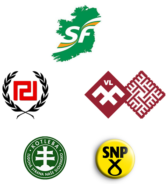 Sinn Fein uses a graphic image of the island of Ireland entire, The National Alliance of Latvia uses a motif from traditional folk costume (with that hint of National Socialism), The Scottish National Party uses a device used to execute Christians, Kotleba of Slovenia uses a Christian Orthodox cross, Golden Dawn of Greece uses a fragment of ancient Greek meandros from architectural friezes which has something of the twisting swastika.
The best example is Benito Mussolini, who in looking for an emblem for his Italian nationalist party reached back in Italy's history to ancient Rome, and found the fasces, the bundle of sticks bound together around an axe for chopping them up and making a fire, used in Roman religious rituals. You can see the fasces on carvings in Rome, a procession of robed supplicants following the head priest, the pontifex, the fasces over his shoulder. It represented a number of things Mussolini wanted to convey; people organised and bound together, the importance of ritual, the importance of following a leader, and Rome's glory. Mussolini's symbol of the fasces for his Partito Nazionale Fascista has given us the most potent word in the political lexicon.
SPELLING IT OUT
Not all political messaging can be intuited from the associations of a symbol. These messages can be nebulous, they are atmospheric, associations that work best over time. For absolute immediacy and clarity, words are best to spell the message out.
These can elevate from a secondary policy level to become the main identity. When Tony Blair was reorganising the Labour Party, the title of a draft manifesto "New Labour, New Life for Britain" seemed so effective in conveying the new blend of Socialism with Capitalism, the so-called 'third way', that it ascended to become the main brand.
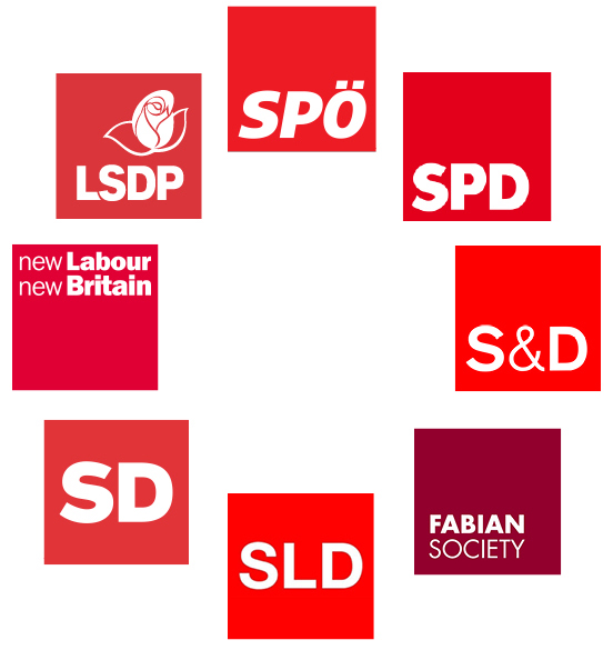 The business-like unrevolutionary red boxes of European Social Democracy in a friendship circle: SPÖ of Austria, The Sozialdemokratische Partei Deutschlands (SPD) in power either with a majority or in coalition for most of post-war German history, S&D emblem of the Progressive Alliance of Socialists & Democrats in the EU parliament, the Fabian Society following the policy of Roman general Fabius in the Punic War who simply wore down the Carthaginians with guerrilla tactics, SLD of Poland, SD of Slovenia, the logo with which British Labour under Tony Blair's leadership signalled its shift to a more German style of Socialism and three election victories, and finally with rose the LSDP of Lithuania.
Some phrases have become so effective at encapsulating a political ethos, that they long survive the election period. At any social gathering in Britain today a heated debate can be started by saying "what about that bus", everyone will know that you are referring to a bus decorated with a campaign message by 'Vote Leave', the organisation devoted to leaving the European Union.
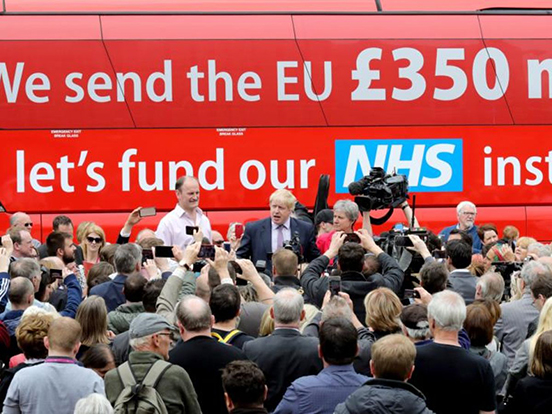
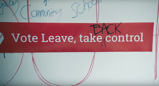
The recent BBC film 'Brexit: The Uncivil War' about Vote Leave, and Dominic Cummings, who became its director, was dramatically hinged on the single moment when Cummings wrote one word. The campaign phrase was, until Cumming's intervention, "vote leave, take control", but Cummings in the form of actor Benedict Cumberbatch is unsatisfied. He doesn't feel it is emotive enough, it doesn't epitomise what benefit leaving the EU will deliver. The turning point comes when Cummings-Cumberbatch leans over, and adds the word "back" - inventing what commentator Steve Richards called "an ingenious mantra", and politician Rachel Reeves called "the most powerful phrase of my lifetime".
 The American version must surely be President Trump's red baseball cap, emblazoned with 'Make America Great Again'. Wearing the cap in public will almost certainly mean you are beaten up. Jussie Smollett's paid attackers who were actually Nigerians wearing ath-leisure, were described by Smollett to police as white men wearing MAGA hats, and liberal America gasped and nodded at how obviously brutal such men must be. Even though they never existed. Teenager Nick Sandmann, wearing a MAGA hat he bought with his classmates on a school trip, was filmed at the Washington Monument smiling as a Native American drummed very close to his face. Largely because of the hat, Sandmann was accused of "racism" by numerous watchers of a video of Sandmann quietly standing still. The power of the hat and the four words is so great it seems to be able to summon forth demons in the minds of some who lay eyes on it, even if it is on the head of a non-extant man or on the head of a child.
News channel CNN has just paid Sandmann a reputed $275 million dollars for defamation.
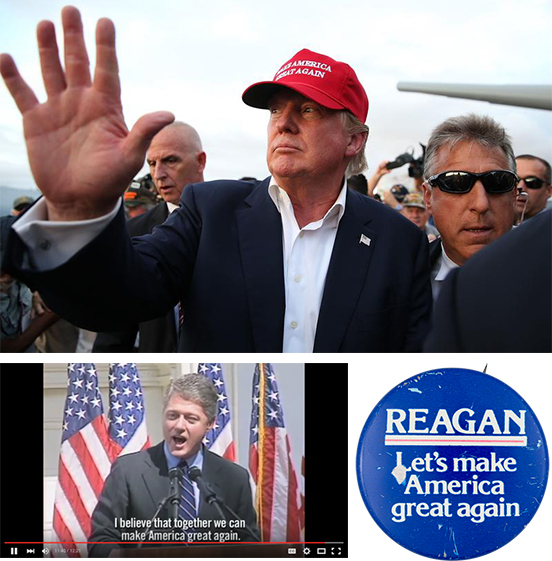
The phrase which seems to incite such rage - commentators talk of MAGA America - does not originate with President Trump. President Clinton used a very similar phrase as the culmination to his campaign speeches. It was the thrust of President Reagan's 1980 campaign. It is an American political trope, a theme, not belonging to an individual, nor a political party, nor even a political philosophy (Clinton and Reagan are far away from one another politically).
THE FACE OF
Heading into the general election of December 2019, Jo Swinson, the new leader of the Liberal Democrats decided her face was of sufficient potency that it should be used as an electoral asset. It is not uncommon for British party leaders to use their faces in ways more usual in presidential campaigns. If elected, a British Prime Minister actually has greater powers than a president, there being no congress nor assembly that controls all the actual legislative powers. A British Prime Minister with a majority is as close as it gets to being a monarch, as Maurice Glasman wrote of the recent election: "All Hail King Boris".
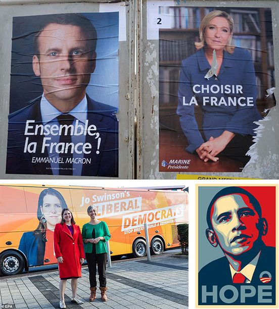 Successful and unsuccessful faces. Jo Swinson taking ownership of her party, in presidential style. Posters for the 2017 presidential election in France. Obama's now iconic 2008 campaign poster - when asked if Obama had fulfilled the hope, the poster artist Shepard Fairey replied "not at all".
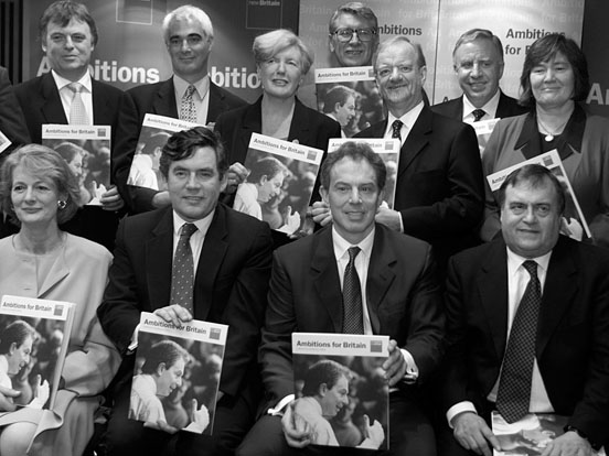 Tony Blair's unhappy-looking cabinet clutching the manifesto we designed, playing its tiny part in winning Labour's first ever consecutive term in 2001. The cover features Blair himself, in shirtsleeves, engaging with an audience. Looking back we can see how much the party's electability rested in his personal drive and oratory, an aspect we as designers took as obvious, hence the cover image.
Politicians and aspiring politicians use a variety of ways of arriving at their presentation. Often it is in-house resources, employed by the party, even designers attached to the printer who is printing the materials using previously agreed guidelines. But reaching out to less-expected professional agencies can yield both a fresh point-of-view, and a more coherently thought-through and therefore more powerful campaign. Such as previously mentioned Michael Woolf designing a magnificent rose for a renewed Labour Party, and and Michael Bierut crafting a logo-like monogram for Hillary Clinton. One notable recent example is the news-worthy Congresswoman, Alexandria Ocasio-Cortez. She employed a branding agency called Tandem, who were able to style AOC's campaign almost as you might for a company or a product launch, every visual aspect carefully considered, including rainbow backgrounds and formatting for superwide banners.
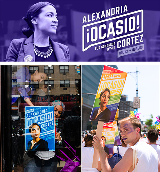 Campaign graphics can attain highly commercial polish, with every line of type carefully scaled and positioned. Here is the personal brand of the Congresswoman who calls herself Notorious AOC, posters and her Facebook banner, showing how the name-logo, Spanish-style punctuation with American star, and various other messages are elegantly detailed.
ABOVE US & INSIDE US
Perennial symbol of beneficial heavenly intervention on your side is the star. It appears in national banners - both America and China follow their own stars ... nations as varied as Cuba, Israel, Australia, Indonesia, Cape Verde, Panama and Vietnam all look to the heavens.
Very notably, the European Union has chosen stars as the banner under which it will unite Europe. The circle of stars is a common version of the saintly halo in Catholic art. Its use by the European Union hints at a link with the pan-national Catholic church, and casts the Commissioners as modern-day priests. The EU stars are the stars of the divine, they are the stars of predestination, of virtue.
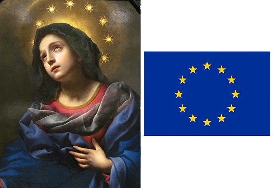 Painting of The Madonna in Glory by Carlo Dolci, and flag of the Bureaucrats in Brussels.
Almost at the opposite end, politically and virtue-wise, a blog about Italian politics started by a ribald Italian comedian, Beppe Grillo, attracted such an avid community that it spawned a political party. His blog logo, a megaphone with stars spilling from it, gave the party its name, Five Star. As a party it typifies the new politics sweeping the Western world; it is populist (the good people vs the evil elite) and uses social media (it is immediately national, instead of building slowly from local meetings).
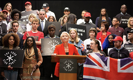
Writer Russell T Davies created a populist politician for a television drama "Years and Years" - Vivienne Rock gathers a huge movement under the banner of the Four Star Party, four asterisks representing her saying she didn't give a f*** about Palestine. The production designer selected black, see the political colour wheel above, this presages what happens in Davies' drama, which ends with death camps.
We might look outside ourselves for guidance, or we might might look inside. One or two political parties are starting to cut straight to the heart of politics, to use a symbol that represents our purest feelings. Spanish Unidas Podemos is a new left-of-centre populist party, whose name means "united we can", strangely echoing President Obama's campaign pledge. Their logo looks for all the world like a premium ice cream, wrapped in imperial purple. Another party that has eschewed any kind of emblem from political history is another Spanish party, Partido Socialista Obrero Español, who have dropped the socialist rose for a keyboard-savvy 'forward slash' and an avatar-friendly heart.
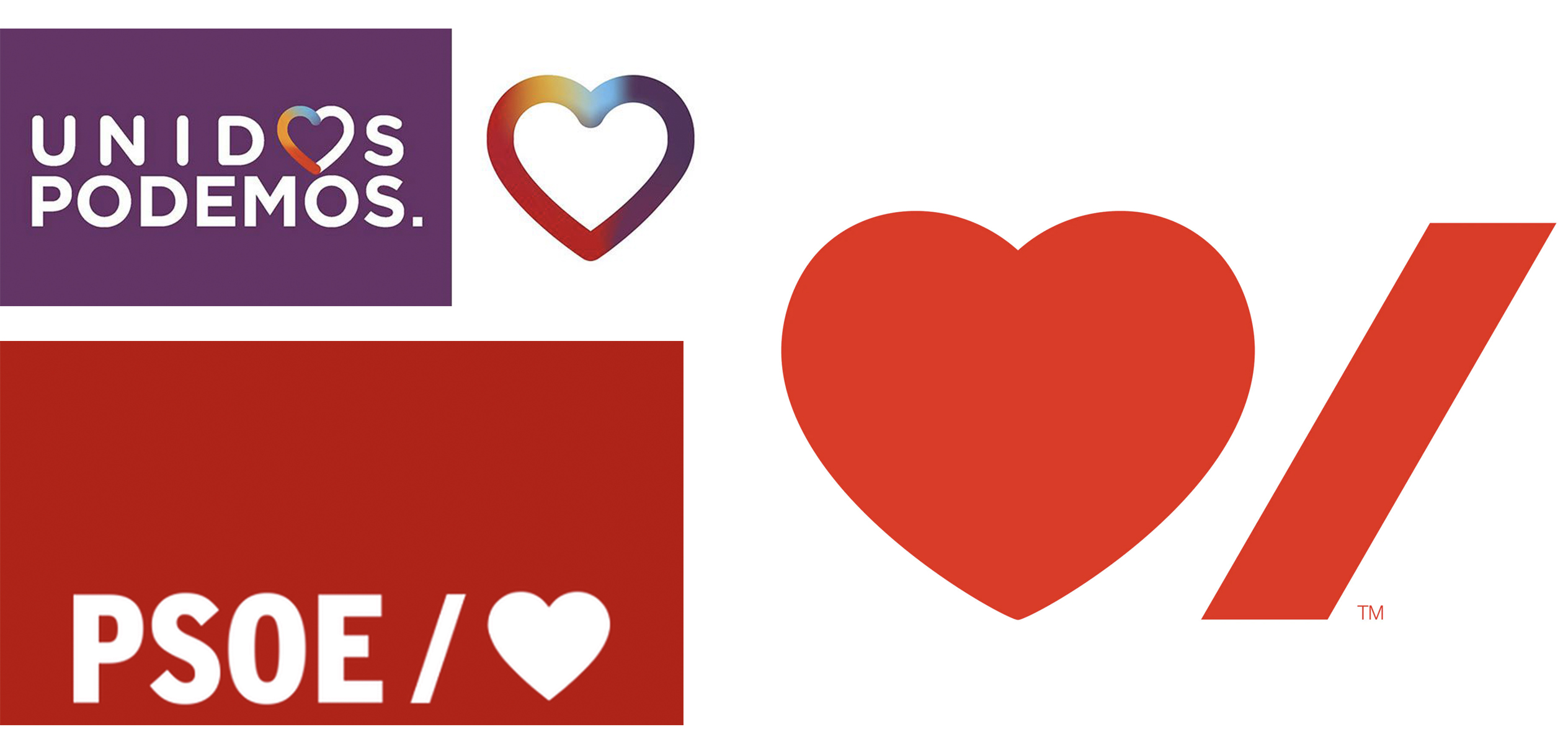 Two new Spanish populist parties on the left currently in a coalition government: Unidas Podemos and PSOE, two hearts pumping blood into Spain, rapidly renewing their branding to try and keep pace with the collapsing house of cards that is modern politics. On the right, a new-ish logo by Paula Sher for the Canadian Heart & Stroke Foundation, is Pedro Sanchez of PSOE inadvertently running the Spanish chapter?
But these left-wing parties are formulating policy pragmatically rather than programatically. PSOE and Podemos just raised taxes on high earners and raised the minimum wage for low earners. Although higher taxes and a higher minimum wage are from the socialist playbook, they are normal fiscal levers used by parties of every stripe - the Conservatives in the UK have just raised the minimum wage, Viktor Orban raised it by an enormous 17%. One aspect of what is happening today is that the real effects of the wholesale collapse of state socialism in 1989 is making itself apparent. Political philosopher John Gray says this: "[Socialists] regard themselves as the embodiment of advancing modernity. Yet the pattern they imagined in history shows no signs of emerging. Any tendency to gradual improvement has given way to kaleidoscopic flux. Rather than tending towards some rational harmony, values are plural and contending. Political monotheism - the faith that only one political system can be right for all of humankind - has given way to inescapable pluralism."
Before he achieved his first electoral victory - which to put it perspective, was more than twice the size of Boris' at a phenomenal 180 seats, a double-Boris, and was followed by two more victories - Tony Blair dramatically signalled a change in Labour's political ethos by changing the party's constitution. He altered Clause Four from the Marxist Project "to secure ... the common ownership of the means of production" (code for state nationalisation), to the more pliant "create for each of us the means to realise our true potential ... [and build a society] where we live together, freely, in a spirit of solidarity, tolerance and respect". In other words, the end-point was no longer laid down. Labour would not always be moving towards a specific, predetermined place by predetermined means. But moving in a freer way, more pluralistic, more contingent on actual conditions, more open to interpretation and reinterpretation.
Matthew Goodwin's alarming chart plotting the average vote share for social democracy, Europe-wide... Spelled out by this paper by Benedotto/Hix/Mastrorocco: "The story of the electoral performance of social democracy over the past 100 years is the story of the rise and fall of a particular electoral coalition. Social democratic parties emerged as electorally successful after 1918 to represent the industrial working class. The primary goal of these parties was to win an electoral majority and to transform capitalism. This strategy was limited by the size of this social group, and the fact that not all industrial workers supported socialism. Only after social democratic parties moderated their policies (moved closer to the median voter), could the electoral coalition be broadened. By adding another group (public sector workers) to their coalition, social democratic parties started to win between one-third and a half of all votes in many countries. This new coalition established social democrats as one of the main electoral forces in European politics between the 1950s and 1990s..." This coalition has unravelled; globalisation and technology has changed employment, industrial and public sector workers are fewer, and do not necessarily share aims, there is a far greater appetite for radicalism amongst younger than older voters.
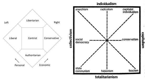 Political scientist Matthew Goodwin argues that "the model has changed", "there has been a structural change in the electorate". The old coalitions of voters that once fitted together under a party banner, are now very different to one another. Put very simply: a university undergraduate at Oxford holds very different views about the world to a forty-something mother with two jobs in Bolsover. The over-simplistic model of left-centre-right, dating from the French Assembly just before the revolution, when monarchists and clerics sat on the King's right, and the merchants and intellectuals sat to the left, might no longer be helpful in the modern world. Two other less linear models: The Nolan Chart of the 1960s, the Christie-Meltzer Diagram of 1970 (recalibrating politics is not new). Perhaps our views on different subjects are not always in the same place. To be economically communitarian, but socially conservative, fiercely patriotic, how does that person vote?
LADY BAG OR BANANA
If politics in the West seems tempestuous, the Electoral Commission of India (ECI) has to deal with thousands of parties - one recent election had over two thousand registered parties and two thousand unregistered. The truly major national and regional parties all get to keep their party branding in perpetuity, so-called "reserved symbols", and have chosen symbols that resonate with Indian culture; lions or lotus flowers, a raised hand and a plough. The ECI offers each political party, when it registers, a booklet filled with mundane images of what look like mostly household objects. The smaller and newer parties then have to use this symbol during the campaign, and, most importantly for a population which still has a high incidence of illiteracy, on the ballot paper.
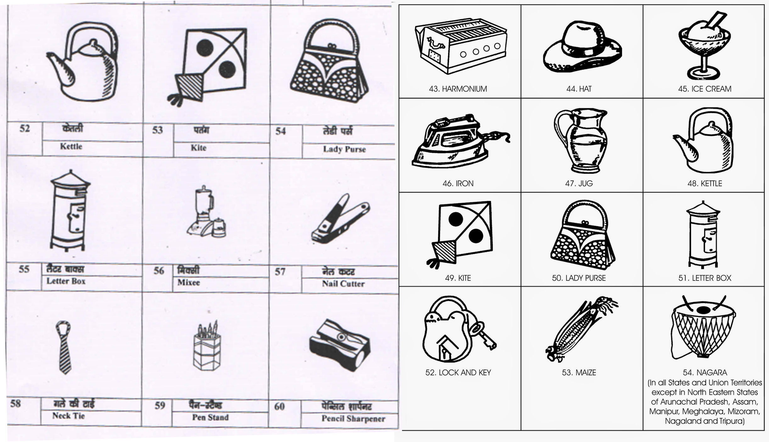 Publications by the Electoral Commission of India offering parties possible symbols - India has over two thousand parties, about sixty of which have "reserved symbols", that they can use at each election.
This randomness of symbol is the opposite of what happens in Western politics, which has been up until now all about being seen to continue in a political tradition, the longer the better. Many symbols and colours in Western politics are hundreds of years old. Choosing from a leaflet, your finger hovering over what is almost a Surrealist handbook, can go in a good and a bad direction. You might end up with a ladder, a key, a car, a ceiling fan or a lady purse, all of which you could imagine have highly positive associations in rural India. Some are harder to see as positive; an iron to burn your fingers? a kite which so easily crashes? bread which would go stale in minutes in Indian heat? a melting ice cream? an empty glass when you have almost constant thirst? The ECI is constantly updating the symbols, they have added a CCTV, a phone charger and a USB thumb drive.
Apparently there is one symbol that never gets chosen: a big fat balloon. Even the most newly-minted political instincts are alert to its negative associations. Bang!
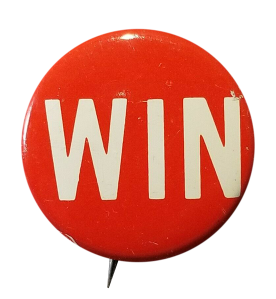 Come on you Reds. The most stripped-down political hope.