20.07.2018
DESIGNER PROFILE
Interview by Andrew Neish.
Edited extracts from Philatelic Bulletin, Volume 55, July 2018.
Republished by kind permission of the Royal Mail Group Ltd and KMS Publishing.
Stamp images © Royal Mail Group Ltd.
WHERE IT ALL BEGAN...
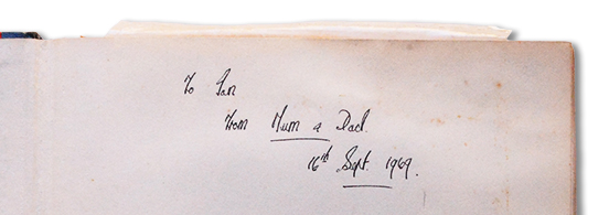
'To Ian, From Mum & Dad, 16th Sept. 1969.' This simple message of affection, in a stamp album given to Ian Chilvers as an eighth birthday present, instigated his life-long love of stamps, and indeed design, as expressed in miniature. That this leading stamp designer still regards the album with great fondness at the age of 56 is testament to the power of philately to inspire. And his love for his parents.
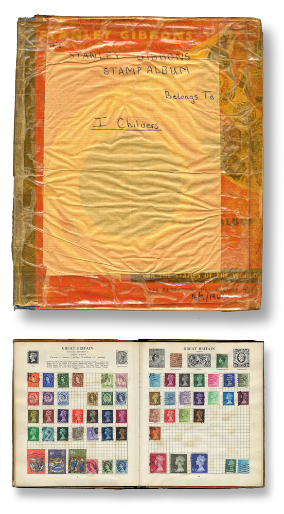
"This was my eighth birthday, and it was the time of Blue Peter, when you were always encouraged to cover your precious books," laughs Ian.
Opening the album today in his airy south London design studio, he recalls that first contact with stamps, and reveals how profoundly they have informed his life.
"I remember my father showing me how to apply a hinge to the back of each stamp and how to line everything up on the grid in order, so that the stamps are neatly distributed across the page. I think this taught me to organise, and that's just what graphic design is for me; it's that discipline of having a logic to what you place on a page, and where."
 "My favourite stamps in this album were David Gentleman designs; Churchill, Battle of Britain, Concorde and so on — even though I didn't know they were Gentleman's at the time. All of these graphic images were lodged in my head from then on, and even though I didn't consciously know what I was doing, at art college I was following Gentleman's simple brilliance, distilling a thought down onto a tiny bit of paper — and I guess I've been trying to do that ever since."
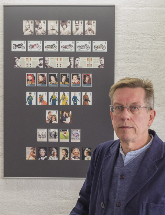
On the studio wall is a poster displaying some of Atelier's stamps for the Royal Mail. Glancing at the display, Ian talks of logic, of order in design, yet his stamps do not suffer from a methodical, restrictive approach that becomes repetitive. Far from it: they are visually stunning.
Ian acknowledges that stamp issues are a mix of art and editorial, that they are narratives of our nation, of British life and history. And to tell a great story you need to know your subject.
As Ian puts it, "I do believe in a sort of 'method design'. By which I mean: steep yourself in the subject. Then when I present ideas for a stamp issue to the Royal Mail, I really know my stuff and can offer a real solution, not an airy-fairy 'I-think-this-would-look-nice' approach. That just doesn't work."
LEAVING NOTHING TO CHANCE
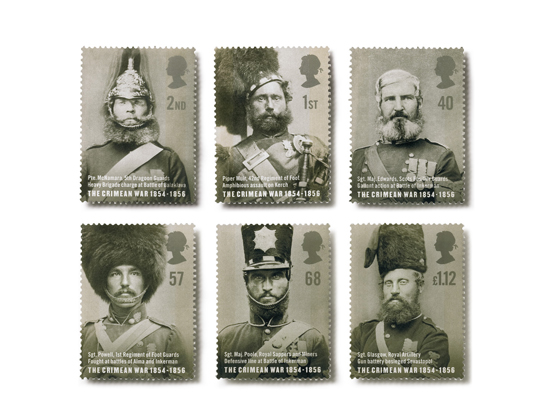
What evidently does work is Ian's insistence on stepping away from his computer before starting to design. Take the 2004 Crimean War issue — the extraordinary result of spending time deep in the archives of the National Army Museum in Chelsea. There he pulled off the shelves a rare album, nearly 150 years old, containing contemporary photos of rank-and-file veterans of the 1854-56 conflict; the worn yet proud faces of men who had seen battle, their staring eyes testifying to the horrors of war.
"I was so struck by these powerful images. I delved deeper and discovered that Queen Victoria herself had commissioned these photographs. She wanted a record of the men who had actually fought the enemy, rather than simply of the victorious and well decorated generals. I thought this was a fantastically egalitarian stance and I realised this was the right way to remember the war."
As thorough as ever, Ian left nothing to chance. "I then commissioned a military genealogist to search army records. We had to run checks on each soldier. It was essential to ensure that nobody had a criminal past or a blemished military record. You cannot feature an unsavoury character on a stamp next to the Queen's head."
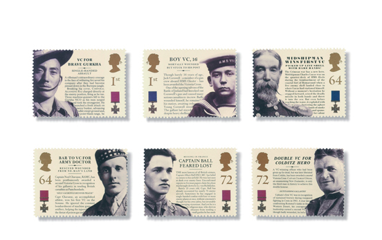 This diligent level of research lies at the heart of Ian's work. Take the Victoria Cross stamps; simply featuring VC recipients would not really tell the whole story — as servicemen in uniform can look, well, rather uniform. Ian wanted to present the various acts of gallantry and heroism behind each medal, and show them on the stamps. "I found these stories more enthralling than the portrait photographs, so I started investigating contemporary newspaper reports of the men's actions."
And with what results. With old-fashioned newspaper fonts and a writing tone reflecting the era in which the men fought, Ian's designs offer a moving testament to courage in conflict.
ROYAL DEADLINE
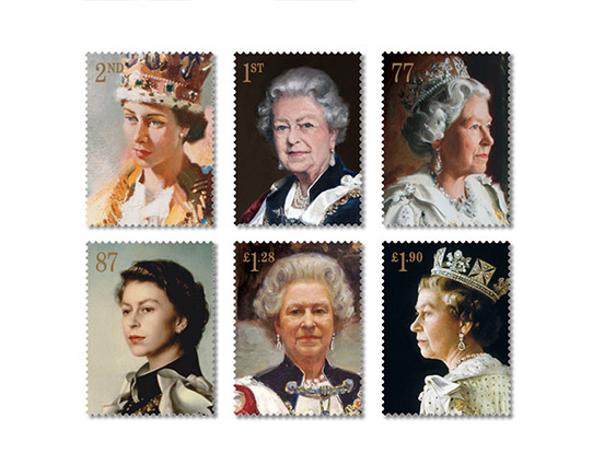
Six Decades in Royal Portraits is another stamp set that is underpinned by diligent research. Ian's first instinct was to present the Queen in a radical way, to position the monarchy in the modern word. Initial investigations yielded portraits by Andy Warhol and Lucian Freud, and a controversial 1997 Royal Society for the Arts commission by Justin Mortimer, showing Her Majesty's head adrift from her body.
These pictures were put on a long list of around 100 images assembled by Ian and shared with the Royal Mail team. "Prints of all these paintings were laid out on a giant table and as we moved them around, it became clear that a radical issue was not going to work — three radical portraits just weren't enough for a set," Ian recalls.
"Perhaps following that childhood stamp album approach and my fanaticism for setting things in order, I thought about showing a progression of painting styles through those six decades. But that would be mixing visual styles, which would make the issue look disjointed. So we progressed to looking at images that were calm and regal; how we thought the Queen would like to be perceived. It's like panning for gold — you sift and sift and sift — and searching for the best becomes the route that you develop."
With a short list of around ten portraits, Ian then investigated the painters and checked how each work was appraised by the fine art world. "After all, these are royal paintings, so you have to check their standing. For the Queen, we had to select artists and portraits that commanded respect."
There were to be five stamps featuring portraits commissioned during the Queen's reign, with a sixth stamp featuring an entirely new work specially commissioned by the Royal Mail. This new portrait would appear on the 1st class stamp, the most important stamp in any set. The next challenge was to find the right artist for the commission.
"We had a set of five portraits that sat well together visually. I then had to find an artist whose work would complement them. But there was an added dimension: the artist would need an audience with the Queen, so I had to find someone who would have the nerve to do that, who wouldn't be fazed by painting in the presence of Her Majesty. So this part of the process wasn't only about design — it was about assessing an artist's proven experience and considering who would paint a portrait that would complement the five we'd already selected for the set."
The commission ultimately went to Nicky Philipps, already known for painting Princes William and Harry. Time was of the essence as the set had an issue date.
"We had five stamps ready, with artists' permissions acquired, colour-balancing and artwork completed. It was quite unnerving but Nicky delivered in time," Ian recalls. "All we needed at that moment for the final stamp was a head and shoulders profile, so Nicky focused on that first. The rest of her canvas was blank, to which she later added robes and corgis."
ACKNOWLEDGING A HERO
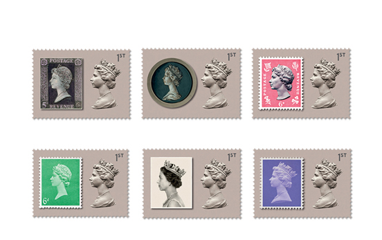
As a stamp designer, being commissioned to develop the Machin 50th Anniversary issue was quite an accolade. Arnold Machin is as much a hero for Ian as David Gentleman is. "I do admire the fact that he was first and foremost an artist and a sculptor who made drawings, who crafted a bas-relief, who created that famous cast of the Queen's head. He succeeded in producing a portrait that was regal, understatedly elegant, and in no way 'showy'. He went through an enormously long process to produce what we all now recognise as a national icon.
"My aim for this stamp issue was to show an artist at work, to present that evolving process and progress. And it was important to get the issue right — first, because Machin is so important. And second, because philatelists really know their stuff. For many the Machin portrait is the 'Holy Grail', and you cannot slight something so iconic and so beloved."
Nerve-racking it might have been to design a set that would be scrutinised in fine detail by the 'Machin mafia', but for Ian stamp design is always a privilege. "One of the great pleasures of working for the Royal Mail is that it has taken me full circle," he says. "That album and those Gentleman stamps influenced me at the age of eight — and here I am designing stamps. I've got a lot to thank the Royal Mail for."
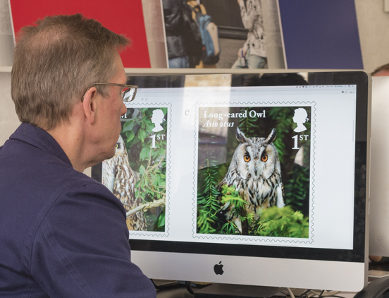
See all the stamps designed by Atelier for the Royal Mail.