CHECKERED HISTORY
Tate
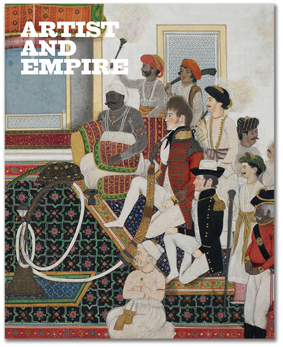
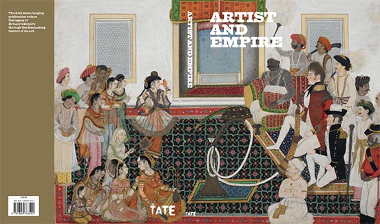
Tate Britain mounted a major exhibition of art associated with the British Empire from the 16th century to the present day.
From the Tate's own literature: "The wars, conquest and slavery of empire are difficult and painful to address - but the legacy of empire is everywhere and affects us all. Artist and Empire brings together extraordinary and unexpected works to explore how artists from Britain and around the world have responded to the dramas, tragedies and experiences of the Empire.
"Featuring a vast array of objects from collections across Britain, including maps, flags, paintings, photographs, sculptures and artefacts, the exhibition examines how empire has shaped art past and present. Contemporary works within the exhibition suggest that the ramifications of the Empire are far from over.
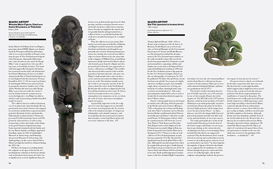
"Historic works by artists such as Joshua Reynolds and George Stubbs are shown with objects including Indian miniatures and Maori artefacts, as well as contemporary works. Through this variety of artworks from a complex mix of traditions, locations and cultures the fragmented history of the Empire can be told."
Some reactions: Jonathan Jones in the Guardian: "It is the genius of Tate Britain's exhibition Artist and Empire to resurrect the British Empire as a physical reality you can see and feel, and almost smell and hear. Is that a Highland marching band; are those the cries of rebels approaching the compound? The ghosts of empire become flesh and blood in this awe-inspiring, exciting and provocative exhibition."
Matthew Collings in The Standard: "It's a genuinely interesting and absorbing show ... The strength of Artist and Empire is its ambiguity. It isn't only about victimhood and suffering but unquestioned glory obviously isn't the theme either."
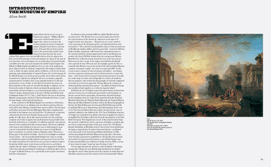
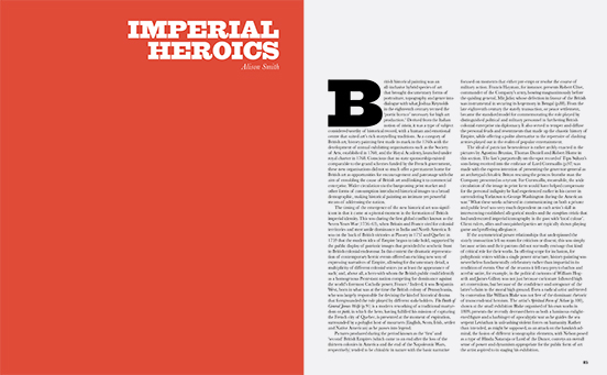
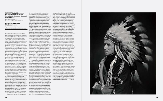
Our design approach to the catalogue was as with many projects that bring the past into a modern context: evoke the past, but arrange it in an overtly modern manner.
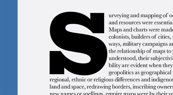
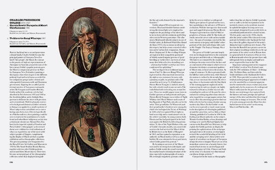
We sought out one of the wonderfully eccentric early Victorian typefaces, which grew ever madder in an attempt to attract readers on crowded walls of posters and shops crammed with packages. We settled on a so-called Egyptian font, by Vincent Figgins, called Giza. Although there does not seem to be any genuine design or physical reason for the name, the advent of heavy 'slab serif' typefaces coincided with Napoeon's invasion of Egypt in 1809 and Britain's defence of sea access to her colonial territories. So within the typeface choice we managed to encapsulate something of the cultural appropriation so common in an empire.
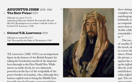
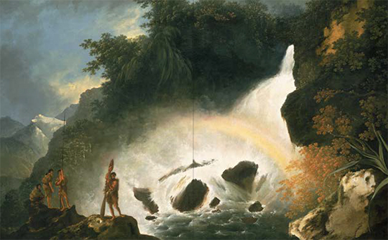
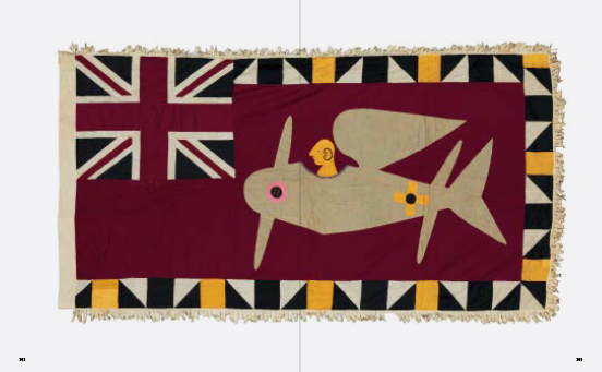
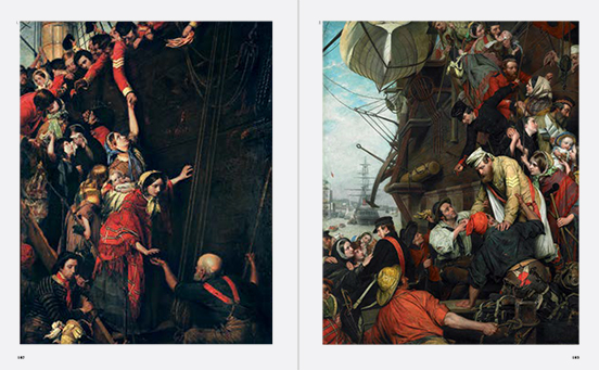
Other than giving the characterful font full reign, the design task was to emphasise the diversity of the artworks, cutting around sculptures and ovals, giving plenty of page width to landscape and history paintings, so that the viewer is constantly met with fresh forms.

Selected spreads
Detail
