Graphic design practice is today largely desk-bound. There is limited direct interaction between the designer and client beyond a slew of emails and perhaps a Zoom meeting or two. Concepts are exchanged as PDFs for review. These on-screen representations are visually perfect, but often detached from any real-life setting and offered with little foresight as to how the digital concept may be realised. On the production side, it is rare for a designer to liaise with the manufacturer whose task is to convert final artwork into reality.
The transition to designing with software — marketed as unlocking a seemingly limitless range of creative options — has ironically fostered insular creatives. Richard Sennett's 2008 book The Craftsman foresaw this drift:
Computer-assisted design might serve as an emblem of a large challenge faced by modern society: how to think like craftsmen in making good use of technology. 'Embodied knowledge' is a currently fashionable phrase in the social sciences, but 'thinking like a craftsman' is more than a state of mind; it has a sharp social edge.
Perhaps swimming against the flow, Atelier take every opportunity to visit the manufacturers that we work with. Meeting the recipients of our artwork, understanding the work that they do to make it, and discovering other production possibilities enriches our next design project and means that we can talk convincingly to clients about any new creative challenge. The 'social edge' that Sennett mentions is also a factor in the successful completion of any project. When you know the people you work with, there is a communal interest in taking pride in what you do at every stage.
A recent fact-finding visit to an iron foundry bolstered our relationship with the craftsmen who take on our projects; nurturing an enthusiasm for new collaborations, particularly projects that may link modern technology with this long-established craft.
This blog post is a record of our findings.
TRANSMUTATION
Casting iron is the transmutation of matter; turning the alignment of atoms into new structural arrangements. Metallurgists call the conversion 'graphitisation'. I just think it fascinating, particularly when natural geometry is involved.
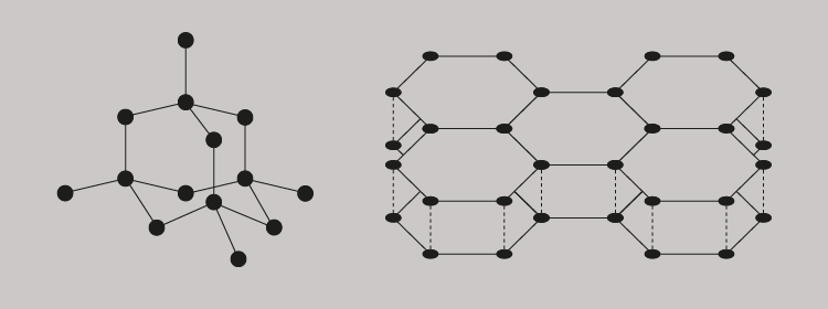
Let us start with carbon. The simplest and most common atomic arrangement for pure carbon is a diamond, where its crystalline tetrahedral structure is formed by one carbon atom bonding with only three others (above, left). Another form of carbon is graphite and whilst it is also crystalline, its hexagonal structure is a consequence of atoms bonding across a plane and in layers (above, right).
As we all know, a diamond is pure carbon and the toughest naturally occurring substance. It is a crystalline solid. Graphite, on the other hand, does not have a precise atomic shape. It is an amorphous solid. With prolonged heating of the amorphous carbon graphite, it is possible to rearrange the atomic structures to create new crystalline shapes using moulds. This graphitisation requires temperatures of up to 3,000ºC, followed by natural cooling. Both heating and cooling needs to be carefully controlled.
PATTERNS AND MOULDS
Our project was a series of wall-mounted donor plaques and the challenge was to push the known limits of the foundry's casting process — in particular, the legibility of letterforms inset into cast iron. To begin with, the two-dimensional designs existed only as digital PDFs. These had to be converted into a three-dimensional wire frame. Getting the CAD data correct at this stage was critical, as any error at this point will carry through to the final cast.
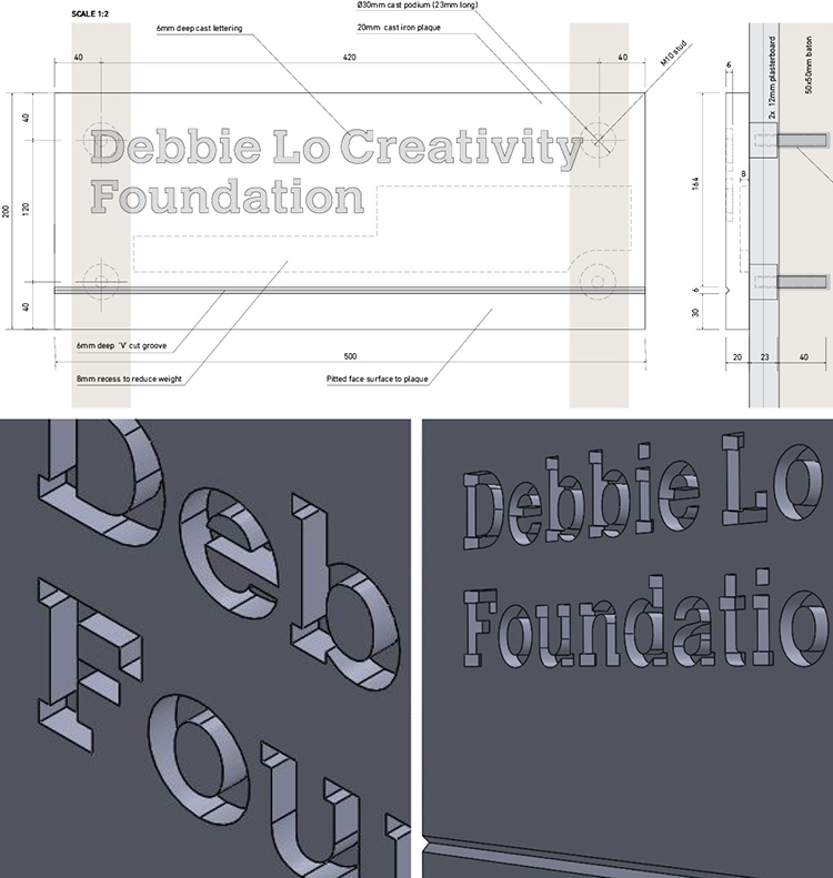
Accurately defining the dimensions of the finished plaque was obviously the main priority, but preparing a CAD pattern also includes thinking about the space surrounding the form; how the sand will be packed and how the sand moulds will be separated. A parting line needs to be established where the top part of the mould (the cope) is separated from the lower part (the drag). Internally, much thought is given to how the molten iron will flow through the mould. It will enter via a vertical hole in the cope (called a down-peg), flow through a channel (called a runner) and finally be distributed via off-shoots (called in-gates). A riser is provided as an escape for internal gas and steam generated during the pour. Lastly, an allowance has to be made for about 1% contraction during solidification and cooling.
Patterns were originally made in wood and given the accuracy involved, these often unseen, once used, and then discarded forms were works of beauty, made by highly skilled carpenters. It is not surprising that old wooden engineering patterns are now being traded by collectors for thousands of pounds. Long after cast-iron steam engines have disappeared, their wooden doppelgängers are prized fragments of long-forgotten engineering brilliance.
Our Hidden River Effra plaques were cut in pattern board (a very dense variant of MDF) using a computer-controlled router, so wood of a sort is still sometimes used. Nevertheless, pattern-making accuracy remains essential and the drawing-board blueprints and carpentry skills of old have been replaced by digital technology; 3D printing is now the future for pattern-making. Powdered polymers are laid down and laser-fused layer by layer, all guided directly from the CAD data. What took many days to fashion in wood now takes a fraction of the time to construct in thermoplastic.
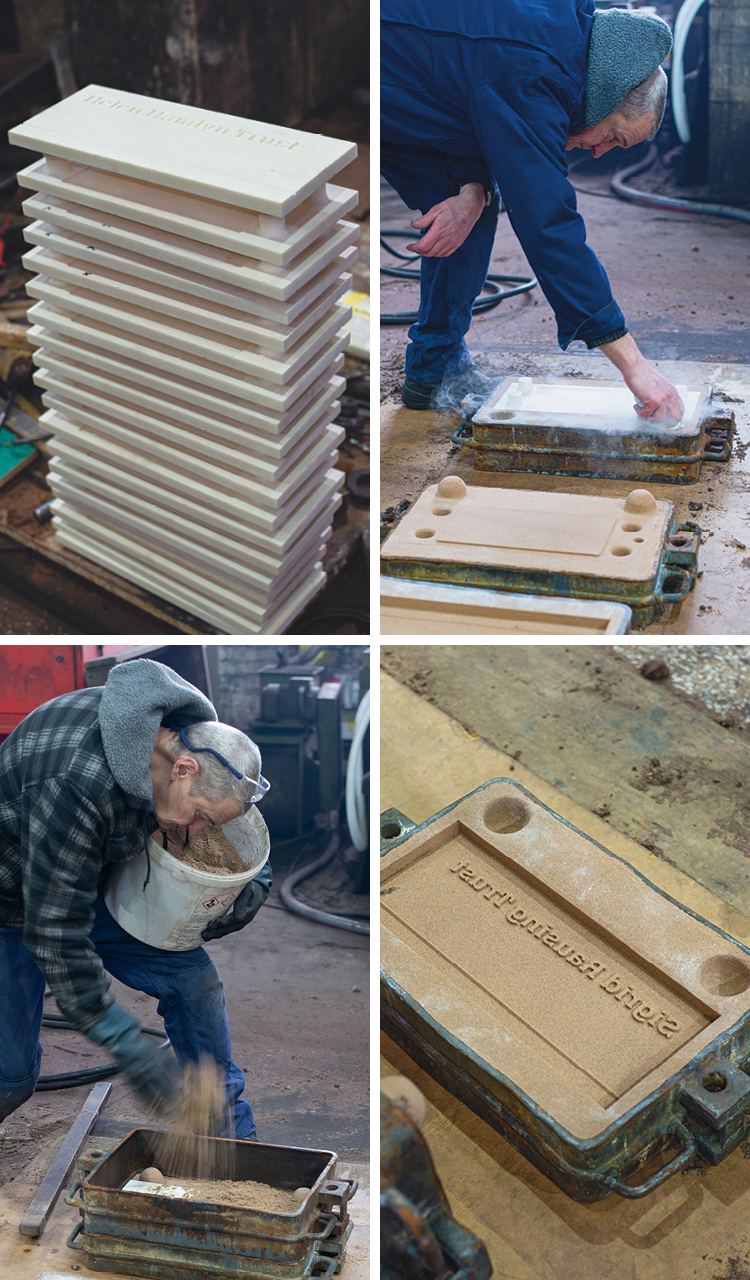
Our patterns were delivered to the foundry where Simon the moulder liberally dusted talcum powder over each of them before carefully positioning them one by one in individual mould boxes. Sand is then rammed to an even compression around the pattern. Mesmerising to watch, he deftly worked his way through the batch, preparing the cope and drag moulds for each plaque. I watched anxiously as the mould boxes were nonchalantly shifted around. Unbelievably, despite the mould boxes lacking a base, not a grain of sand appeared to stray — such was Simon's command of his medium.
While I watched Simon at his craft, Dave the foundry's foreman provided me with a brief lesson on sand, shouting over the noise of the furnace and machinery.
Mould-making sand must have sufficient plasticity to wrap around complex forms, then maintain its shape when coming into sudden contact with molten iron — and then the sand needs to collapse when the cooling iron contracts. The grain size of the sand is also a factor in making it permeable for escaping gases and moisture.
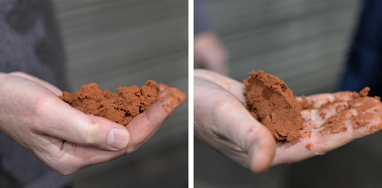
There are many types of sand used for mould-making. Dave showed me a lovely burnt orange sand, confusingly named 'green' sand. It is fine, soft and most important, it is damp; comprising 2 to 5% water to 10% clay and the balance silica sand. When held in the hand, then squeezed and released, the sand maintained its clenched form. However, our moulds were made with a different sand mix, with clay and water replaced by a resin and a catalyst that helps the sand maintain its shape after the pattern has been removed from the mould boxes. This sand mix is cleverly recycled within the foundry.
Casting iron from sand moulds has been evolving for over a millennium. Foundries around the world have used different types of naturally occurring sand, all with different qualities. It slowly dawned on me that what I was watching was the culmination of many generations working with sand — and a meticulous study of this fine-grained composition of stone and minerals. Making a perfect sandcastle on the beach will never be quite the same again.
ELEMENTS
The foundry was producing grey iron for our project. It is an alloy of iron, carbon and silicon.
The core element is pig iron, so named as it comes in ingots that are formed when the molten iron ore is poured into a sand mould fashioned with a central runner and individual offshoot runners that lead to uniform pools. This arrangement is likened to a sow nursing piglets, hence the name.
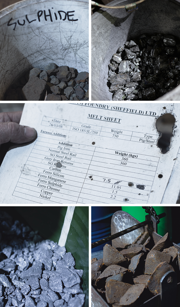
The foundry's furnace man Ian guided me closely through the smelting process. I was introduced to buckets of ore. The usual quota of pig iron (above, right), was halved for our melt mix and the balance made up with recycled steel railway tracks. Steel has a lower carbon content so the deficit was replenished by adding more carbon. Ferro silicon (top, right), is added to help the carbon transition to graphite, ferro sulphide (top, left), is added to strengthen the graphite microstructure and make the iron harder, and ferro manganese (above, left), is added to neutralise the adverse effect of sulphide, which makes the melt viscous.
The quantity of each element added to the melt mix must be precise to ensure that the alloys melt and solidify at the same temperature — known as the eutectic point. This is the lowest possible temperature at which the different elements nucleate in thermal equilibrium, forming new structural solids.
FURNACE
The furnace capacity, the ladle size and the volume of casting needs to be matched for a consistent melt, and at this foundry the eutectic point lies at 1,154ºC. Ian had many tasks to attend to while the furnace reached this incomprehensible temperature. When I asked him how he knew when the melt was ready, he replied that he could tell by eye. But for reassurance, he showed me the heat probe and predicted the current temperature. Sure enough, the probe was dipped into the melt and the reading matched his judgement.
My father was an electromagnetic engineer and so I have a rudimentary understanding of the principles of electrical charges in coils. As Ian guided me around the control panel of his induction furnace, he seemed impressed that a graphic designer understood heat transfer. Electricity passes at high frequency (up to 10,000 cycles per second) through a coil arranged around the outside of the crucible. Conductive materials such as iron have their own inherent magnetic fields and the coils around the crucible produces a contrary field. It is this motion-resistance that produces heat.
I found this a particularly ingenious use of electromagnetism. Heat is not transferred from the crucible wall to the ore, as with a conventional pot over a fire. Instead, heat is produced within the ore itself. Furthermore, when the eutectic point is reached and the melt is fully fluid, the magnetic fields generate a stirring action that can be controlled to determine the quality of the alloy. The stir is governed by the power and frequency applied, the size and shape of the furnace, the shape of the coil and the density of the melt.
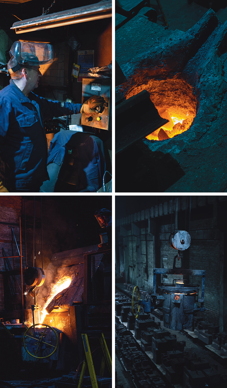
Ian kept a constant eye on his furnace — like a top chef slicing onions while also watching a simmering pot. He abruptly broke off to attend to his melt. During the smelting process, oxides rise and form a viscous layer on top of the melt; this is called slag and must be removed. Ian skilfully scooped up these impurities from the glowing surface. "Look now," he shouted as he pointed to the mouth of the furnace, "the colour of the melt has changed." It dawned on me that I'd just witnessed a real 'slagging off'.
As the melt gradually reaches the point when it is ready to be poured from the furnace (called tapping), the ladle is pre-heated to match the melt temperature. It isn't really a ladle as we would know it, rather a giant bucket suspended on chains that are attached to an overhead crane. The ladle glowed from within as it glided towards the furnace. From a safe distance I watched the furnace pivot on its yokes and decant molten iron into the ladle.
This furnace produces 750kg of molten iron. Two shifts produce 1,500kg a day. Simon is constantly busy, having to prepare just enough moulds to stay ahead of the furnace.
CASTING
The pouring temperature for cast iron is between 1,260ºC and 1,426ºC. It takes three foundry men to manoeuvre the ladle; the foreman Dave takes control of the overhead crane, Ian the furnace man handles the ladle turning-wheel, and Simon attends to the risers in his sand moulds. Again watching from a safe distance, I became engrossed in the synchronisation of the pouring team who knew exactly what to do without speaking. Their entire focus was on aiming the pour, pouring the right amount, stopping the pour and moving on to the next mould. Concentration was absolute — always watching the pour and where their colleagues stood.
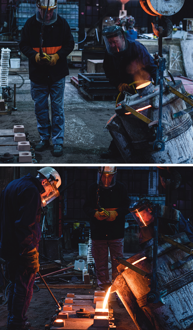
Most impressive was Ian's parabola management. Dave guided the ladle so that it was at the correct height and distance from the mould and aligned with the pouring point, now easier to see with a sand funnel (called a pouring bush) placed over the down-peg opening. Ian spun the pouring wheel to pivot the ladle forward on its trunnions. A parabola of molten iron dived from the lip of the ladle, straight into the pouring bush. It is an impressive feat to observe, given that the mouth of the pouring bush measures no more than 10cm in diameter. Ian holds the ladle steady so the pour flows without variation, and awaits a signal from Simon as the riser on the other side of the mould begins to fill. When molten iron reaches the same level in the pouring bush and riser, the parabola needs an instant cut-off; Ian spins the pouring wheel in reverse and the ladle pivots backwards to an upright position. There are no dribbles from the ladle lip and just a few spit-splashes around the mouth of the pouring bush.
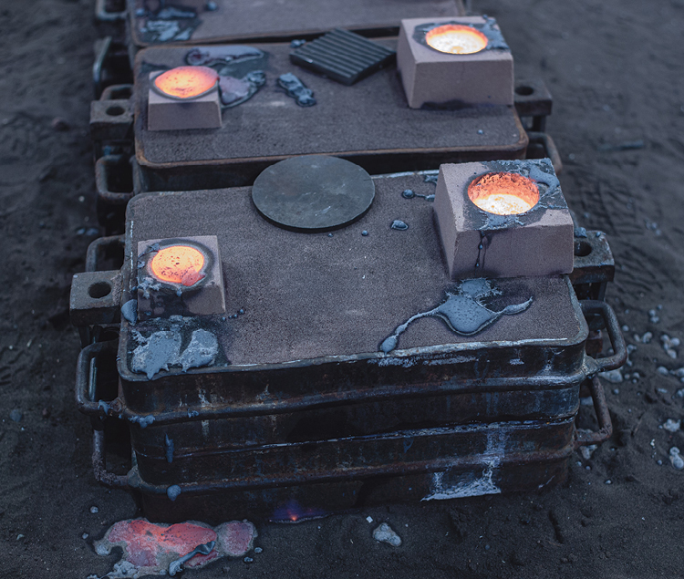
The pouring team passes down the line of moulds, repeating the same precision moves until the ladle is almost empty and it is returned to the furnace end of the foundry. The ladle residue is emptied into pig moulds that will be left to cool overnight before being added back into another melt mix.
The moulds are all left with glowing pouring bushes and risers. Dave walks the line of moulds, checking his inventory. Simon returns to work on the next batch of sand casts. Ian returns to nursing his furnace.
KNOCKING OUT
Eighteen hours later, I returned to see the castings emerge from the moulds. Judging the right time to break the moulds is another acquired skill. If it is done too soon, the hot surface of the metal will react with the cool air and the structure of the iron can form carbides, becoming hard. Before breaking the moulds, all that can be seen of the casts are the pouring bush and riser holes. However, the greyness of the iron visible from these apertures is a guide to the right moment for separation.
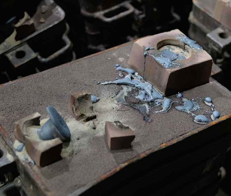
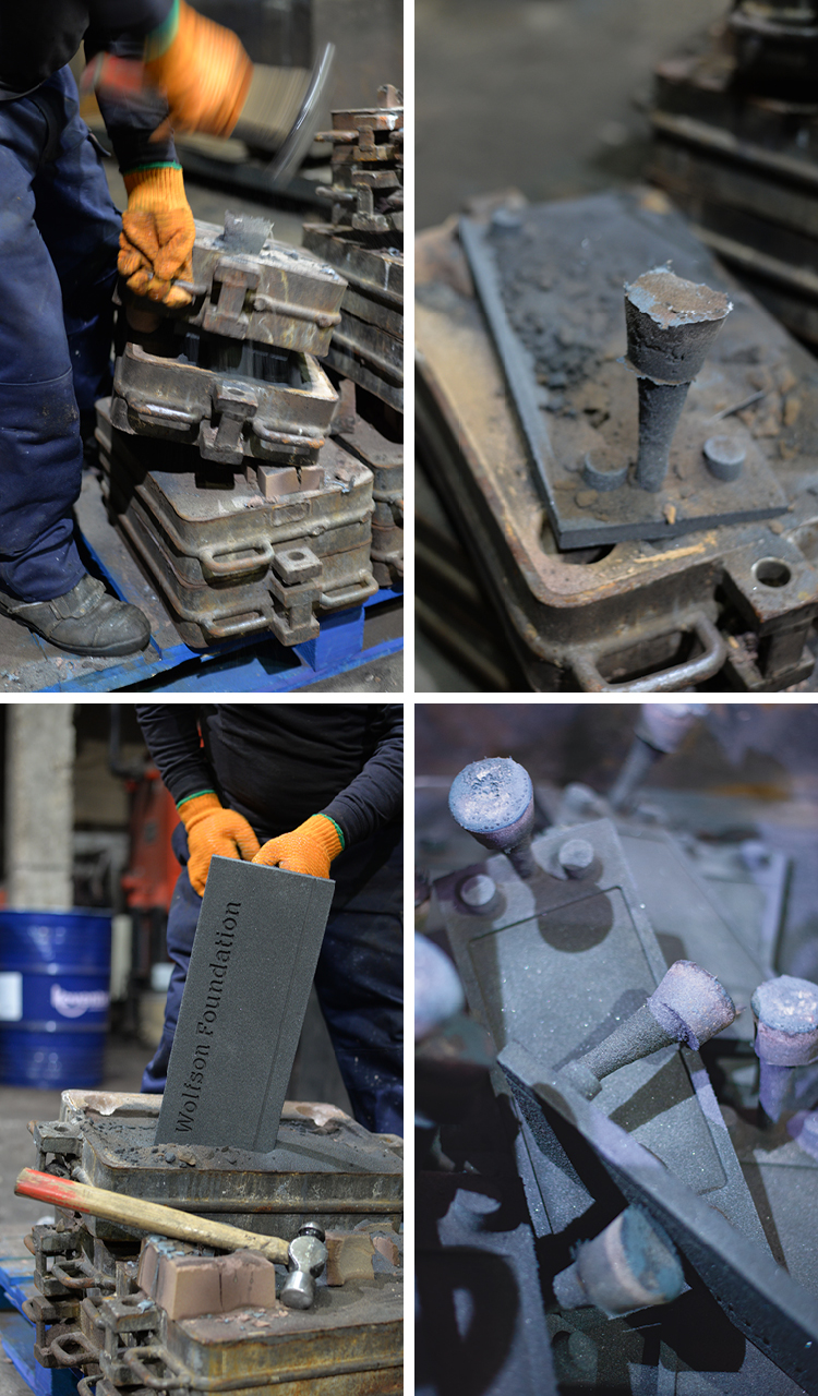
Splitting the cope from the drag and pulling the cast from the sand is called a knocking out. It is another task for Ian while his furnace is slowly building up heat for the first melt of the day. As usual, his attention is divided between the very physical breaking apart of the moulds and listening to the hum of the furnace. Away from the furnace control panel, the audible pitch of the electromagnetic charge helps him judge what stage the furnace has reached in its temperature climb.
With several hefty hammer blows, the cope mould is prized away from the drag mould and the now solid down-peg is grasped to pull the cast from the collapsing blackened sand. Our batch of 22 cast-iron plaques took about an hour to extract. It was dusty, noisy and arduous work.
Ear defenders were needed when the noise level became quite deafening; the sand reclaimer vigorously shook the moulds to separate the remaining sand clinging to the cope and drag boxes. Meanwhile, our plaques with their strange down-peg and riser appendages were transported to the finishing workshop.
FINISHING
Cast cleaning is called 'fettling'. This includes the removal of the down-peg and risers. 'Burrs' also occur along the parting line of the sand mould, where small amounts of molten iron will sometimes seep out of the mould. A combination of hand-held and machine grinders cut and scrape away unwanted iron in a dramatic shower of screaming sparks. The fettlers wear respiratory equipment and clothing to protect them from high dust levels. Even so, this is a challenging environment in which to work day in, day out.
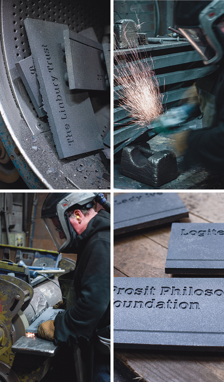
While the furnace hummed next door and the grinders screamed, our plaques clanked in the tumbler drum of the shot blaster behind us. This machine was rather like a giant spin dryer but steel shot is fired through the holes in the drum as it turns slowly. Our plaques are cleaned in the process, providing them with a stripped, even finish.
FINDINGS
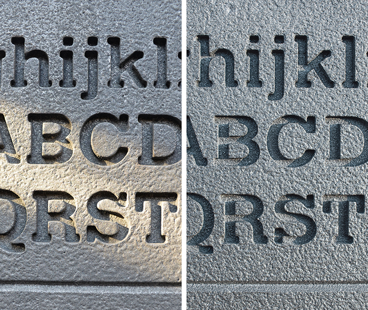
Early prototype castings provided us with some guidance on the legibility of inset letterforms:
• The lettering Calvert 107 was selected for testing. It is a wide-bodied slab serif character with low ascenders and short descenders, squared-off terminals, and large counters.
• A complete character set of upper and lower case letters was tested.
• The smallest lettering size was tested to establish how much detail could be held during sand-moulding.
• Letter-spacing was tested, to establish the minimum space between letters that could be held during sand-moulding.
• The inset depth of the letters was tested; checking how it would be affected by light fall and the resulting shadows, while remaining legible.
• Front surface texture was added to provide greater contrast with the smooth inset lettering.
Design developments made after prototyping:
• A compromise had to be made between the front inset lettering depth and the weight-saving recess on the reverse.
Summary of advances in design and manufacture knowledge:
• Successful casting of digital letterforms (type faces) is dependent on the body weight and terminal widths.
• Factors governing the sharpness of cast letters (where sharp letter outlines provide maximum legibility) include: the melt mix and the grade of sand used.
THANK YOU
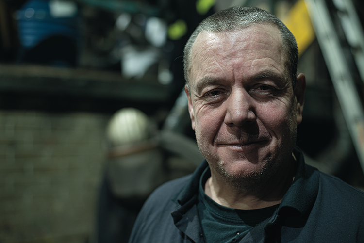
To Mike, the fourth generation owner of the family-run Durham Foundry (Sheffield) Ltd. Also Dave the foreman, Simon the moulder and Ian the furnace man (above). Their dilligence in keeping me safe and their limitless patience with me was exemplary over a day and a half of questioning.
See the finished casts for The Royal College of Art: Utilitarian signs
Ian Chilvers

I first wrote this just after the UK general election of December 2019. Rather a lot of water has passed under our bridge since then, things that seemed red-hot-urgent are now passing into cool history, but I think it makes many eternally relevant points about how groups gathered around a set of political ideas express their identity.
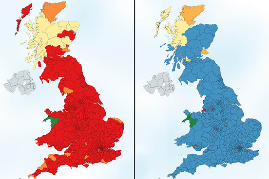 Two countries. Britains that show a very stark divide between two groups of British voters, in this infographic by Electoral Maps UK using voting intentions in 2018. On the left, the map shows voters 18-24, which would have returned 600 of 632 seats to Labour, and on the right the map shows just the votes of the over 65s, which would have yielded 575 seats to the Conservatives - these are both majorities the like of which no party has ever had, an almost complete annihilation of any other party. Who is voting with their head and who their heart?
British politics since the early 1990s has been, in my view, been mushy.
Tony Blair saved Labour from a cycle of seemingly endless defeats, and in a strange echo of today, the infiltration by the Marxist Militant Tendency. He did so by borrowing fiscal probity from the Conservatives, moving so far from what some Socialists see as Socialism, his period in office is known by socialist purists as Blatcherism.
It seems the deep origin of Blair's Blatcherism was acknowledging the electoral success of Conservatism (four elections and eighteen years on the trot) as obviously having something very popular with the British people. And learning from the electoral success of progressive Democrat Bill Clinton, who won the first of two consecutive terms with the phrase "the economy stupid"; promising fiscal prudence along with "change".
Then, after Blair, came David Cameron and George Osborne, who called Blair 'The Master' for his election-winning abilities. They saved the Conservatives from repeated defeats by borrowing social progressivism from Labour - the matching combination of financial-dryness with social-liberalness. The opposing parties resembled a Venn diagram, with most of their policy areas almost entirely overlapped. Or one of those stick insects that spends most of its life immobile, indistinguishable from a twig. Is it a twig, is it an insect, nobody knows.
Then in 2016 came the referendum on whether or not to remain in the European Union. The debates
that preceded and have followed this referendum have been the most contentious, vibrant, polarising,
emotional debate in thirty years. Politics has become urgent and meaningful again. It suddenly seems to
matter what you believe.
As a designer, I have been been especially alert to the communications - the logos and catchphrases, the
colour palettes, the typefaces and the social media memes.
SOMETHING WE ALL LOVE
Any political party aiming to be large, with a membership in the hundreds of thousands, is by definition a "coalition". It has to keep under its banner a wide range of political opinion, and portray itself as appealing to as wide a range as possible of the voting public.
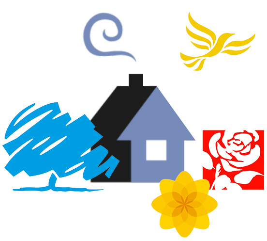 British Paradise: the ideal pastoral home.
All the major British parties, save one, have opted for symbols plucked from the British countryside.
They all speak to the great British Dream; an ivy-covered cottage with a generous garden, the
idealised home, a peaceful haven, the culmination to a successful life.
Let's imagine the scene, made with British political logos... The simple cottage with its curl of chimney smoke. Over there is a broad tree, we can sit in its shade and picnic or read a book. Is it an oak, a copper beech? We don't know, its a bit sketchy. Above in the cerulean sky is a lone bird. What is it, a kite, a dove? We don't know. In the garden are roses, vibrant glorious scarlet. And in the rockery a tiny little yellow poppy.
Just down the lane is the sleepy village John Major spoke of, "long shadows on ... cricket grounds, warm beer, dog lovers". And George Orwell, "winding roads, green fields and red pillar-boxes".
Obviously each of these political symbols have further ideas they wish to convey; the cottage is
Conservative Home, the logo of the website that calls its "the home of conservativism", the idea that
Conservatism has its foundations in John Locke's theory of individual independence resting on private
property. The tree has deep roots and protective branches, with inexorable slow organic growth and a
robust core; the ragged poppy of Plaid Cymru (oddly not the daffodil, the national flower) has
miraculous tenacity; the fact that all Socialists sport red or roses creates a visual link spanning
continents, it is a global Project, and the rose when it blooms is surely one of the most magnificent
things known to us; the Liberal bird is free to fly where it will, and seems to be the epitome of Nature, at liberty to fly anywhere and everywhere.
Whereas the British parties go to the British countryside for their emblems the American parties go to
the zoo.
 The Republican Elephant and Democratic Donkey were both derived from nineteenth century political cartoons, using the animals as metaphors of political behaviour. "Foolish animals"; the elephant dominating and scaring others, the donkey was a jackass powerfully (but somewhat blindly) kicking out.
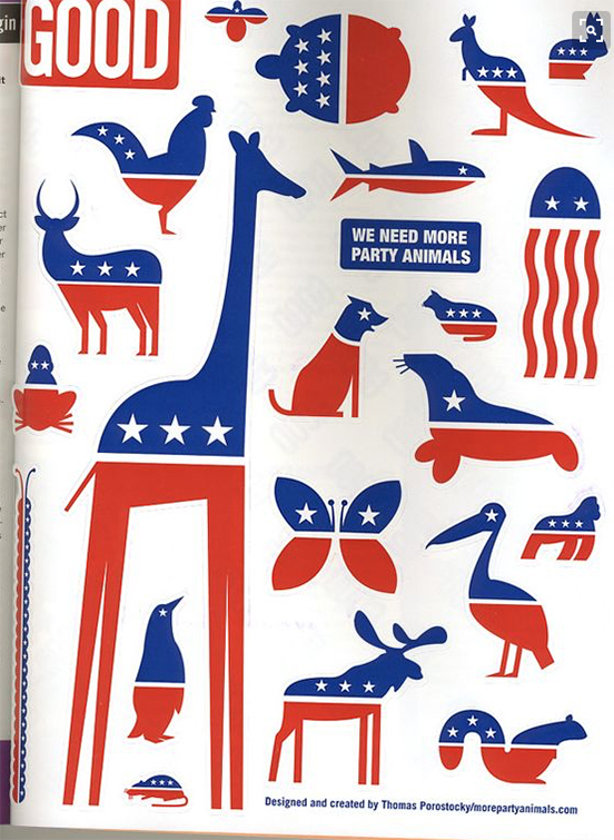 Designer Thomas Porostocky's plea for a wider political spectrum in America.
Elsewhere, designer Michael Wolff has written about his work designing British Labour's version of the
international symbol for Socialism: the rose. Wolff wanted something aesthetically gorgeous, a painting.
For designers and fans of detail, this podcast is well worth listening to, Matt Forde's interview of Peter Mandelson. In the first fifteen minutes, Mandelson describes the significance of Labour's switch from Soviet red flag to British red rose, a visual change that mirrored structural and policy changes, resulting in New Labour. He describes how he and three other Labour luminaries joined Michael Woolf to chose their favourite rose paintings at Philip Sutton's studio... and how Neil Kinnock disliked the over-long stem, which Mandelson ensured was snipped (or did he?)
The rose was first used in 1878 as a red alternative when the red flag was banned in Germany - the flag spoke of mobs in the street, barricades, the Paris Commune and the slaughter that followed, the collapse of society. The rose, more placid than the flag, yet still revolutionary red, became the symbol of the Socialist International. The American Socialists and the French Socialists use a rose in a fist, reinstating the idea of muscle and possibly some street violence.
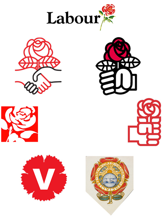 Socialism growing in fertile earth. Originally used because the red flag was made illegal in Germany, the red rose was worn in Socialist buttonholes from the 1880s onwards. In a circle from the top: British Labour by Michael Wolff, the Parti Socialiste of France, the Partido Socialista Obrero Español, the World Socialists by Walter Crane drawn in 1915, the Vänsterpertiet of Sweden, British Labour as it uses Wolff's rose today, the Democratic Socialists of America.
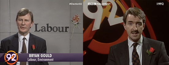 Two of the most prominent strategists of Labour in the election-winning Blair era, both sporting roses.
Wolff says that the rose he designed, in full colour, has been crudely cropped and shoved into a box, losing its brushwork and freeform shape. My guess is that the rose-in-a-box has come from social media,
the tiny "avatar" that marks posts and tweets, like a miniature hallmark on the back of a silver spoon.
When we designed the manifesto for Labour's first ever consecutive election victory, we weren't given
Wolff's rose to use, nor the rose-in-a-box, but a simple red box, with the legend "new Labour new Britain" inside it. What made it Labour was the colour. Each party has a distinct colour, and any new party has to choose one not attributed to an existing party. The association of colour to party is so potent, it is almost enough on its own, without names or logos.
A word here on the strange anomaly of red which represents Socialism all over the world except America, where red is the Republican Party, the party of conservatism. Every political American goes to the Stars and Stripes for their election branding: using the white, red and blue, the stars and bars. (Even the rebellious Notorious AOC follows the tradition, see her patriotic use of the star later in this piece.) Probably the simple needs of the media in depicting which states on the map have voted for which candidate - best communicated with colour - have caused the two primary colours to be associated with the two primary parties. Since the navy blue and the bright red come from the flag, the essence of the United States, there is no sense that this is revolutionary red of the Communards or China or the Soviet Union.
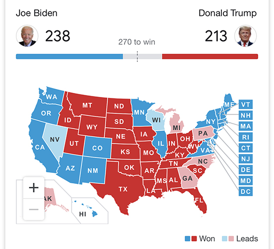 America split between patriotic blue and patriotic red - not Conservative blue and Socialist red, in America it is the red that is more conservative, and blue that is seen as more progressive, or in another unEuropean usage: liberal.
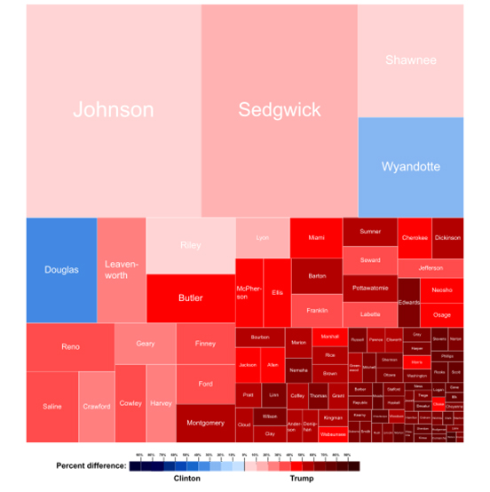
The state of Kansas and its votes for Republican and Democrat Presidential candidates in 2016. The names are names of the counties, which are arranged by size of population, rather than geographic location. Colour makes this kind of graphic viable, hence the binary red and blue for the two primary parties.
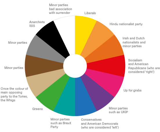 The political spectrum: all the fundamental colours are taken, any new party has an increasingly impoverished choice.
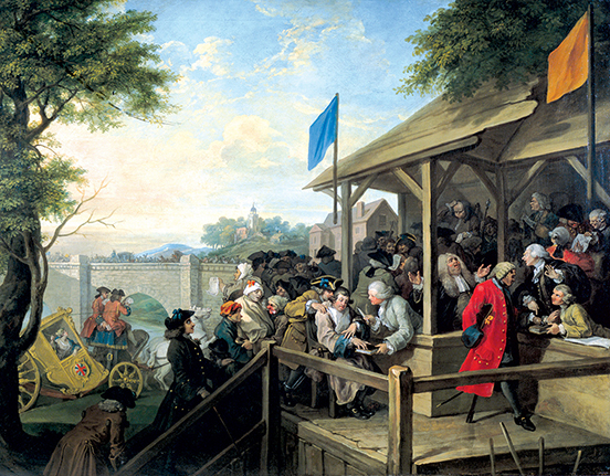 Before party logos, there was only colour. One of William Hogarth's series of paintings charting the corruption of mid-eighteenth century politics in Britain called 'Humours of an Election'. This one shows 'The Polling', with the flags of Tories (blue) and Whigs (buff), and party activists bringing various unsuitable citizens to vote; a mental patient, a corpse and a man with a hook (which means he cannot lay his hand upon a Bible to swear his identity). The Whigs later mutated into the Liberals, and their buff mutated into yellow - although with the advent of Scottish National Party yellow, the Liberal Democrats are gravitating towards orange.
NEW DIRECTIONS
Nature does what it does, despite humankind's desire to control it. Some political parties want to portray a more deliberate controlled politics: more pointed. Arrows say: we know where we want to take you.
The newly formed Brexit Party has literally a single policy, after which they will disband. Their name and emblem spell out their intentions. Designer Ben Terrett has commented that not only does the Brexit Party logo point metaphorically, but also literally and emphatically at the square on the ballot paper that you must mark.
Although Hillary Clinton was given a right-pointing arrow by designer Michael Bierut, many Americans saw her policies as left-leaning. In fact it is hard wading through the forty pages of her policy ideas, still on her website, to work out what she was offering: one commentator said the policies were well thought through but "arguably at the expense of having a big-picture orientation". Right at the top, presumably the most important?, are an end to Alzheimer's and support to those with autism. Further down is "comprehensive immigration reform" (but will it lead to more or fewer immigrants?) Hillary's arrow-letter was expanded into an entire alphabet, there is a C ready and waiting for daughter Chelsea.
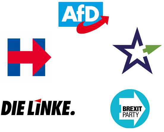
Pointing the way, which always seems to be the same way: Alternative für Deutschland has an arrow
that zooms to the right, EU star for a which-way-next project run by the Institute for International & European Affairs, the Brexit Party's emphatic put-your-tick-here marker, Nigel Farage's newest political entity uses the same emphatic pointer, Germany's Die Linke actually pointing left (although its your left, their right), Hillary Clinton's monogram pointing away from the Deplorables.
Another new British party that you would imagine might have gone the arrow route, chose a very strange emblem. The Independent Group (TIG, its members were called Tiggers) was formed from a collection of Labour and Conservative MPs, unhappy with the direction of politics. The TIG name was apparently a place-holder, and then they confusingly relaunched as Change UK, which was judged as too close to a campaigning website change.org, so they then switched to The Independent Group for Change.
What emblem would communicate their "new politics"? Two equals signs? Society neatly stratified? A redacted document? Embroidery on a naval Captain's cuff?
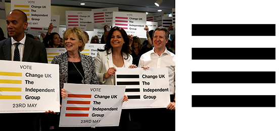 Logo for short-lived The Independent Group for Change, are these bars of a political cage they must break out of? Is it inspired by the 'hamburger menu' icon on their website?
A BIG NO
Britain's fourth biggest party by vote share is the Scottish National Party. Its logo is derived from Scotland's flag, the cross of Saint Andrew, who insisted on being crucified on a crux decussata, considering himself unworthy of dying like the Messiah. The SNP cross is twisted from a single line, like a ribbon or a pretzel, in an effort to make a thistle - another Scottish emblem from deep in its past.
The activist group Extinction Rebellion uses a somewhat similar logo, designed by a street artist known as ESP. He told a journalist he was chalking the symbol onto a wall, and "[onlookers] became curious about the meaning and one said "X marks the spot", then his friend said "No, time's running out". I turned around and was like "Yes!!". The symbol can be seen an hourglass inside a globe, a stop sign, an emphatic X for extinction. To further emphasise the cross, the group reduces its name to the initial XR.
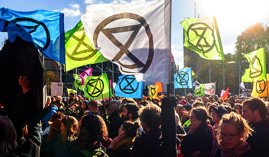
In our culture, the cross is most commonly used for negation. Road signs with a single oblique line, half the cross, mean 'you cannot do this'. A cross on your homework means it is wrong. To brandish such an emblem is to brandish a big NO.
The political party with a strong nation as its main political aim uses a motif derived from the national bedrock. Ideally an image of something before the nation got spoiled by foreign influences; the symbol of an early religion, something from the earliest aboriginal peoples, the idea is to go backwards in history to a period when the nation was pure. The emblem is meant to represent something essential in the nation, something of its founding strength, and stands for the idea that there should be continuity with that previous halcyon time.
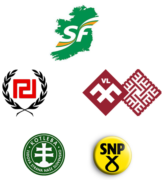 Sinn Fein uses a graphic image of the island of Ireland entire, The National Alliance of Latvia uses a motif from traditional folk costume (with that hint of National Socialism), The Scottish National Party uses a device used to execute Christians, Kotleba of Slovenia uses a Christian Orthodox cross, Golden Dawn of Greece uses a fragment of ancient Greek meandros from architectural friezes which has something of the twisting swastika.
The best example is Benito Mussolini, who in looking for an emblem for his Italian nationalist party reached back in Italy's history to ancient Rome, and found the fasces, the bundle of sticks bound together around an axe for chopping them up and making a fire, used in Roman religious rituals. You can see the fasces on carvings in Rome, a procession of robed supplicants following the head priest, the pontifex, the fasces over his shoulder. It represented a number of things Mussolini wanted to convey; people organised and bound together, the importance of ritual, the importance of following a leader, and Rome's glory. Mussolini's symbol of the fasces for his Partito Nazionale Fascista has given us the most potent word in the political lexicon.
SPELLING IT OUT
Not all political messaging can be intuited from the associations of a symbol. These messages can be nebulous, they are atmospheric, associations that work best over time. For absolute immediacy and clarity, words are best to spell the message out.
These can elevate from a secondary policy level to become the main identity. When Tony Blair was reorganising the Labour Party, the title of a draft manifesto "New Labour, New Life for Britain" seemed so effective in conveying the new blend of Socialism with Capitalism, the so-called 'third way', that it ascended to become the main brand.
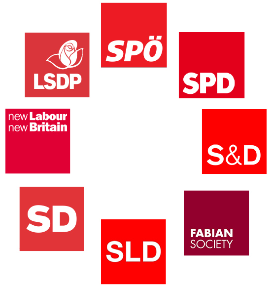 The business-like unrevolutionary red boxes of European Social Democracy in a friendship circle: SPÖ of Austria, The Sozialdemokratische Partei Deutschlands (SPD) in power either with a majority or in coalition for most of post-war German history, S&D emblem of the Progressive Alliance of Socialists & Democrats in the EU parliament, the Fabian Society following the policy of Roman general Fabius in the Punic War who simply wore down the Carthaginians with guerrilla tactics, SLD of Poland, SD of Slovenia, the logo with which British Labour under Tony Blair's leadership signalled its shift to a more German style of Socialism and three election victories, and finally with rose the LSDP of Lithuania.
Some phrases have become so effective at encapsulating a political ethos, that they long survive the election period. At any social gathering in Britain today a heated debate can be started by saying "what about that bus", everyone will know that you are referring to a bus decorated with a campaign message by 'Vote Leave', the organisation devoted to leaving the European Union.
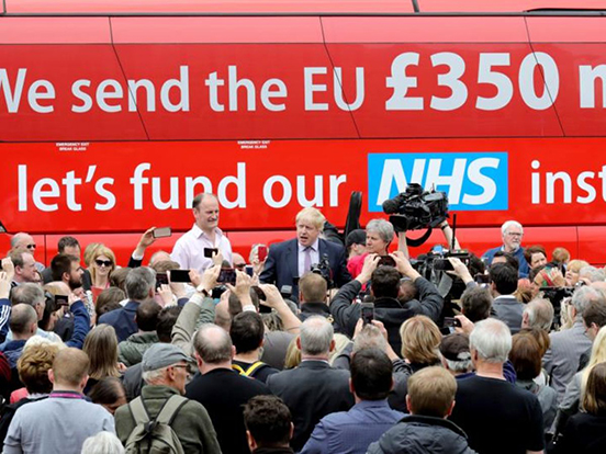
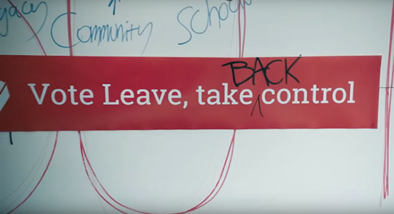
The recent BBC film 'Brexit: The Uncivil War' about Vote Leave, and Dominic Cummings, who became its director, was dramatically hinged on the single moment when Cummings wrote one word. The campaign phrase was, until Cumming's intervention, "vote leave, take control", but Cummings in the form of actor Benedict Cumberbatch is unsatisfied. He doesn't feel it is emotive enough, it doesn't epitomise what benefit leaving the EU will deliver. The turning point comes when Cummings-Cumberbatch leans over, and adds the word "back" - inventing what commentator Steve Richards called "an ingenious mantra", and politician Rachel Reeves called "the most powerful phrase of my lifetime".
 The American version must surely be President Trump's red baseball cap, emblazoned with 'Make America Great Again'. Wearing the cap in public will almost certainly mean you are beaten up. Jussie Smollett's paid attackers who were actually Nigerians wearing ath-leisure, were described by Smollett to police as white men wearing MAGA hats, and liberal America gasped and nodded at how obviously brutal such men must be. Even though they never existed. Teenager Nick Sandmann, wearing a MAGA hat he bought with his classmates on a school trip, was filmed at the Washington Monument smiling as a Native American drummed very close to his face. Largely because of the hat, Sandmann was accused of "racism" by numerous watchers of a video of Sandmann quietly standing still. The power of the hat and the four words is so great it seems to be able to summon forth demons in the minds of some who lay eyes on it, even if it is on the head of a non-extant man or on the head of a child.
News channel CNN has just paid Sandmann a reputed $275 million dollars for defamation.
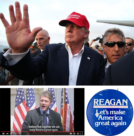
The phrase which seems to incite such rage - commentators talk of MAGA America - does not originate with President Trump. President Clinton used a very similar phrase as the culmination to his campaign speeches. It was the thrust of President Reagan's 1980 campaign. It is an American political trope, a theme, not belonging to an individual, nor a political party, nor even a political philosophy (Clinton and Reagan are far away from one another politically).
THE FACE OF
Heading into the general election of December 2019, Jo Swinson, the new leader of the Liberal Democrats decided her face was of sufficient potency that it should be used as an electoral asset. It is not uncommon for British party leaders to use their faces in ways more usual in presidential campaigns. If elected, a British Prime Minister actually has greater powers than a president, there being no congress nor assembly that controls all the actual legislative powers. A British Prime Minister with a majority is as close as it gets to being a monarch, as Maurice Glasman wrote of the recent election: "All Hail King Boris".
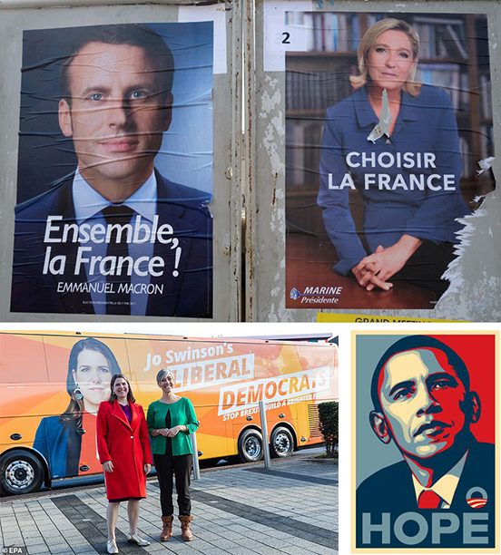 Successful and unsuccessful faces. Jo Swinson taking ownership of her party, in presidential style. Posters for the 2017 presidential election in France. Obama's now iconic 2008 campaign poster - when asked if Obama had fulfilled the hope, the poster artist Shepard Fairey replied "not at all".
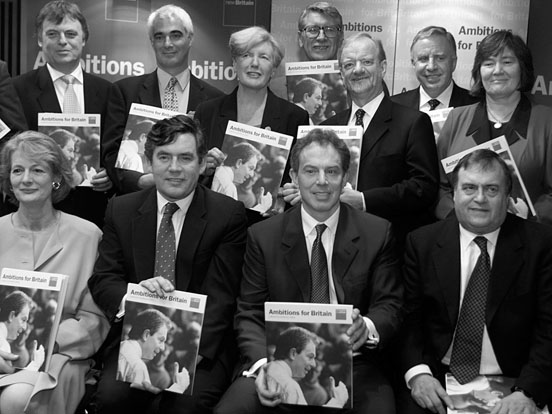 Tony Blair's unhappy-looking cabinet clutching the manifesto we designed, playing its tiny part in winning Labour's first ever consecutive term in 2001. The cover features Blair himself, in shirtsleeves, engaging with an audience. Looking back we can see how much the party's electability rested in his personal drive and oratory, an aspect we as designers took as obvious, hence the cover image.
Politicians and aspiring politicians use a variety of ways of arriving at their presentation. Often it is in-house resources, employed by the party, even designers attached to the printer who is printing the materials using previously agreed guidelines. But reaching out to less-expected professional agencies can yield both a fresh point-of-view, and a more coherently thought-through and therefore more powerful campaign. Such as previously mentioned Michael Woolf designing a magnificent rose for a renewed Labour Party, and and Michael Bierut crafting a logo-like monogram for Hillary Clinton. One notable recent example is the news-worthy Congresswoman, Alexandria Ocasio-Cortez. She employed a branding agency called Tandem, who were able to style AOC's campaign almost as you might for a company or a product launch, every visual aspect carefully considered, including rainbow backgrounds and formatting for superwide banners.
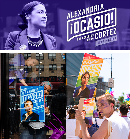 Campaign graphics can attain highly commercial polish, with every line of type carefully scaled and positioned. Here is the personal brand of the Congresswoman who calls herself Notorious AOC, posters and her Facebook banner, showing how the name-logo, Spanish-style punctuation with American star, and various other messages are elegantly detailed.
ABOVE US & INSIDE US
Perennial symbol of beneficial heavenly intervention on your side is the star. It appears in national banners - both America and China follow their own stars ... nations as varied as Cuba, Israel, Australia, Indonesia, Cape Verde, Panama and Vietnam all look to the heavens.
Very notably, the European Union has chosen stars as the banner under which it will unite Europe. The circle of stars is a common version of the saintly halo in Catholic art. Its use by the European Union hints at a link with the pan-national Catholic church, and casts the Commissioners as modern-day priests. The EU stars are the stars of the divine, they are the stars of predestination, of virtue.
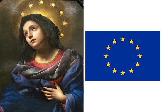 Painting of The Madonna in Glory by Carlo Dolci, and flag of the Bureaucrats in Brussels.
Almost at the opposite end, politically and virtue-wise, a blog about Italian politics started by a ribald Italian comedian, Beppe Grillo, attracted such an avid community that it spawned a political party. His blog logo, a megaphone with stars spilling from it, gave the party its name, Five Star. As a party it typifies the new politics sweeping the Western world; it is populist (the good people vs the evil elite) and uses social media (it is immediately national, instead of building slowly from local meetings).
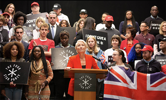
Writer Russell T Davies created a populist politician for a television drama "Years and Years" - Vivienne Rock gathers a huge movement under the banner of the Four Star Party, four asterisks representing her saying she didn't give a f*** about Palestine. The production designer selected black, see the political colour wheel above, this presages what happens in Davies' drama, which ends with death camps.
We might look outside ourselves for guidance, or we might might look inside. One or two political parties are starting to cut straight to the heart of politics, to use a symbol that represents our purest feelings. Spanish Unidas Podemos is a new left-of-centre populist party, whose name means "united we can", strangely echoing President Obama's campaign pledge. Their logo looks for all the world like a premium ice cream, wrapped in imperial purple. Another party that has eschewed any kind of emblem from political history is another Spanish party, Partido Socialista Obrero Español, who have dropped the socialist rose for a keyboard-savvy 'forward slash' and an avatar-friendly heart.
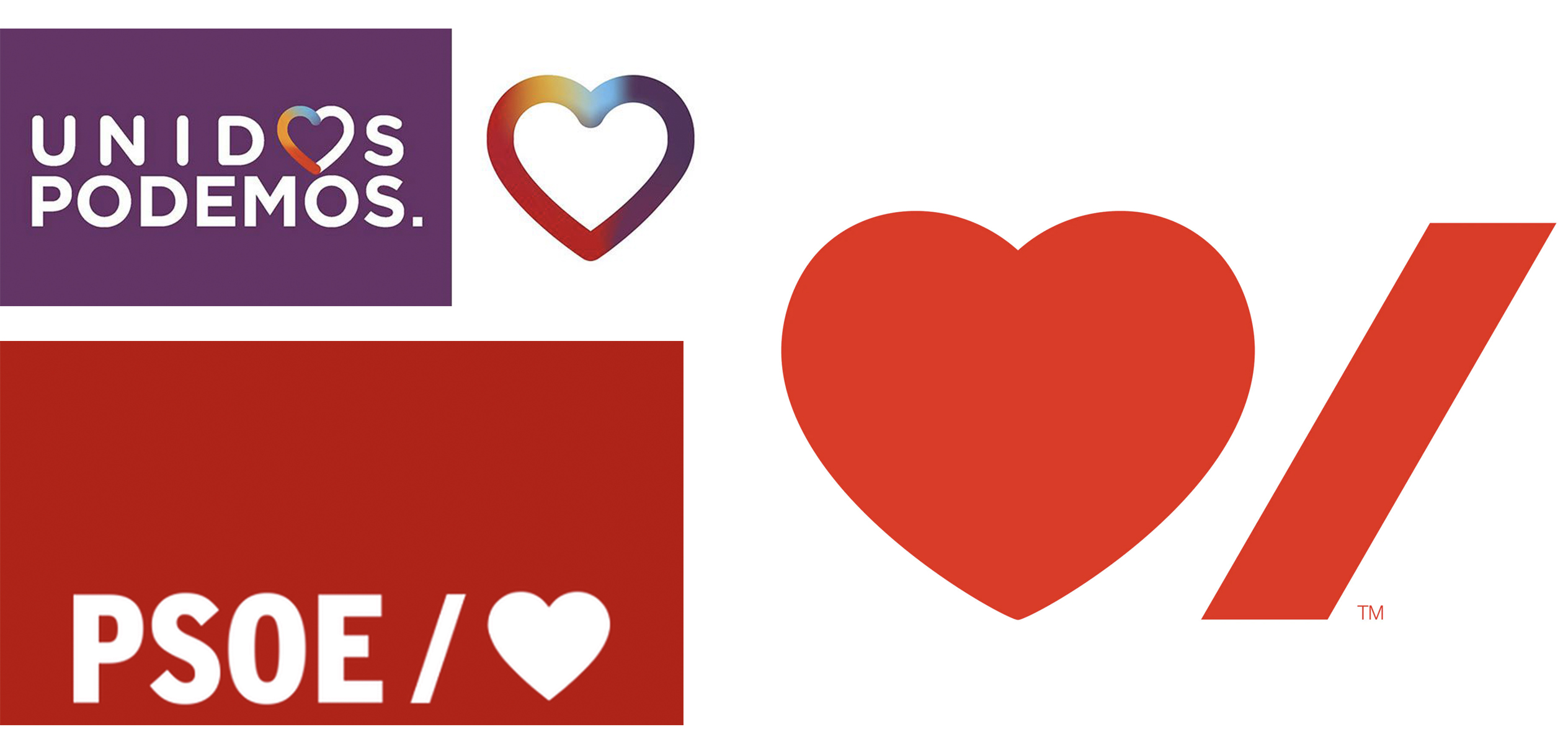 Two new Spanish populist parties on the left currently in a coalition government: Unidas Podemos and PSOE, two hearts pumping blood into Spain, rapidly renewing their branding to try and keep pace with the collapsing house of cards that is modern politics. On the right, a new-ish logo by Paula Sher for the Canadian Heart & Stroke Foundation, is Pedro Sanchez of PSOE inadvertently running the Spanish chapter?
But these left-wing parties are formulating policy pragmatically rather than programatically. PSOE and Podemos just raised taxes on high earners and raised the minimum wage for low earners. Although higher taxes and a higher minimum wage are from the socialist playbook, they are normal fiscal levers used by parties of every stripe - the Conservatives in the UK have just raised the minimum wage, Viktor Orban raised it by an enormous 17%. One aspect of what is happening today is that the real effects of the wholesale collapse of state socialism in 1989 is making itself apparent. Political philosopher John Gray says this: "[Socialists] regard themselves as the embodiment of advancing modernity. Yet the pattern they imagined in history shows no signs of emerging. Any tendency to gradual improvement has given way to kaleidoscopic flux. Rather than tending towards some rational harmony, values are plural and contending. Political monotheism - the faith that only one political system can be right for all of humankind - has given way to inescapable pluralism."
Before he achieved his first electoral victory - which to put it perspective, was more than twice the size of Boris' at a phenomenal 180 seats, a double-Boris, and was followed by two more victories - Tony Blair dramatically signalled a change in Labour's political ethos by changing the party's constitution. He altered Clause Four from the Marxist Project "to secure ... the common ownership of the means of production" (code for state nationalisation), to the more pliant "create for each of us the means to realise our true potential ... [and build a society] where we live together, freely, in a spirit of solidarity, tolerance and respect". In other words, the end-point was no longer laid down. Labour would not always be moving towards a specific, predetermined place by predetermined means. But moving in a freer way, more pluralistic, more contingent on actual conditions, more open to interpretation and reinterpretation.
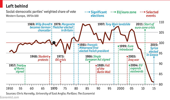 Matthew Goodwin's alarming chart plotting the average vote share for social democracy, Europe-wide... Spelled out by this paper by Benedotto/Hix/Mastrorocco: "The story of the electoral performance of social democracy over the past 100 years is the story of the rise and fall of a particular electoral coalition. Social democratic parties emerged as electorally successful after 1918 to represent the industrial working class. The primary goal of these parties was to win an electoral majority and to transform capitalism. This strategy was limited by the size of this social group, and the fact that not all industrial workers supported socialism. Only after social democratic parties moderated their policies (moved closer to the median voter), could the electoral coalition be broadened. By adding another group (public sector workers) to their coalition, social democratic parties started to win between one-third and a half of all votes in many countries. This new coalition established social democrats as one of the main electoral forces in European politics between the 1950s and 1990s..." This coalition has unravelled; globalisation and technology has changed employment, industrial and public sector workers are fewer, and do not necessarily share aims, there is a far greater appetite for radicalism amongst younger than older voters.
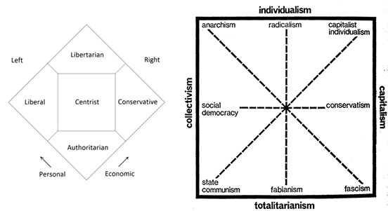 Political scientist Matthew Goodwin argues that "the model has changed", "there has been a structural change in the electorate". The old coalitions of voters that once fitted together under a party banner, are now very different to one another. Put very simply: a university undergraduate at Oxford holds very different views about the world to a forty-something mother with two jobs in Bolsover. The over-simplistic model of left-centre-right, dating from the French Assembly just before the revolution, when monarchists and clerics sat on the King's right, and the merchants and intellectuals sat to the left, might no longer be helpful in the modern world. Two other less linear models: The Nolan Chart of the 1960s, the Christie-Meltzer Diagram of 1970 (recalibrating politics is not new). Perhaps our views on different subjects are not always in the same place. To be economically communitarian, but socially conservative, fiercely patriotic, how does that person vote?
LADY BAG OR BANANA
If politics in the West seems tempestuous, the Electoral Commission of India (ECI) has to deal with thousands of parties - one recent election had over two thousand registered parties and two thousand unregistered. The truly major national and regional parties all get to keep their party branding in perpetuity, so-called "reserved symbols", and have chosen symbols that resonate with Indian culture; lions or lotus flowers, a raised hand and a plough. The ECI offers each political party, when it registers, a booklet filled with mundane images of what look like mostly household objects. The smaller and newer parties then have to use this symbol during the campaign, and, most importantly for a population which still has a high incidence of illiteracy, on the ballot paper.
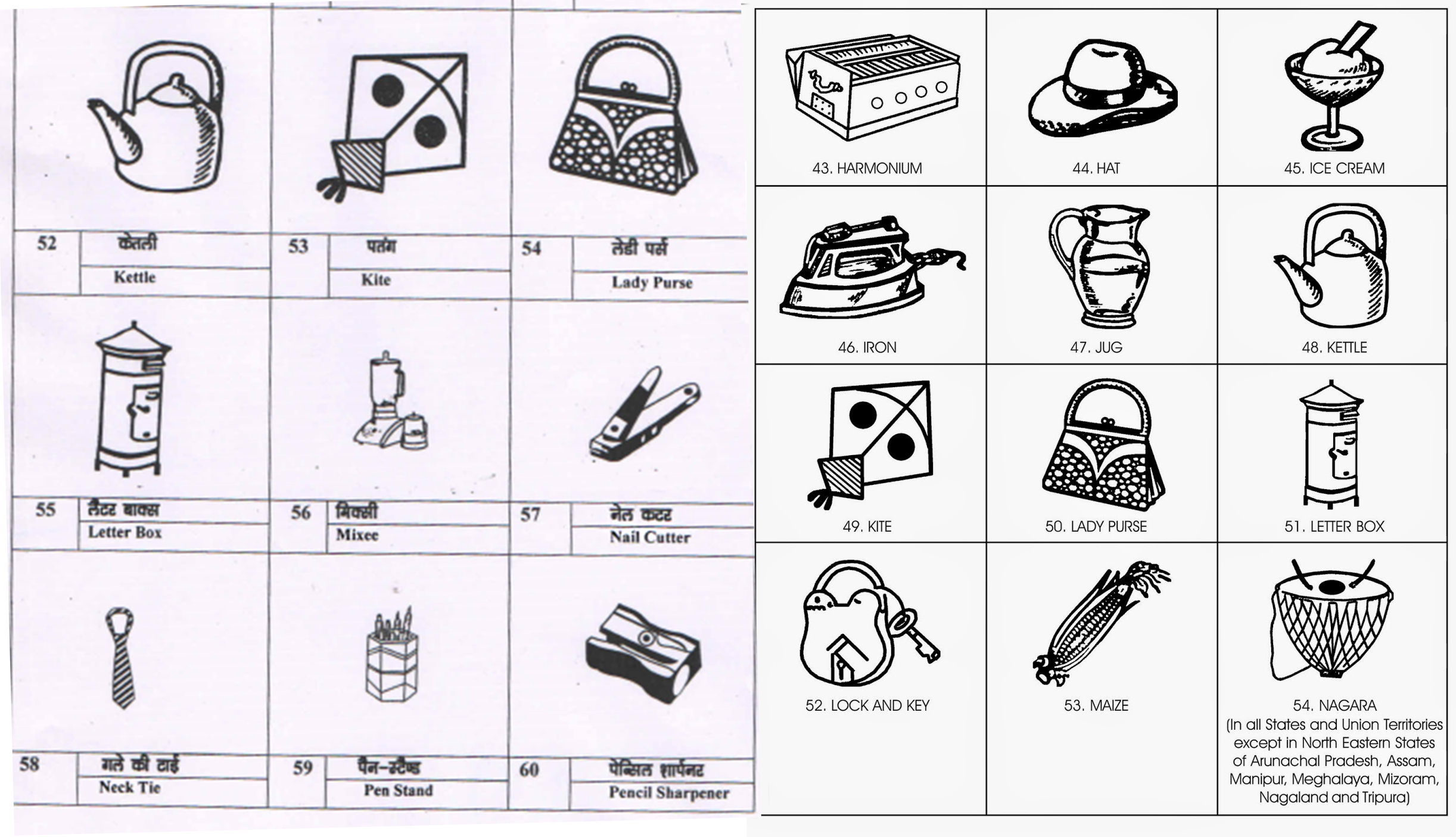 Publications by the Electoral Commission of India offering parties possible symbols - India has over two thousand parties, about sixty of which have "reserved symbols", that they can use at each election.
This randomness of symbol is the opposite of what happens in Western politics, which has been up until now all about being seen to continue in a political tradition, the longer the better. Many symbols and colours in Western politics are hundreds of years old. Choosing from a leaflet, your finger hovering over what is almost a Surrealist handbook, can go in a good and a bad direction. You might end up with a ladder, a key, a car, a ceiling fan or a lady purse, all of which you could imagine have highly positive associations in rural India. Some are harder to see as positive; an iron to burn your fingers? a kite which so easily crashes? bread which would go stale in minutes in Indian heat? a melting ice cream? an empty glass when you have almost constant thirst? The ECI is constantly updating the symbols, they have added a CCTV, a phone charger and a USB thumb drive.
Apparently there is one symbol that never gets chosen: a big fat balloon. Even the most newly-minted political instincts are alert to its negative associations. Bang!
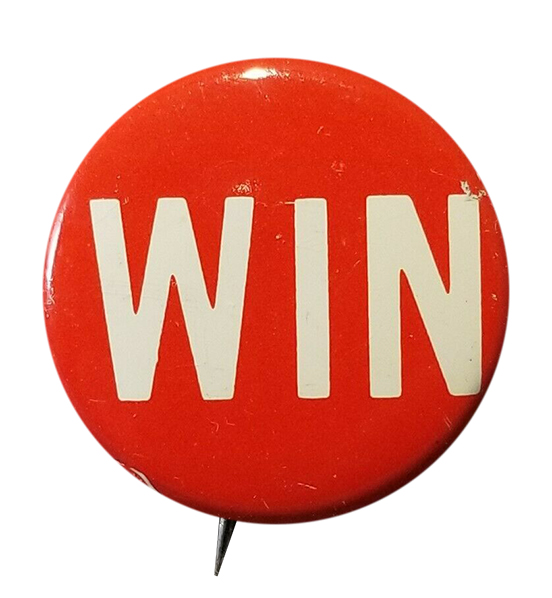 Come on you Reds. The most stripped-down political hope.
To say it has been an unprecedented year is the greatest understatement. This last year was "our war". With as great a set of intrusions into, and obstacles in front of our lives, but with far fewer casualties than the last actual affecting-all-society war. (Although Imperial College's prediction in March of 2020 was for a death toll equal to WWII.)
We all have our memories of this remarkable moment, all of which once this time is history, we will not believe could have been possible. Deathly quiet streets. Clear skies without con trails. Raucous bird song. Unkempt hair. Days wearing only pyjamas. The hunt for food. The obsession with toilet paper. The worry we might never see friends and distant family ever again. The fear that police would search shopping bags, and discover your forbidden easter eggs. (Chocolate for children considered "inessential", just as schooling was.)
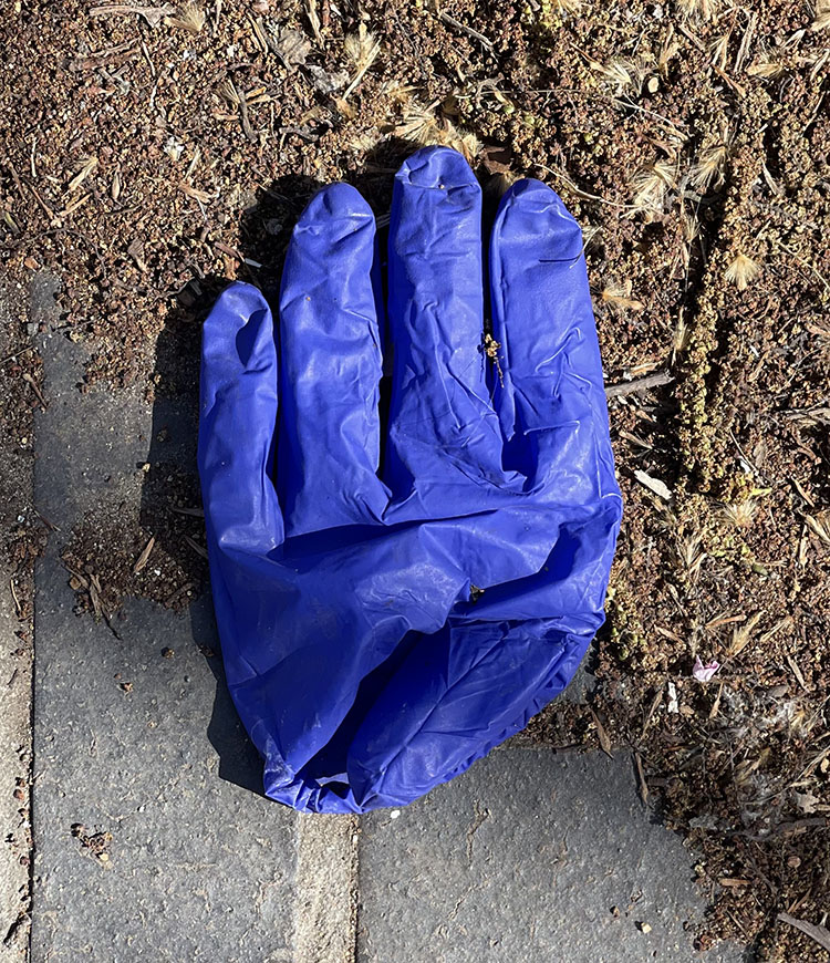
One memory I will have is the PPE. Not just the huge hassle of wearing it - the mask that slides about, the steaming-up glasses, trying to quickly don it whilst simultaneously fishing for Oyster card, the dismay realising you left it in another coat - but the amazing amount of it discarded in the street.
BC (Before Covid) I bought my daughter a collapsible metal straw, we were getting accustomed to carrying spoons for use in cafés, my pockets filled with several foldable bags, such was the growing condemnation of "one use" plastic. But AC (After Covid) the oceans were forgotten, and "one use" plastic can be seen everywhere. Most oddly gloves. The kind that you only ever used to wear when gutting or de-boning fish.
Now the science is showing us that Covid does not transmit by surfaces (technically called fomites) - the gloves and gel and all that hand washing turns out to have been pretty needless. The abandoned gloves are certainly growing rarer.
The gloves are often thin, and look like sloughed skin. Folded into pained shapes, trodden on. To me they look forlorn. But writer Vladimir Nabokov thought differently, he invented a silly proverb in his novel Pale Fire: "the lost glove is happy". If that is so, I present gloves gleefully waving, dancing in glove paradise.
Quentin Newark

Lecture delivered to the Sign Design Society, 2001
If you don't know where you are going, all roads lead to one place; according to the Roman proverb. Lacking any particular direction myself, I ended up working on a number of large sign projects during the 1990s. As a graphic designer more comfortable in attending to the spaces between letters, my mind was totally unprepared for the mental gymnastics required to comprehend three-dimensional spaces, read plans, and take imaginary tours around very complicated public buildings. I spent days in these places; ignoring the stares of passers-by while I peered around corners, over balconies, and paced purposefully up and down walkways. What slowly absorbed me was meeting the principal wayfinding challenge: how do you coax people into taking one route over another?
And so I became fascinated by the persuasive powers of type, colours and pictograms. The arrow, in particular, has always interested me, since it didn't seem to matter how wonderfully original and startling a sign design appeared to be, nor how readable and consistent the type was. The motivating factor in directing a visitor one way or another was the pictogram they saw first: the arrow.
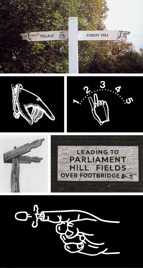
The demise of the pointing finger. These old signs are now regarded as a 'heritage' item in our towns and countryside. The pointing finger never really worked at 45°, it looked a bit limp and indecisive. It would never work on a car fuel-gauge (Yukio Ota) so perhaps it should be put out of its misery, shot, and left for dead (Shigeo Fukuda).
Has it always been an arrow? As a young boy I seem to remember countryside signs with pointing fingers leading me across vast muddy fields and down high-hedged lanes. I had an great affinity for these signs; I trusted them simply because they had a human form — I'd go anywhere they directed me. However, the pointing finger is not so common today. And I find it strange that in the digital age of geo-positioning systems, we use instead a pictogram of one of our ancestors' earliest killing instruments.
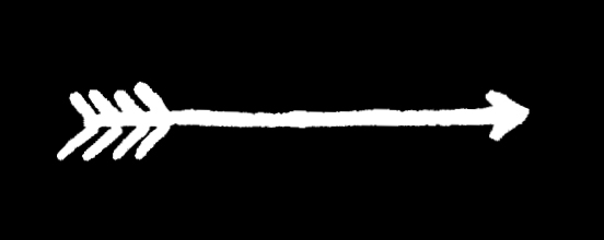
Handed a bow and arrow, we may instinctively know what to do with it; arrow to bow, draw back, aim and release. Where does it go? The flight of an arrow is straight from archer to enemy, or direct from A to B. There is no concept of deviation from its intended target, and its flight is swift. This is an appealling and an evidently lasting analogy that has stayed with us for thousands of years.
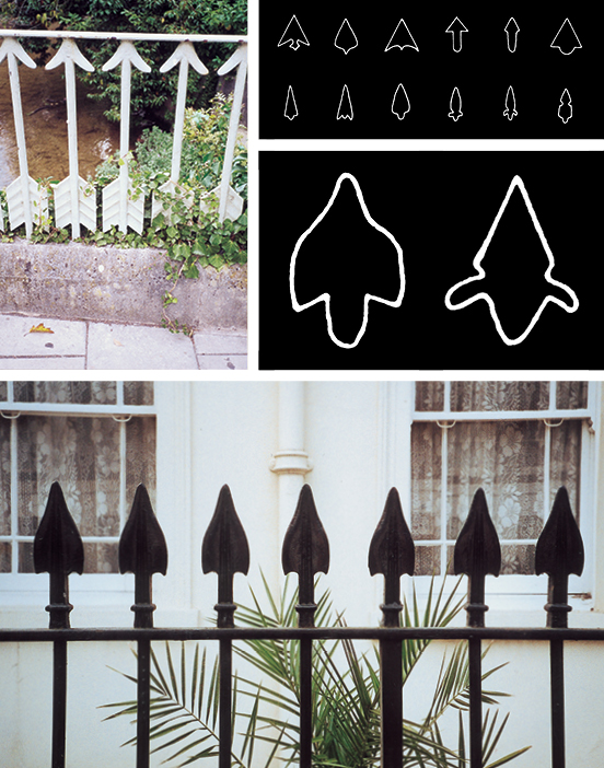
Upended iron arrows on a countryside bridge. Archeological study of Stone Age arrowheads from Africa. Compare the outline of the Stone Age arrowheads with the profile of the capped railings outside this typical London town house.
The form of the 'killing' arrow goes back a long way. Archeological studies of Stone Age flints reveal ingenuity worthy of the modernist design maxim 'form follows function'. Some arrowheads were sleek, fashioned to pierce tough animal hide; others had barbs to embed themselves; and some were just simple broad-heads intended to stun. More than 10,000 years after the Stone Age, we continue to fashion new graphic arrowheads.
If you look carefully at the railings outside period town houses, you may notice arrowheads as decorative terminals to iron railings. Or are these railings arrows that have been planted upright to create a dangerous barrier? Harking back to our primitive past, upended arrow railings are actually a sign telling us 'don't come here'.

Arrows in religion (The Martyrdom of St Sebastian, 15th Century), alchemy (emanating from Greco-Roman astronomy symbols), art (Sky/Ground mural, Rigo 23, USA, 1998), and science (biology notation).
Despite this, the arrow as a graphic shape can morph to describe different types of movement, such as speed. Arrows have been used by graphic artists to explain complicated ideas. Conceptual artists use arrows to startle. Mystics see the arrow as representing inspiration, a directed energy for some uncertain purpose. Conversely, scientists use the arrow in formulae to describe a proven reaction.
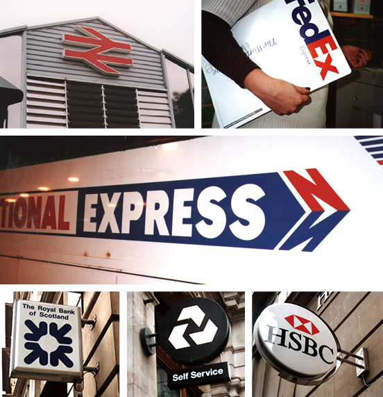
Arrows in branding; British Rail (DRU), FedEx (Landor Associates), National Express, Royal Bank of Scotland, National Westminster Bank (HSAG), HSBC (Henry Steiner).
In the trademark arena, the arrow is ubiquitous and most prolific within the transport sector — for the reasons described above. The banking sector has progressively ditched its traditional symbolic representations of safety and security, and adopted the arrow in order to emphasise its dynamic global reach. Presumably, world-wide coverage is now more important than security to the average wage-earner needing a method for paying household bills.

It seems to me that the arrow is a loaded symbol, capable of delivering an infinite number of messages. Even the most rudimentary arrow-shaped sign has the power to save lives. Take, for instance, the two short lines of stones intersected with one long line of stones. Baden-Powell taught his Boy Scouts to use this method of laying down trails, so that rescuers could be led to lost souls.
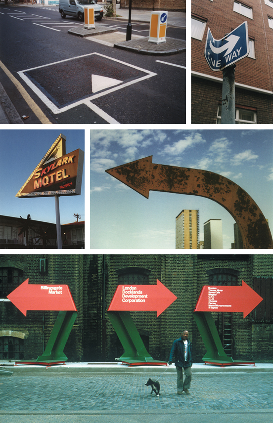
Lost without the arrow? Imagine our cities without arrows (my local high-street is festooned with insistent arrows). America is so vast that arrow signs are everywhere. An original Brasilia city sign (from the film 'Vacancy', 1999). Temporary arrows create a mini-city for the London Docklands Corporation (Pentagram, c.1985).
We would all be lost souls without the arrow. Matthias Müller made Vacancy, a short documentary film about Oscar Niemeyer's futuristic and totally out-of-scale city, Brasilia. In the film he describes the city as 'an emptiness hidden beneath a thick coating of signs' and concludes that 'this city repeats its signs so that it can begin to exist'. What would our cities be like without the arrow? If all signs with arrows were removed, would we continue to have city centres and city suburbs? I think not. Furthermore, we need arrow signs to create cities; the London Docklands being one such example. Once the largest trading port in the world, it was heavily bombed during World War II and then left poverty-striken and desolate. Before reconstruction began, the developers installed giant sculptural arrows to direct fleets of tipper trucks across a roadless wasteland. Now that wasteland is a major financial and technology hub for the City and the population of the area has more than doubled. On an even grander scale, the United States exists as a country made by signs — staked out from the East Coast to the West. That love affair with the sign is at its most profligate in the gambling city of Las Vegas, and at its saddest in the fading, rusting structures outside the forgotten backwater motel. For all their exuberance, these arrows often promise far more than they can actually deliver.
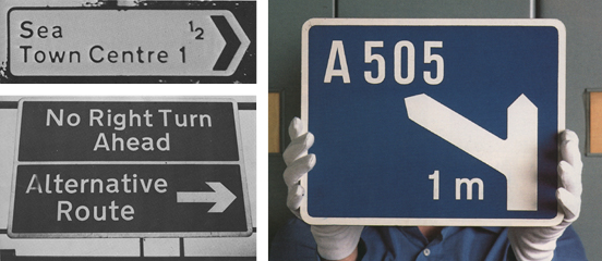
Belief in the arrow. Accompanied by words, an arrow becomes convincing — even when the information is illogical. These examples from the 'The Times' newspaper prove the point. Thankfully, more sensible signs are provided on Britain's motorways. Designed for reading at high speed, these arrows forewarn, instruct us to manoeuvre, and guide us on to new roads (Kinneir & Calvert, 1958).
Can we still trust the sign of the arrow? It would appear that we continue to have an unquestionable devotion to the pictogram, although less so when accompanied by words. Readers of the The Times contributed many humorous examples in a long-running feature during the 1970s. While belief in the printed word has become somewhat diminished, words assigned to an arrow still have credence — so much so that we will hurtle along at 70mph (or faster) on the nation's motorways, veering one way or another, according to a line of type and an arrow on a blue-and-white sign. How trusting of us.
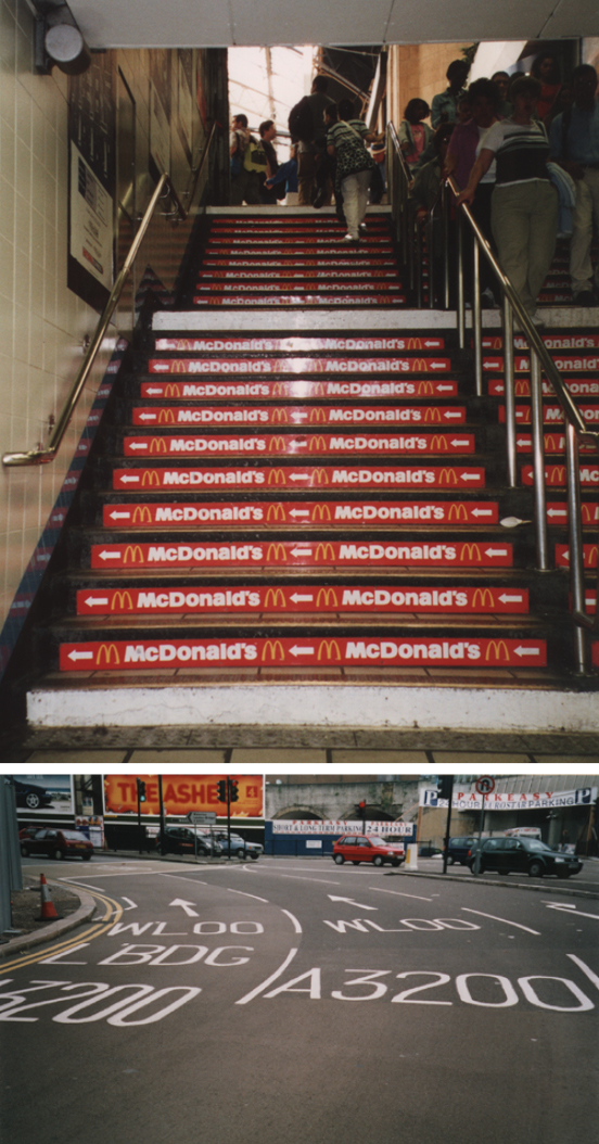
Yet the arrow is an over-used pictogram. It is flaunted wantonly on our streets, directing us to fast-food outlets, and it confuses us on multi-lane roundabouts. Is this death by arrows? What does the future hold for the arrow?
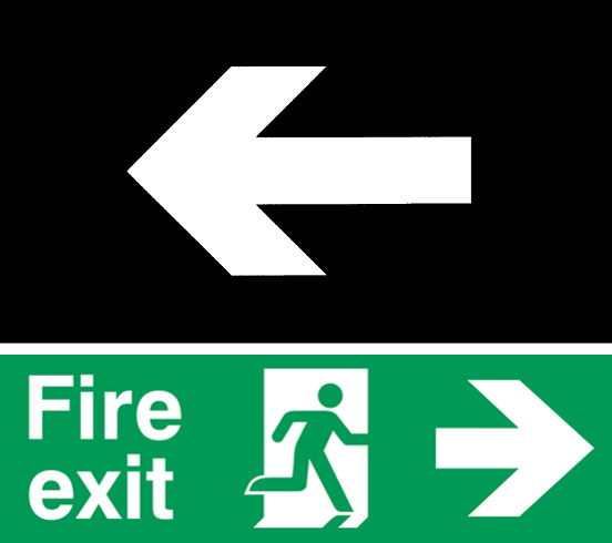
ISO 7001, the new arrow to be trusted worldwide.
Sttandardisation is one option according to the International Standards Organisation directive number 7001 and ratified by Member States in 1985. After five years of development and at a cost of ¥10m, ISO 7001 launched the international emergency exit sign on the world (that's the green-and-white sign with the man running out of the open door). Belgium's contribution to the project was the arrow, specified as having an arrow-head clipped in parallel to the main shaft, with the barbs set at a magical 86° angle, and an arrow shaft being longer than any other line, to signify direction. All logical stuff, but the problem now is that this arrow has assumed supremacy. It looks as if the thousands of years of continual evolutionary development is about to stop; any further creative development is impermissible; and that the ISO 7001 arrow is to be served up forever, as bland as a ready-made microwave meal.
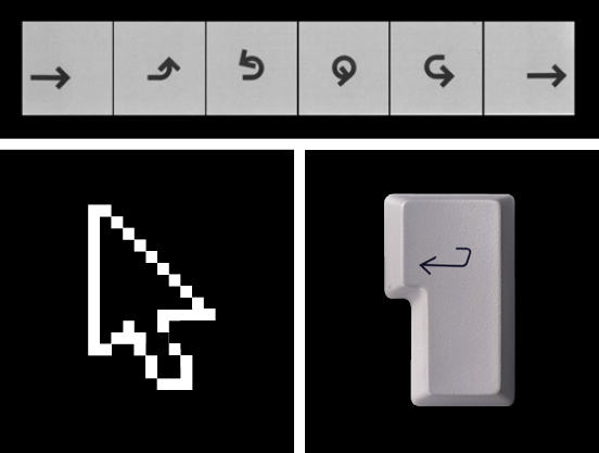
New arrows. Arrow symbols developed by IBM in the 1970s for use on their products. Today's on-screen cursor. Some of the arrows we all use every day.
The arrow has adapted and developed according to the demands of its age — it was a killing tool that became a harmless metaphor and a pictogram to which we now regularly entrust our lives. Is the ISO 7001 arrow really the end to this story? No, the arrow continues to take on new forms, appearing on keypads and touch-screen displays. Products marketed globally will increasingly rely on clever pictograms to unlock the seemingly endless potential of new electronic devices. And as products get even smaller, the miniaturising of buttons will depend on the arrow to guide us from one instruction to the next.
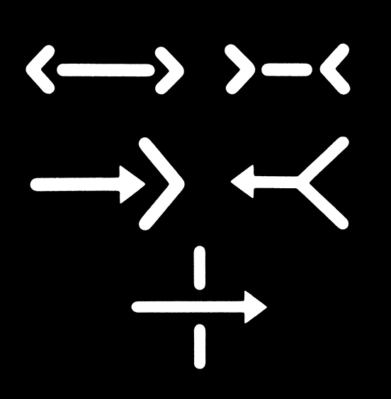
The future for arrows. Examples from LoCoS (Lovers' Communication System), a new pictorial language: far, not far, pull, push, pass through (Yukio Ota, 1964).
Looking ahead, the arrow inherently points the way. Japanese designer Yukio Ota has been developing a simplified communication system using pictograms. As one would expect, his LoCoS word system exploits the arrow to describe activities. It underlines the seemingly inexhaustible tasks to which the humble arrow can be assigned. Ota's experiments are based on Chinese kanji systems of writing, and he sees his work as a 'new weapon' in the battle for 'mutual understanding' on a worldwide scale.
The arrow has been travelling along on its own evolutionary path for thousands of years. As new arrows appear on new products and in new languages, the idea that the humble arrow could guide us towards a future of closer understanding is quite uplifting, isn't it?
Ian Chilvers

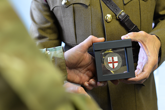 Presentation of a new Commander's Coin.
The tradition with the United States Army is that a Commanders Coin is presented to military personnel in recognition of excellence in competitions. It has evolved now with it's chief purpose promoting pride and to build cohesion and morale.
There are differing accounts of the origins of the Commander's Coin. Robust competition between the US Army, Navy and Air Force — to be the first for almost anything — means any definitive answer is long obscured behind a rivalrous smoke-screen. Legend has it that the antecedent 'challenge coins' began circulating in the drinking bars of Saigon during the Vietnam War (1955-75). There, local coins were over-stamped with a Unit's emblem and were used to prove membership of the relevant military company. Whoever could not produce one were challenged to buy in the drinks, hence the term 'challenge coin'. Of course, these coins were always kept to hand to avoid having to stand for a costly round, and so were much cherished. The impact upon the drinking districts of Vietnam was tangible; non-military drinkers stayed away for fear of having to buy a round of drinks, and so some bars became military-only haunts.
During the Gulf War (1990-1991), the British military worked side-by-side with US-led coalition forces. Close operational ties between the US and the British were further strengthened during the war in Afghanistan (2001 - present). It was during this conflict that British military personnel were awarded US Commander's Coins, which gave rise to the need to reciprocate in kind. British units including the Royal Engineers and the Royal Army Medical Corps developed their own Commander's Coins.
Today a Commander's Coin is often exchanged as a gift of friendship, presented to attached Units or individual soldiers, or to visiting Commanding Officers, Chiefs of Staff, Defence Secretaries and Heads of State. If you watch the President of the US in a televised address from the Oval Office, you will often see a fully stocked Commander's Coin rack on a table immediately behind him.
Captain Sexton, a Permanent Staff Administration Officer (PSAO), had been detailed to commission a Commander's Coin for Colonel Boreham, the Commanding Officer (CO) of 256 (City of London) Field Hospital. Captain Sexton knew that to deliver a Coin his CO would be proud to award, and one that a soldier in his Unit would cherish, he would need the services of a graphic designer. Captain Sexton contacted the only graphic designer he knew (an old school friend) at Atelier Works — and conveniently based just a seven minute walk from the Field Hospital HQ. Coincidently, Atelier were fully aware of the RAMC, having researched the Corps' history for thier Royal Mail Victoria Cross stamps, which features amongst others, Noel Chavasse, RAMC (VC and Bar).
Each of the Atelier partners had fathers in the Armed Services and grandfathers who fought in both World Wars. The partners therefore considered it an honour to be asked to design a Commander's Coin for 256 and agreed to do so, gratis.
After a meeting the CO was happy for Atelier partner Ian Chilvers to prepare some initial ideas. The first step was to look closely at the prevailing design of various existing Commander's Coins. Some examples were acquired, and online collections were surveyed. It was clear that most Coins had been commissioned by individuals who may have found themselves perhaps a little out of their depth. It was also clear that the Army 'doesn't do aesthetics'; just practical delivery, quick and on the double.
By default, it seemed that all Commander's Coins carried the relevant Unit's insignia and a motto. Many were a combination of coloured enameling and mixed metals. As an award, it was felt that the Coins should be one step below an official military medal. So the Commander's Coins that Atelier studied at times were not a true reflection of the heritage and the pride in the organisations they were designed to represent.
Ian asked Captain Sexton what a Field Hospital actually does. He briefly explained the tri-aging, treatment and evacuation processes, from the initial point of wounding, and that the specialist medical staff with the Unit are drawn mainly from the NHS. He explained they are deployed on operations either as part of a formed Unit, individual reinforcements, or as reliefs in place for an already purpose-built Field Hospital.
Highly impressed by the commitment made by these medics, Ian began to wonder whether this Commander's Coin could in some small way pay tribute to such dedication — and even assist in teaching battlefield medical procedure.
"What is the most important thing soldiers should do when they reach a casualty?" Ian asked Captain Sexton. "Follow the Master Drill!" he barked in response. Then, remembering that Ian was a 'civy', he went on patiently to outline the Master Drill; standard battlefield training for all military personnel."You have to drum this into a soldier time and time again", he said. "In a fire-fight, you stem the bleeding and then check airways. After the fire-fight you triage, and then communicate with others to arrange evacuation while maintaining the stability of the casualty. In! That! Order!"
Ian felt he'd stumbled upon a purpose for the 256 Commander's Coin.
The Coin features the 256 insignia; the rod of Asclepius (the staff and the snake) overlaid upon the City of London shield. Surrounding the shield is the legend 'Commanding Officer's Coin' and '256 (City of London) Field Hospital'. This is set in the typeface Albertus; significant because it was designed by the pre-eminent type designer Berthold Wolpe, who lived very close to the 256 Regimental Headquarters in Walworth. Many of the surrounding street signs (also designed by Atelier Works) are set in Albertus. The typeface is closely associated with the local community and so is the new Commander's Coin.
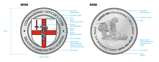 The design of a new Commander's Coin.
The design of this Coin's front face is (quite intentionally) similar to other Commander's Coins, but has been kept very simple and very legible. The reverse face is more unconventional, because it features a medic applying a tourniquet to a battlefield casualty.
The image was created by staging the scene in the unit's Drill Hall, using personnel from 256. Close attention was paid by Atelier to the correct battlefield clothing and equipment, and — most important of all — careful positioning of the soldiers, so that they created a strong outline, which could be easily recognised in miniature. Live viewing of photographs on a laptop helped Atelier direct the poses so that they worked in a circular format. It is noted that the Red Cross armband is on the right arm and not, as convention has it, on the left. This was done for narrative reasons.
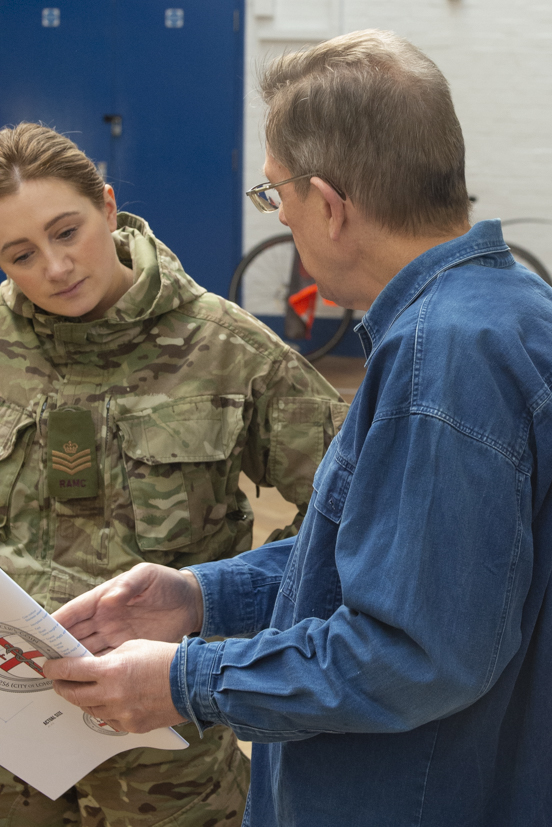
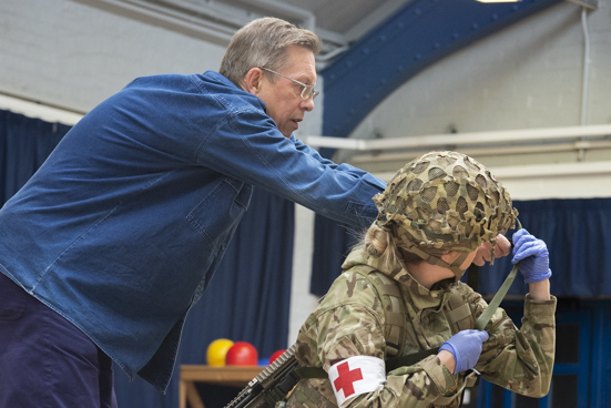
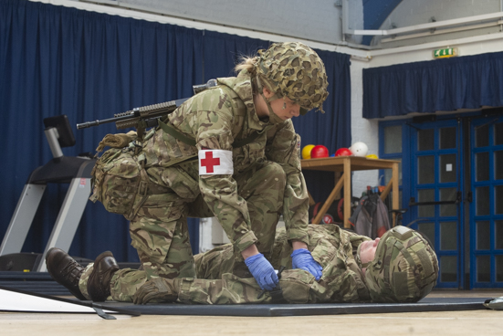 Photo shoot for the new Commander's Coin.
Back in the studio, the final image was manipulated to edit out extraneous detail, to highlight other features so that they would be recognised in bas-relief and a foreground was added. Finally, the key points of the Master Drill — as emphasised by Captain Sexton — were added around the perimeter of the Coin.
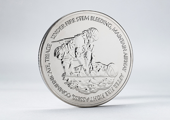
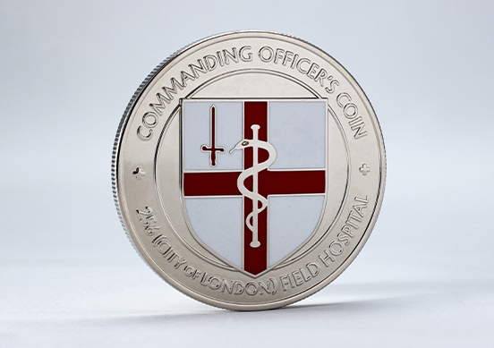 The finished new Commander's Coin.
From stamped coins in Vietnam, to one-upmanship coins post-Afghanistan, the Commander's Coin has certainly evolved. Now the CO of 256 (City of London) Field Hospital has an appropriate Coin that links the local community with an extremely practical, instructive, and indeed potentially life-saving message embedded into its design.
Ian Chilvers


![]()
 Two countries. Britains that show a very stark divide between two groups of British voters, in this infographic by Electoral Maps UK using voting intentions in 2018. On the left, the map shows voters 18-24, which would have returned 600 of 632 seats to Labour, and on the right the map shows just the votes of the over 65s, which would have yielded 575 seats to the Conservatives - these are both majorities the like of which no party has ever had, an almost complete annihilation of any other party. Who is voting with their head and who their heart?
 British Paradise: the ideal pastoral home.
 The Republican Elephant and Democratic Donkey were both derived from nineteenth century political cartoons, using the animals as metaphors of political behaviour. "Foolish animals"; the elephant dominating and scaring others, the donkey was a jackass powerfully (but somewhat blindly) kicking out.
  Designer Thomas Porostocky's plea for a wider political spectrum in America.
 Socialism growing in fertile earth. Originally used because the red flag was made illegal in Germany, the red rose was worn in Socialist buttonholes from the 1880s onwards. In a circle from the top: British Labour by Michael Wolff, the Parti Socialiste of France, the Partido Socialista Obrero Español, the World Socialists by Walter Crane drawn in 1915, the Vänsterpertiet of Sweden, British Labour as it uses Wolff's rose today, the Democratic Socialists of America.
 Two of the most prominent strategists of Labour in the election-winning Blair era, both sporting roses.
 America split between patriotic blue and patriotic red - not Conservative blue and Socialist red, in America it is the red that is more conservative, and blue that is seen as more progressive, or in another unEuropean usage: liberal.
 The political spectrum: all the fundamental colours are taken, any new party has an increasingly impoverished choice.
 Before party logos, there was only colour. One of William Hogarth's series of paintings charting the corruption of mid-eighteenth century politics in Britain called 'Humours of an Election'. This one shows 'The Polling', with the flags of Tories (blue) and Whigs (buff), and party activists bringing various unsuitable citizens to vote; a mental patient, a corpse and a man with a hook (which means he cannot lay his hand upon a Bible to swear his identity). The Whigs later mutated into the Liberals, and their buff mutated into yellow - although with the advent of Scottish National Party yellow, the Liberal Democrats are gravitating towards orange.
 Logo for short-lived The Independent Group for Change, are these bars of a political cage they must break out of? Is it inspired by the 'hamburger menu' icon on their website?
 Sinn Fein uses a graphic image of the island of Ireland entire, The National Alliance of Latvia uses a motif from traditional folk costume (with that hint of National Socialism), The Scottish National Party uses a device used to execute Christians, Kotleba of Slovenia uses a Christian Orthodox cross, Golden Dawn of Greece uses a fragment of ancient Greek meandros from architectural friezes which has something of the twisting swastika.
 The business-like unrevolutionary red boxes of European Social Democracy in a friendship circle: SPÖ of Austria, The Sozialdemokratische Partei Deutschlands (SPD) in power either with a majority or in coalition for most of post-war German history,
 The American version must surely be President Trump's red baseball cap, emblazoned with 'Make America Great Again'. Wearing the cap in public will almost certainly mean you are beaten up. Jussie Smollett's paid attackers who were actually Nigerians wearing ath-leisure, were described by Smollett to police as white men wearing
 Successful and unsuccessful faces. Jo Swinson taking ownership of her party, in presidential style. Posters for the 2017 presidential election in France. Obama's now iconic 2008 campaign poster - when asked if Obama had fulfilled the hope, the poster artist Shepard Fairey replied "not at all".
  Tony Blair's unhappy-looking cabinet clutching
  Campaign graphics can attain highly commercial polish, with every line of type carefully scaled and positioned. Here is the personal brand of the Congresswoman who calls herself Notorious
  Painting of The Madonna in Glory by Carlo Dolci, and flag of the Bureaucrats in Brussels.
 Two new Spanish populist parties on the left currently in a coalition government: Unidas Podemos and
  Political scientist Matthew Goodwin argues that "the model has changed", "there has been a structural change in the electorate". The old coalitions of voters that once fitted together under a party banner, are now very different to one another. Put very simply: a university undergraduate at Oxford holds very different views about the world to a forty-something mother with two jobs in Bolsover. The over-simplistic model of left-centre-right, dating from the French Assembly just before the revolution, when monarchists and clerics sat on the King's right, and the merchants and intellectuals sat to the left, might no longer be helpful in the modern world. Two other less linear models: The Nolan Chart of the 1960s, the Christie-Meltzer Diagram of 1970 (recalibrating politics is not new). Perhaps our views on different subjects are not always in the same place. To be economically communitarian, but socially conservative, fiercely patriotic, how does that person vote?
  Publications by the Electoral Commission of India offering parties possible symbols - India has over two thousand parties, about sixty of which have "reserved symbols", that they can use at each election.
 Come on you Reds. The most stripped-down political hope.


 Presentation of a new Commander's Coin.
  The design of a new Commander's Coin.

 Photo shoot for the new Commander's Coin.
 The finished new Commander's Coin.