STRIKING A BALANCE
Camden Council HQ
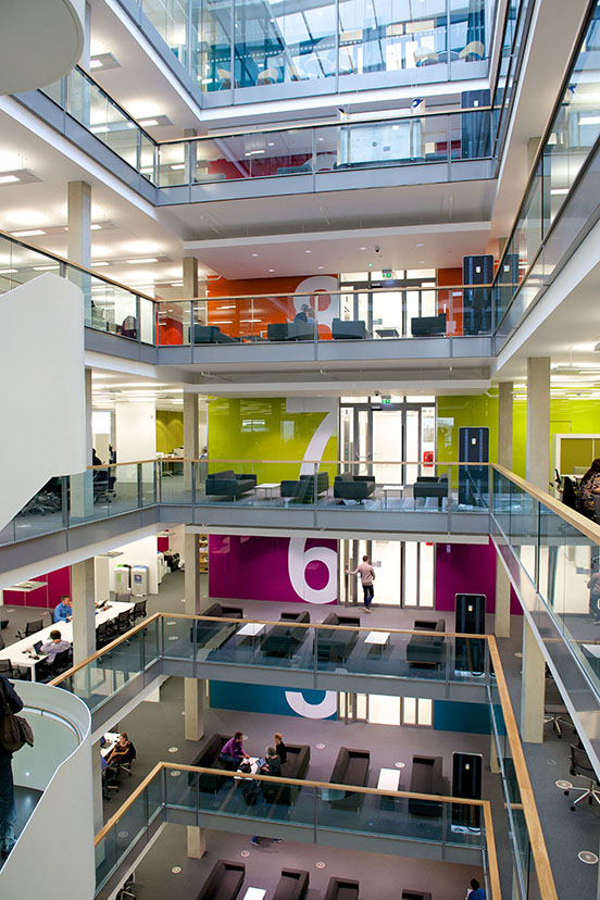
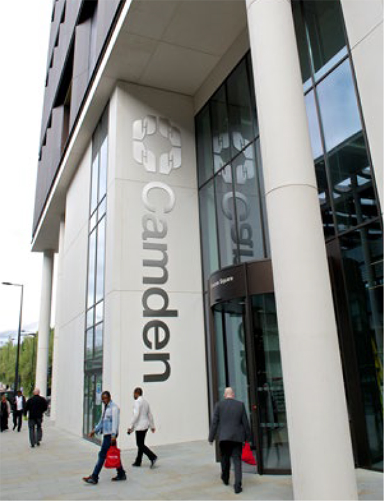
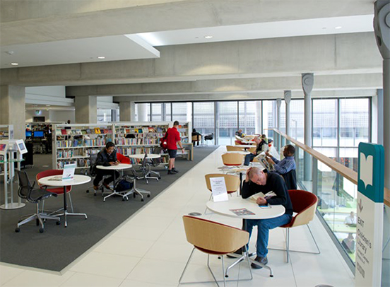
The London Borough of Camden found itself in the position of many local authorities — it was divided across a large number of sites, many built a hundred years ago, with multifarious maintenance and working issues. A decision was taken to sell or lease eleven properties and use the money to build a brand new headquarters building with new public facilities, including all Council services on a single site — with an anticipated footfall of 1,000,000 visits a year.
Mike Cooke, the Council CEO said: "The building is modelling the organisation we want to be, creative and collaborative."
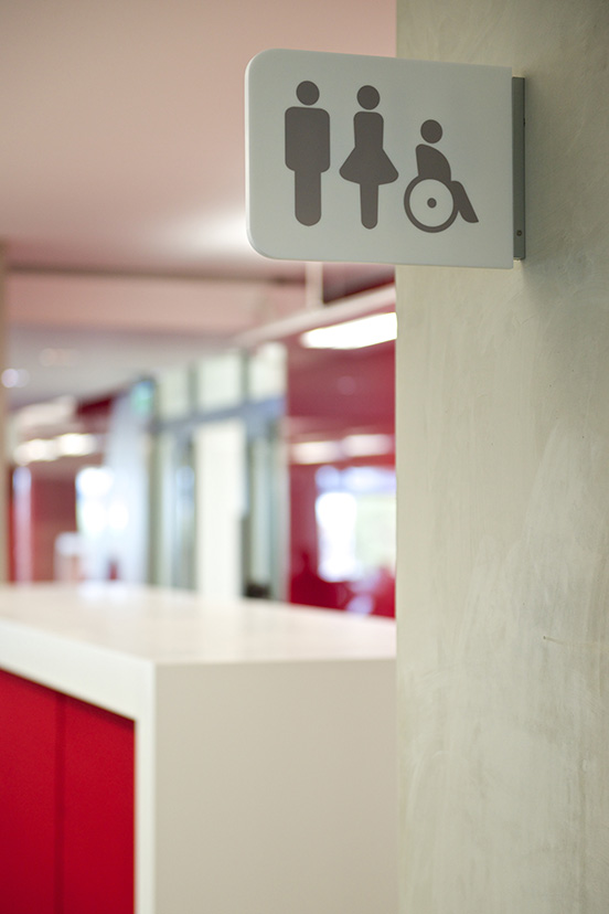
The ambition that gave rise to the building was "coherence". The building consisting of a set of spaces that would feel varied, interesting, inspiring, but that also felt like parts of a coherent whole. And since this is a public building in the truest sense, be fully inclusive and compliant with the access guidelines: BS8300/2010.
We elected to work alongside Whybrow, wayfinding consultants par excellence, with whom we have tackled thorny wayfinding projects for over twenty-five years.
Testimony from the client and the architect:
"Atelier/Whybrow was part of the 5 Pancras Square team alongside the client and architect. The resulting design is fully integrated with the architecture of the building. While clear and informative it brings a joyful veneer to the building, with a thoughtful colour scheme that encompasses wayfinding, identity and furniture selection. It is testimony to Atelier/Whybrow's collaborative approach that the boundary between the graphics and architecture is seamless. Their work adds greatly to the experience and enjoyment of the building."
Peter Fisher, Director, Bennetts Associates
"Navigation in our 5 Pancras Square building was a challenge: with a wide range of multi-use public and private spaces, it was critical that visitors and staff felt immediately at home and could find their way around with ease. Atelier/Whybrow has designed wayfinding that is logical and intuitive, and the use of coloured zones brings added vibrancy to our wonderful new building."
Terry Gallagher, Senior Building Surveyor, Camden Council
Since opening 5 St Pancras Square has won numerous awards including:
Winner Prime Minister's 2015 Better Public Building Award
Winner Best Inclusive Building 2015, Local Authority Building Excellence Award
Winner RIBA London Award 2016, RIBA Sustainability Award
Winner Construction Industry Council Inclusive Environment Award
Winner Transform Awards 2017 Wayfinding category


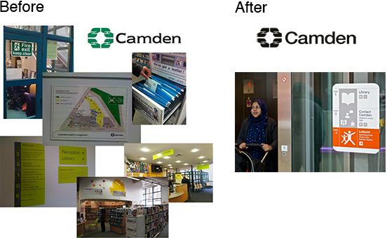
Camden saw the building as the forefront of a modernisation of its brand. We took the opportunity to tidy up the logo, the hands symbol dates from the 1960s, using Helvetica to match the building typeface.
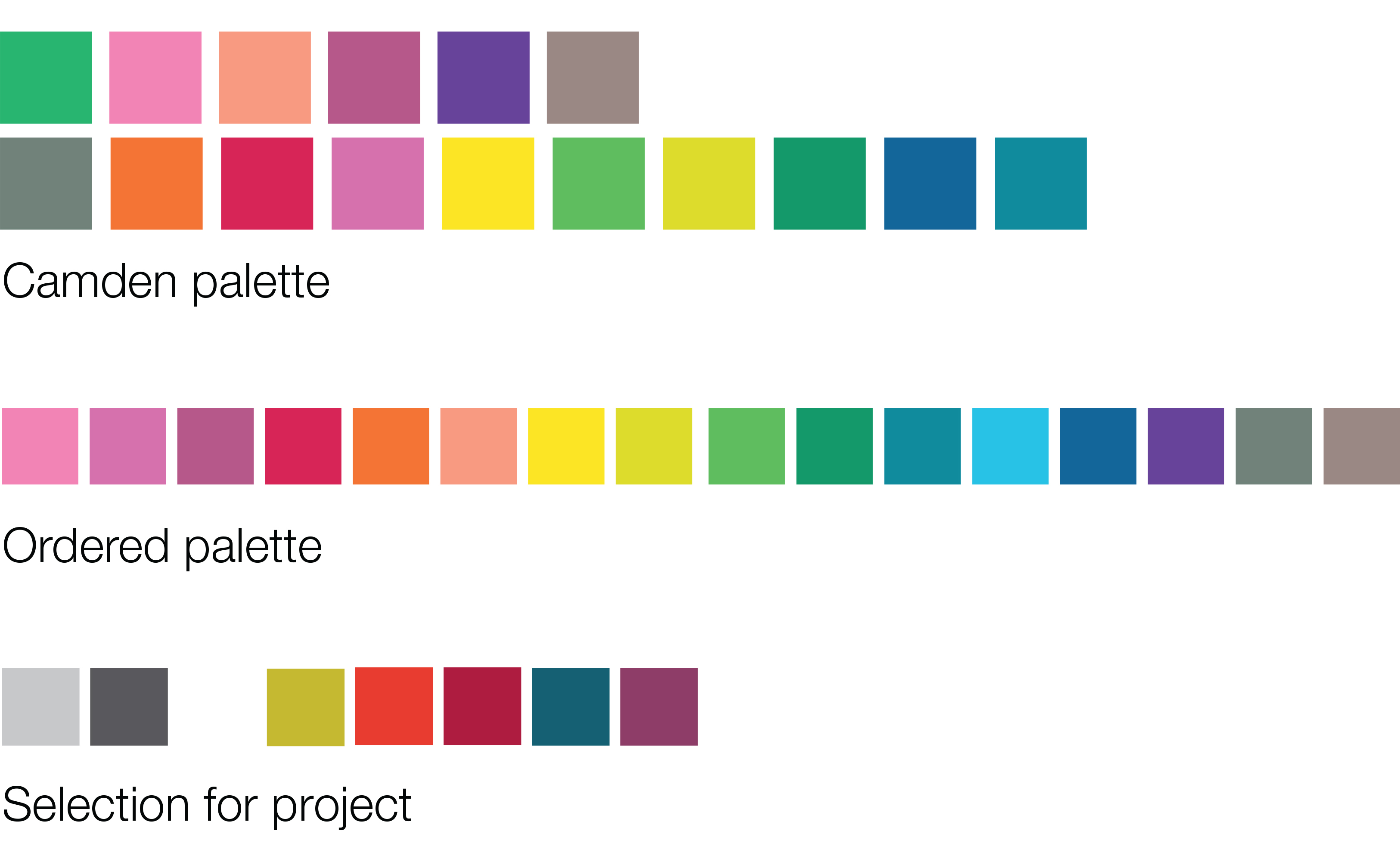
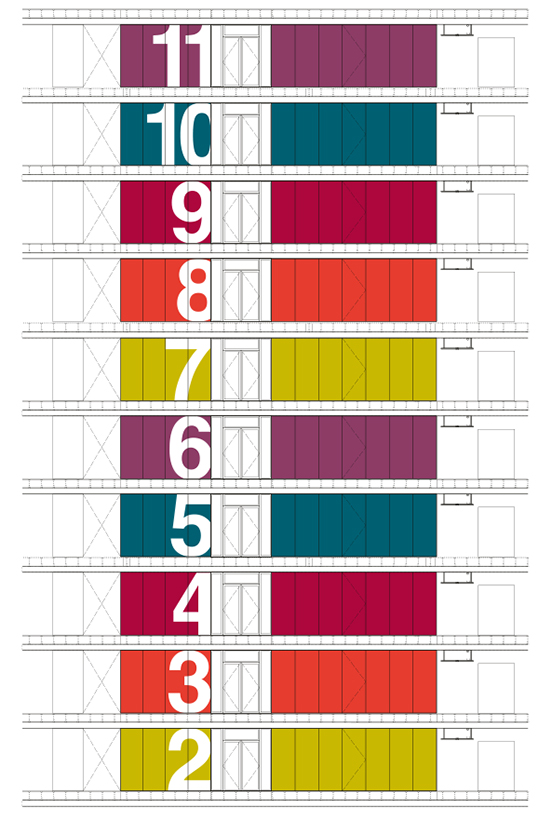
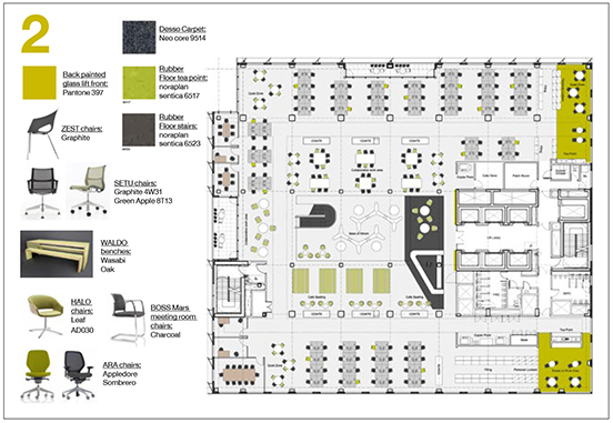
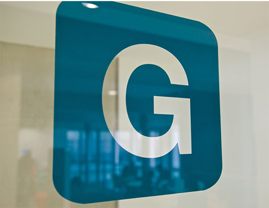
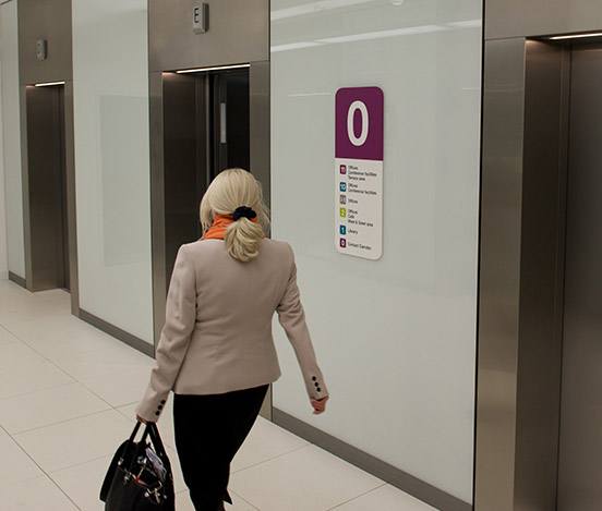
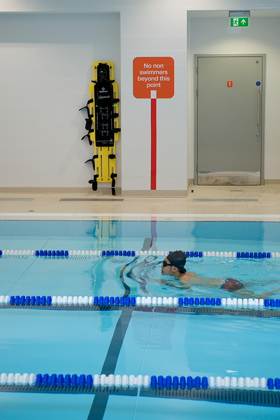
Another task was rationalising the over-extensive brand palette, editing it to very few colours for the building. Each office floor was themed in one of the colours, preventing the spaces from being too white-grey clinical.
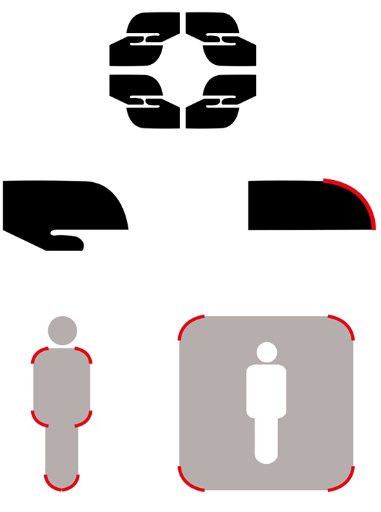
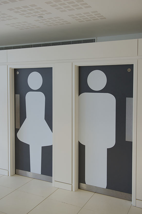
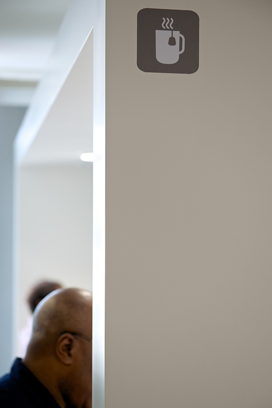
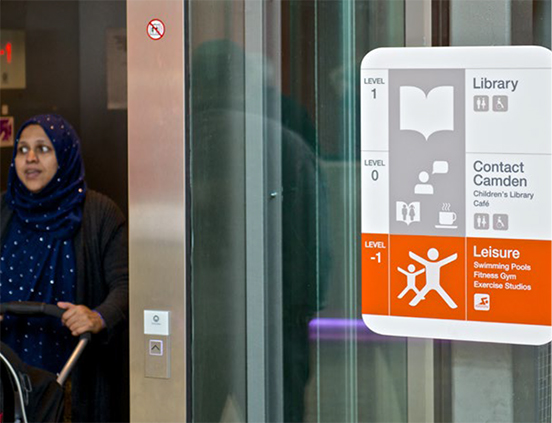
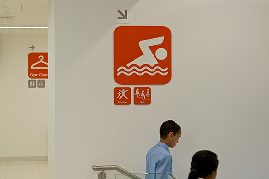
For the building's pictographic system, we extracted the distinctive softening "Camden curve" from the logo to act as a generative and cohering element.
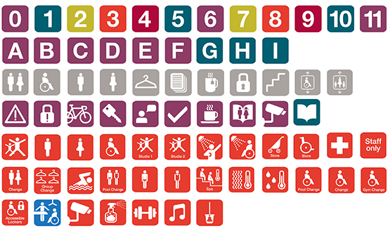
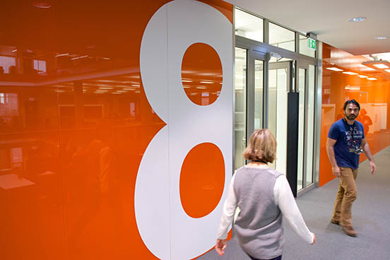
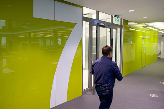
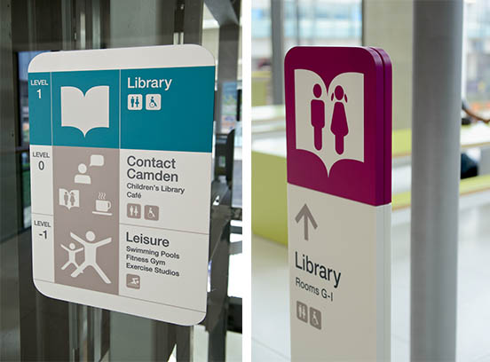
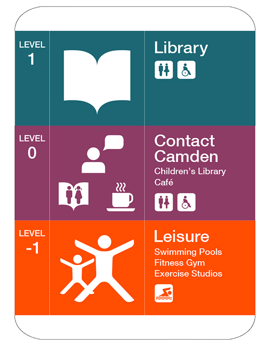 For the public areas, the signs demonstrate how the services divide over the floors. Pictograms are used to support the words since 25% of Camden's residents don't use English as a first language.
Related projects: Glass Mill Discovered, Shimmering signs, A Landmark Icon, Plain and Practical