WAYS FORWARD
Lambeth Council HQ
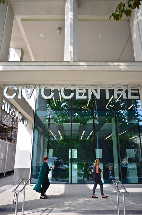
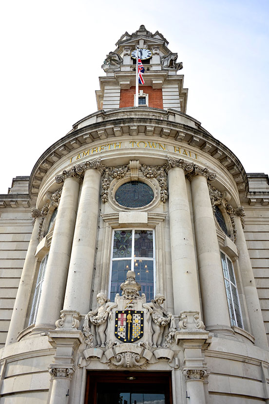 We have created the organisational graphics for London Borough of Lambeth's newly refurbished town hall and new civic centre in Brixton.
We worked on the branding and sign scheme for this, and our brief mirrored the architectural brief; make the best of some existing elements, invent some new elements.
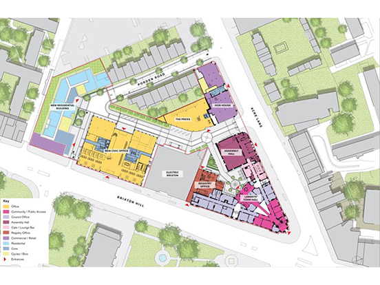 The two main buildings: the 1908 town hall, and a new office building with civic services for Lambeth residents at ground level.
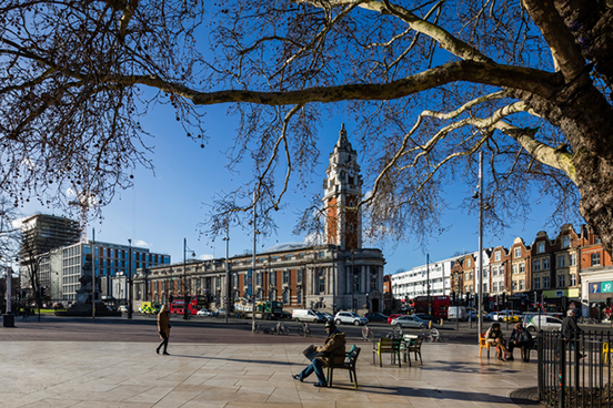
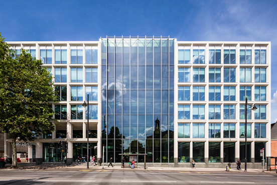
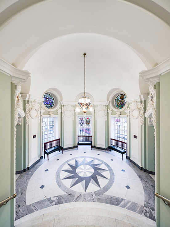
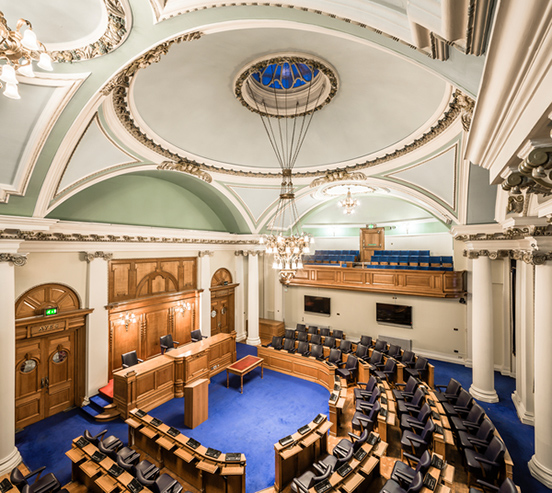
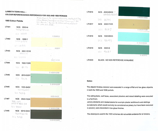 As for existing elements; we advised over the final colour scheme in the historic town hall - the paint analysis revealed two entirely different colour schemes, both historic: 1908 and 1930s, and these needed reconciling. We used Lambeth's logotype, with its stripey flag, and basic Helvetica typeface.
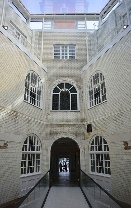
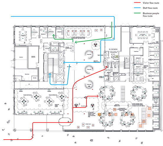
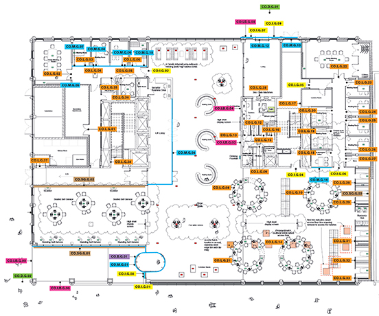
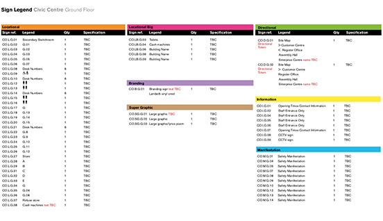
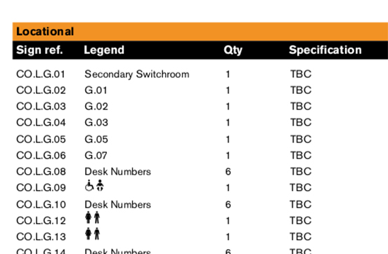
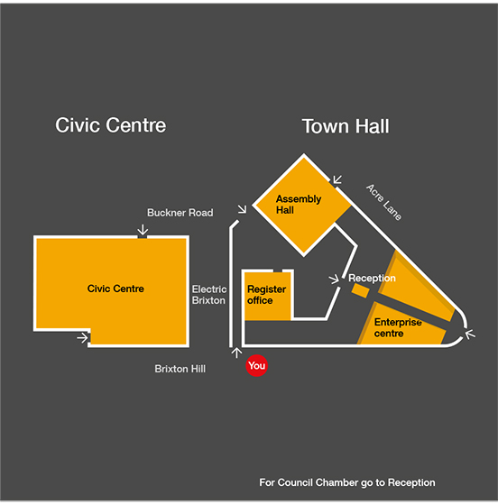
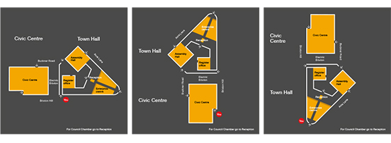
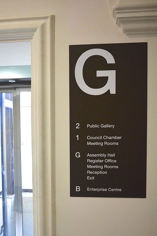
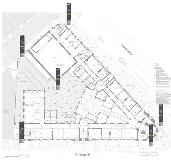 The strategy for orientation is a series of totems surrounding the site, each with a map itemising the four locations the Council offers; 1. the Civic Centre and Council services, 2. the Assembly Hall, 3. the Register Office, 4. the Enterprise Centre. Guiding people towards the right part of the site means that other signs can be minimised.
The map reorientates to match the direction you face.
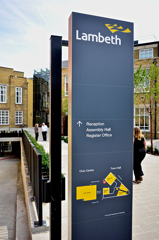
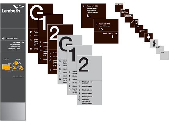
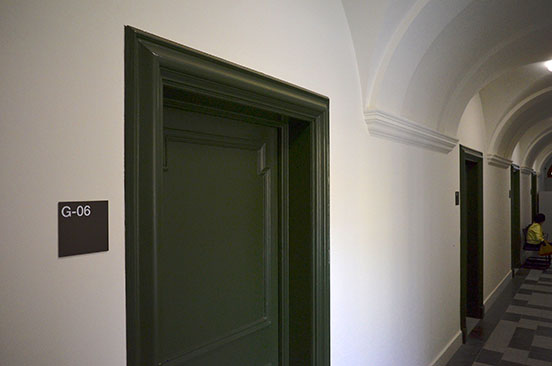
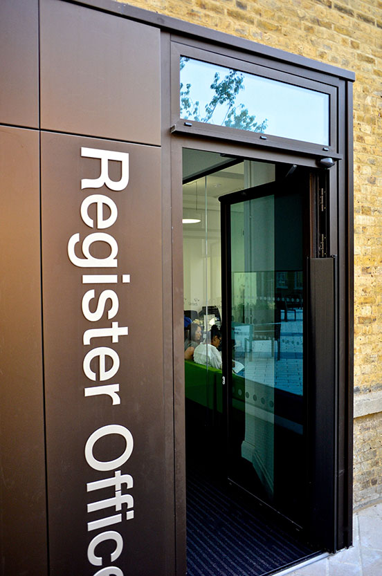
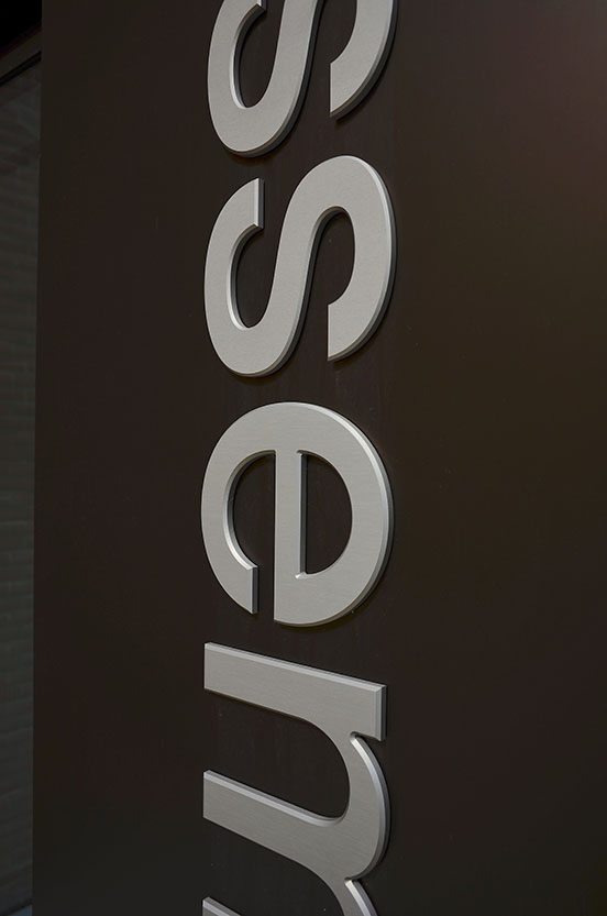
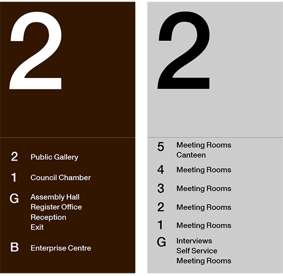 We used anodised aluminium as the sign material - the design remained coherent everywhere, throughout the two main buildings and the paths between them, with a colour shift to match the shift in architectural styles. Silver for the new parts of the scheme, and a sage green for the historic parts. The external signs are Lambeth brand navy blue. In the courtyard, large signs that are part-architecture to create doorways into the brick façade, are brick-brown.
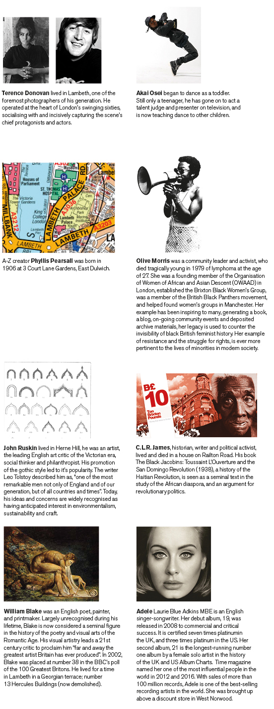
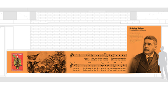
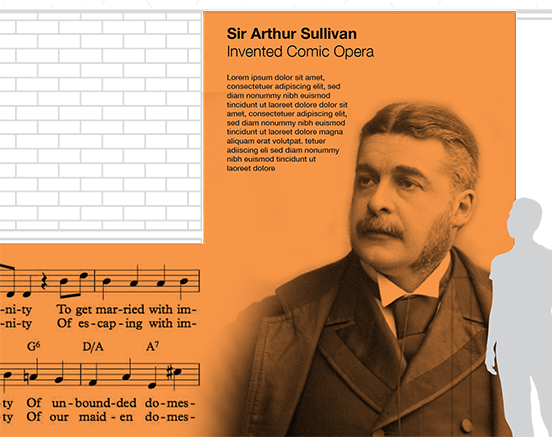
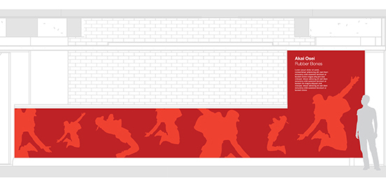
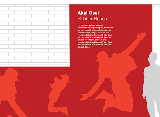
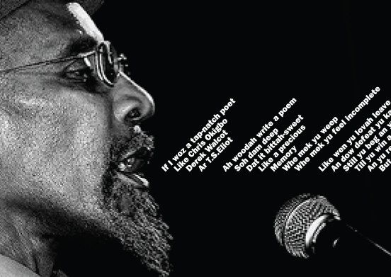
We proposed, at the behest of the Council, ideas about acknowledging the wonderfully rich creativity and character of Lambeth's people; from historians to singers, map designers to political activists.
