CUTTING EDGES
Royal College of Surgeons, Ireland
Founded in 1784, the Royal College of Surgeons in Ireland is Ireland's largest medical school, and has a group of buildings, including its original Georgian home on Dublin's St Stephen's Green.
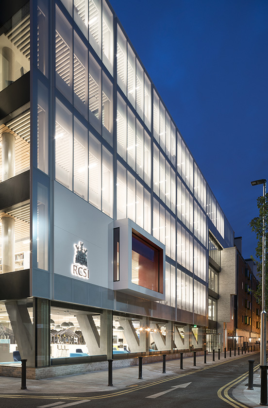
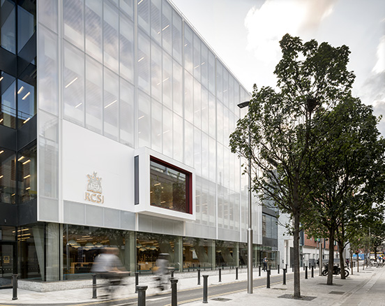
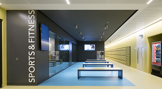
Last year it opened a brand new ten-storey teaching building No.26 York Street — with a three-storey library, operating theatres, auditoria, and state-of-the-art teaching rooms with sports facilities in the basement.
We worked with Henry J Lyons, the architects, and Whybrow, wayfinding agency, to create the navigation and information throughout the building.
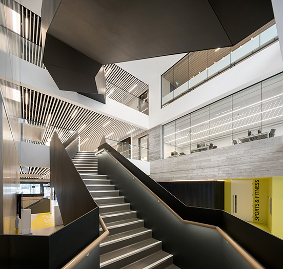
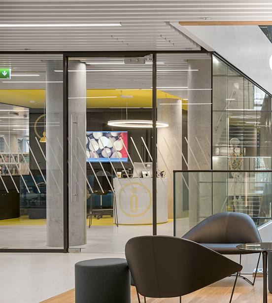
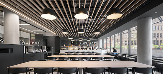
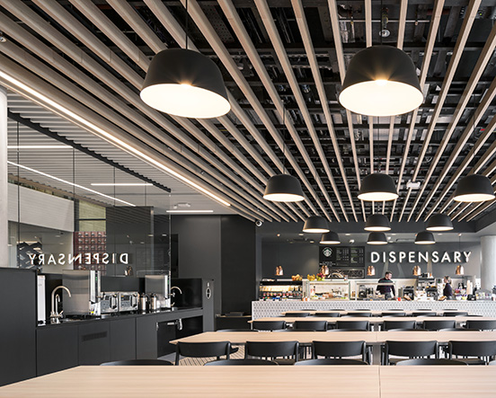
Underpinning the design approach is the idea that the graphics ought to grow out of and enhance the architectural language. We do this using features already established by the architects — the distinctive ceiling diagonals, the extensive use of neutrally coloured materials, the cutting-through of walls, floors and the ceiling to see beyond. The architects developed this language in response to the ten storeys, and the relatively small site, the building is full of facilities, and without light and lightness of touch, risks being dense and compressed. We translated the architectural forms into graphic diagonals (employed liberally as manifestation and as wall motifs), a palette of white and greys, and stencil cutting.
The net effect is that the wayfinding feels entirely part of the building.
The building just won the Education Award at the Irish Construction Awards, and is set to win many more.
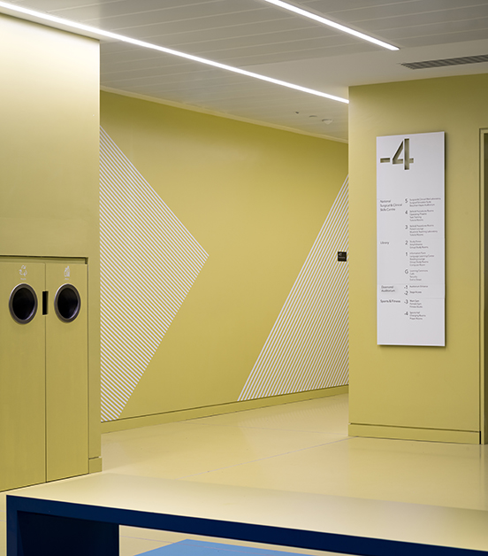
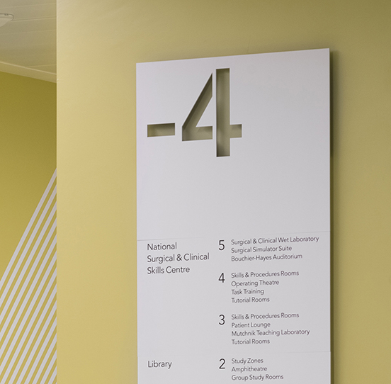
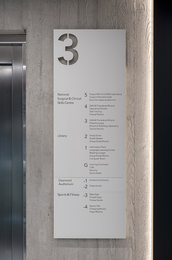 To enable navigation, stairways and lifts have a highly schematised contents page — a typographic version of the building itself.
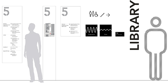
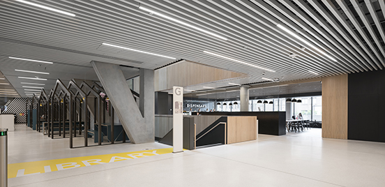
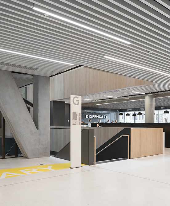
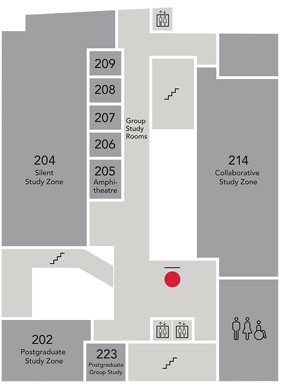 Each floor has a simplified plan immediately outside the lifts and stairs, making it quick to find a specific room.
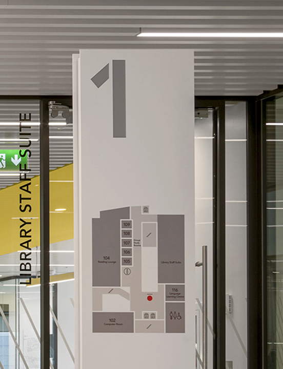


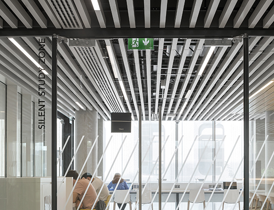
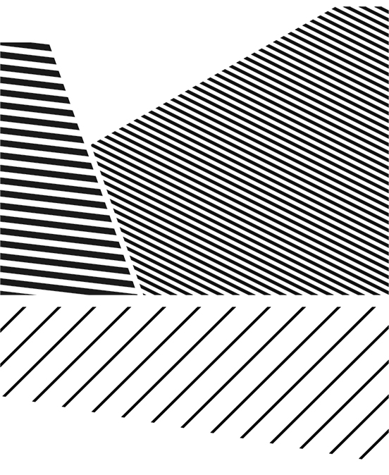
The ceiling provides a constant visual theme of diagonals, which we picked up on to use as the glazing manifestation.
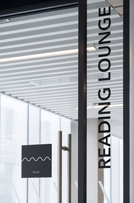
 A tongue in cheek use of a medical motif - signs for the various parts of the library indicate the permitted levels of sound.
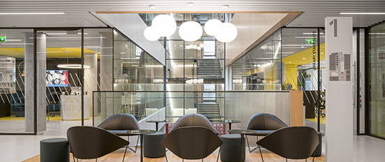


 The icon set was drawn with a thin line, picking up on the thin san serif font used for navigation.
