PISCES CENTRAL
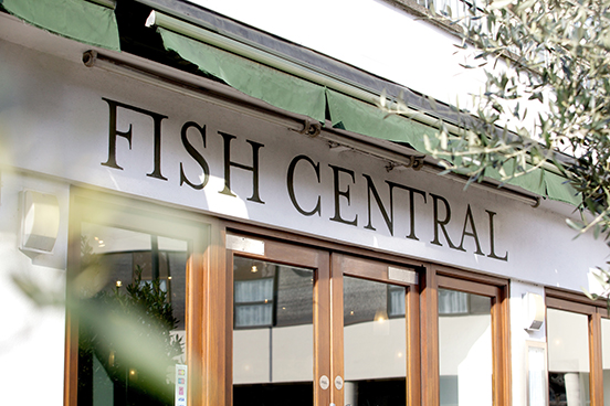
Fish Central
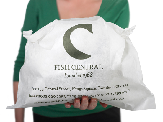
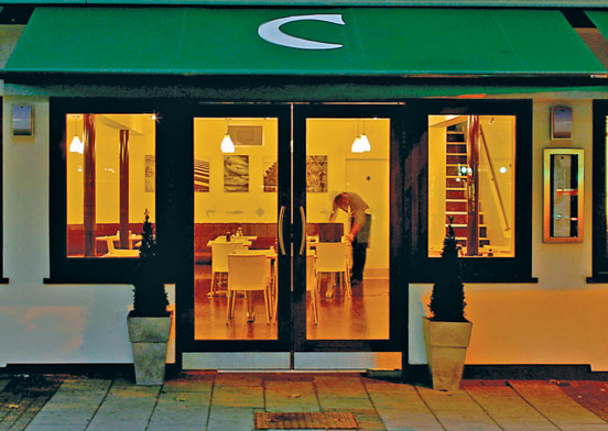
George, the gregarious founder, had been running his family restaurant since 1968. However, the time had come for his two sons to take a more active part in the business. The new generation took stock. They decided that they could increase the size of the restaurant by buying the premises next door and knocking down walls to expand the number of covers. But they weren't going to stop there. They'd also have a new menu created by a guest chef, a bar, and a separate take-away counter. And the new venture needed a new look...
Quite apart from the investment cost, closing a thriving business for a refit was a bold undertaking for the family. During this stressful period, George's sons had to rely on the support and advice of many people — including Atelier. With so much at stake, the two sons were keen to ensure that the Fish Central name was retained, but they also wanted a new identity that could potentially evolve into a chain in future years.
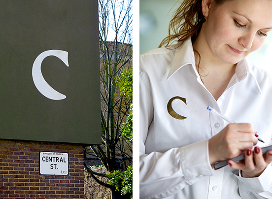
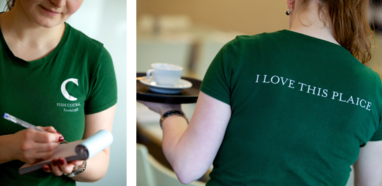
We started with the name; this wasn't going to change. "It's a fish restaurant, located in Central Street," we thought, so we brought these two elements together in a C-shaped fish brand identity.
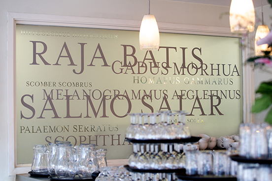
We inadvertently found ourselves assisting with the fit-out. In one instance, there was a problem getting natural light into the kitchen while at the same time providing the chef with some privacy to cook and direct his assistants. A study of Latin fish names provided us with a solution: a typographic shoal in a frosted glass sea that offered both light and privacy. The chef now works behind his catch.
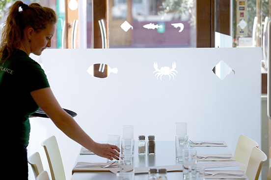
Then the building inspectors demanded safety manifestations on the new glass entrance lobby. A study of several fishing books helped us create a line of fishes to match the menu. It is a great way to introduce customers to their fish dishes.
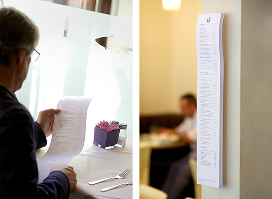
The more conventional design tasks were not overlooked. Of particular note was the restaurant menu. For Atelier, this had been the subject of a longstanding and unfathomable question; why was it that conventional menus were normally A4 and open out to become A3, when space at a typical restaurant table was so limited? A quick office survey supported our suspicions; opening large menus led to overturned wine glasses, disarranged place settings, and an intrusion upon the personal space of whoever may be sitting next to you.
We set to work to solve this conundrum, and after experiments at the Atelier dining table we came up with an inexpensive disposable 'paper roll' menu no wider than the description of a typical Fish Central dish required. By feeding the roll menu up from under the table, holding it between both hands, it was possible to read the whole menu and 'keep one's elbows in at the table'— just as our grandmothers always told us to do. Quite apart from an outbreak of improved table manners in the restaurant, Fish Central love the new menus because there's not so much red wine spilt on pristine white linen tablecloths nowadays.
Atelier isn't really known for menu innovation — but perhaps we should be.
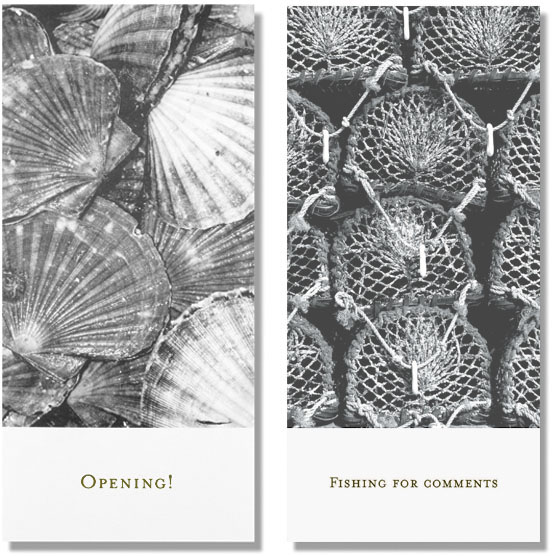
As a family-run business, everything had to be as genial as George. The re-opening night invitation was really a prompt to try the shellfish, while a Fish Central feedback form doesn't hide the fact that it was really fishing for compliments.